About
Randy Krum
President of InfoNewt.
Data Visualization and Infographic Design

Infographic Design

Infographics Design | Presentations
Consulting | Data Visualizations

DFW DataViz Meetup

Join the DFW Data Visualization and Infographics Meetup Group if you're in the Dallas/Fort Worth area!

Search the Cool Infographics site

Custom Search

Subscriptions:


Feedburner

The Cool Infographics® Gallery:

How to add the
Cool Infographics button to your:

Cool Infographics iOS icon

- iPhone
- iPad
- iPod Touch


Read on Flipboard for iPad and iPhone

Featured in the Tech & Science category

Flipboard icon

Twitter Feed
From the Bookstore

Caffeine Poster

The Caffeine Poster infographic

Entries in auto (37)

Thursday
Apr082010

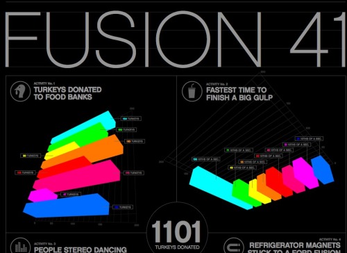
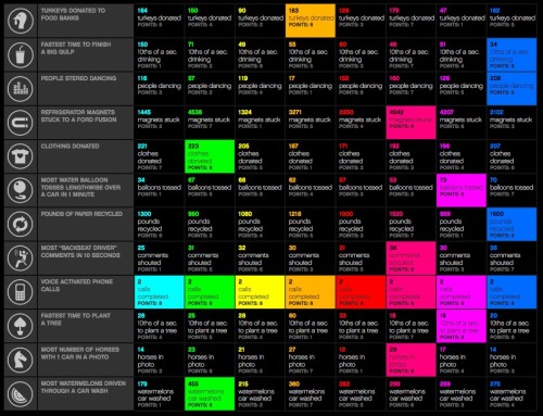
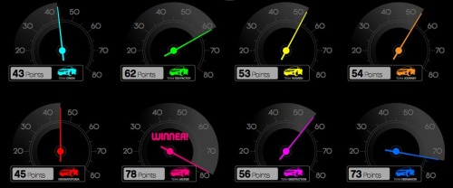
The Ford Fusion 41 Competition infographic

As part of the advertising behind the Ford Fusion, Ford held a contest with eight teams to break some wacky world records.  Tapping into the public interest in infographics, they worked with designer Thomas Porostocky to develop a visual design they could publish.

The Fusion 41 competition amassed a wealth of raw data generated from all of the teams and activities. To bring these numbers to life we handed the database over to designer Thomas Porostocky who spun it into some amazing poster size visuals. Download the PDF to check out the Fusion 41 stats in their full glory.

This infographic has received some criticism on the web, so I thought I would add a few more comments.  I love the idea that Ford has taken some wacky, strange and funny statistics and visualized them to make them interesting and approachable by viewers.  The results from competitions like “Fastest time to plant a tree”, “Most ‘backseat driving’ comments in 10 seconds” and “Refrigerator magnets stuck to a Ford Fusion” help support the idea that it’s not all serious and the Fusion can be a fun car.  I think the statistics behind the competition are very well focused to be humorous and entertaining to the customer profile that Ford is trying to reach.  I like the grid and speedometer design portions of the poster a lot.

We’ve told the world that the Ford Fusion is up to and up for any challenge. So we chose eight Fusion drivers and their friends to put the Fusion to the test. Every 41 hours for three weeks we tasked these teams to rack up the most points by completing activities with a 2010 Fusion. During those 3 weeks the teams strove to out-score each other across 12 separate activities.  In the end, the team leading in the most Activities walked away with the title of Fusion 41 winner and a Ford Fusion of their own.

I only have two complaints about the infographic myself.  First, I don’t like the over-use of bar charts.  It reminds me of the pages of bar charts that many corporate reports have that could be replaced by a good infographic.  Second, the bright colors used are harsh to the eyes and hard to read.

In December, Ford teamed up with 8 loyal Fusion owners and 4 of their friends to compete in relay challenges that set world records in the 2010 Ford Fusion. Fusion 41 activities included the most turkeys donated to a food bank, most clothes donated to a shelter and most people dancing to the Fusion’s stereo to name a few. The teams had a blast participating in the Fusion 41 program and the results were remarkable!

Take a look and post your thoughts in the comments.  What do you think?

Monday
May042009

50 Cars or 1 Bus? Infographic Advertising!

Great visual ad by Flygbussarna in Sweden!  Combining a physical construction of a bus made out of cars on the side of the road, a live webcam, and live infographic information on the website!

Every day thousands of cars are driven to and from Swedish airports. Every car holds only 1,2 persons on average which is to be compared with the Airport Coach that takes over 50. Needless to say, this makes no sense whatsoever from an environmental standpoint. To highlight this, an enormous bus was built out of 50 cars on the side of the highway to the airport. On the website, a live camera not only shows the installation 24/7 but also analyses the image and tracks each and every car going by. This data is then being used to highlight just how much emission we could save just by going by bus instead.

 Thanks to @yplim on Twitter!


Monday
Apr202009

Honda Ad: Keep Doing

Not sure if this Honda Ad is truly "infographics", but it's close.  It sounds like Garrison Keillor from "A Prairie Home Companion" doing the narration.

Thanks Paulo.

Wednesday
Mar042009

F1 Racing Car Changes Video

Great animated video the visually shows you the changes in the F1 racing cars for 2009.

A fantastic computer-animated clip features Mark Webber and Sebastian Vettel racing on track, as they bring to life the biggest rule changes in the history of Formula One.  Last seasons car morphs into the current Red Bull Racing car, the RB5, showing all the bodywork changes from nose to rear wing.
From www.automotivetv.net

Friday
Jan232009

Why Do Freeways Come to a Stop?


This is a simple, good infographic that seeks to explain why traffic on freeways slows to a crawl without any apparent reason to drivers.  By Stephen J. Beard and Rich Exner in The Plain Dealer.

EDIT: Here's a link to the original article, and a high-res PDF of the infographic.

Sunday
Apr272008

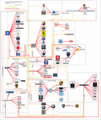
Who Owns the Car Companies? (UPDATE)


TooManyCars.com has updated their family tree style poster of how all of the car companies are related. The latest updates were as of 4/1/08. They have also changed to better software used to zoom into the poster. Each of rectangles you see on the images will zoom in close so you can read the details about the connections.

They've really done a good job tracking down the specific types of relationships and the ownership portions between the companies. High-res PNG or PDF files are also available.

Tuesday
Oct232007

Who Owns the Car Companies?

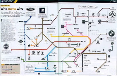
I found three different images showing the complex network of ownership between the automotive companies. Three different attempts at making these complex relationships easier to understand. This first one is a scan from a magazine, but I can't find any reference to which actual magazine it came from. Charted out like a subway map, it's pretty easy to follow.

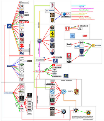
This next one from Too Many Cars is charted like a family tree, or a mind map. It's the easiest the follow, but probably the least aesthetically pleasing. Online the image is broken into smaller pictures so you can zoom closer, but is also available as a large poster in PNG or PDF formats. The data for this one is from 2006, and is the most current of the three.


This last graphic claims to show the ownership mix in the auto industry as a form of bubble chart, but I can't find any date or source data link. I think the bubble sizes represent something, like size of the company or ownership, but I can't tell. So I can't tell how accurate this is. The image is on Tinypic.

Page 1 ... 1 2 3 4