About
Randy Krum
President of InfoNewt.
Data Visualization and Infographic Design

Infographic Design

Infographics Design | Presentations
Consulting | Data Visualizations

DFW DataViz Meetup

Join the DFW Data Visualization and Infographics Meetup Group if you're in the Dallas/Fort Worth area!

Search the Cool Infographics site

Custom Search

Subscriptions:


Feedburner

The Cool Infographics® Gallery:

How to add the
Cool Infographics button to your:

Cool Infographics iOS icon

- iPhone
- iPad
- iPod Touch


Read on Flipboard for iPad and iPhone

Featured in the Tech & Science category

Flipboard icon

Twitter Feed
From the Bookstore

Caffeine Poster

The Caffeine Poster infographic

Entries in auto (37)

Tuesday
Mar272012

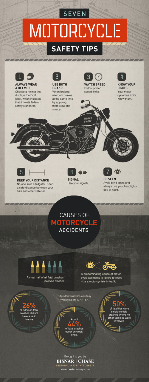
Seven Motorcycle Safety Tips

The Seven Motorcycle Safety Tips infographic comes to us from Bisnar|Chase. This infographic gives some helpful tips on saftey to prevent injuries, but if you do have an accident, they’d like to help!

Motorcycle safety is no joking matter. Please take your safety seriously. If you do become injured in a motorcycle accident we would like to help. Contact us immediately to schedule your free consultation with our reputable California motorcycle accident lawyers.

A couple things I really like about this design.

  • It tells a simple, easy-to-understand story
  • Clean design, not too much visual noise
  • Good illustrations to illustrate each safety tip and statistic
  • Each of the values included are visualized to make them quick and easily to read

The data source is listed in the infographic, but it’s missing a copyright statement and a URL to the original infographic posting at the bottom.  The page with the original posting is also missing sharing buttons for social media, so it’s difficult for readers to share the infographic.

Thanks to Chris for sending in the link!

Friday
Mar022012

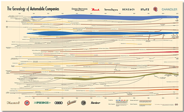
The Genealogy of Automobile Companies 

A brand new infographic poster designed by Larry Gormley at HistoryShots.comThe Genealogy of U.S. Automobile Companies visualizes over 100 years or corporate history of car company mergers, acquisitions and closures.

A flowing history of more than 100 automobile companies across the complete time span of the automobile industry. From 1900 to 1925 over 3,300 organizations were formed to produce automobiles in the United States. In 1910 alone 400 new startups entered the industry. Most attempts lasted less than two years. While car sales exploded (from 1910 to 2010 US sales rose from 200,000 to 11.5 million cars) the strongest entrepreneurs bought out rivals and combined forces. Today, ten companies account for about 90% of all US automobile sales.

This graphic uncovers and explains how the industry was created and how it arrived at its present form. At the core is a full genealogy of over 100 companies from the Big Five to the small defunct companies. Folded into the genealogy is the relative market share of US sales for each company.

The Big Five car companies have unique colors, and all of the other companies are color-coded into categories of he trest of the Top 20, defunct companies and other interesting or famous companies.  The thickness of the lines change over time to represent market share.

You can buy a copy of the 38” x 23” poster for $29.95 over at HistoryShots.com

Thanks to Larry for sending in the link!  Great design!

Wednesday
Jan112012

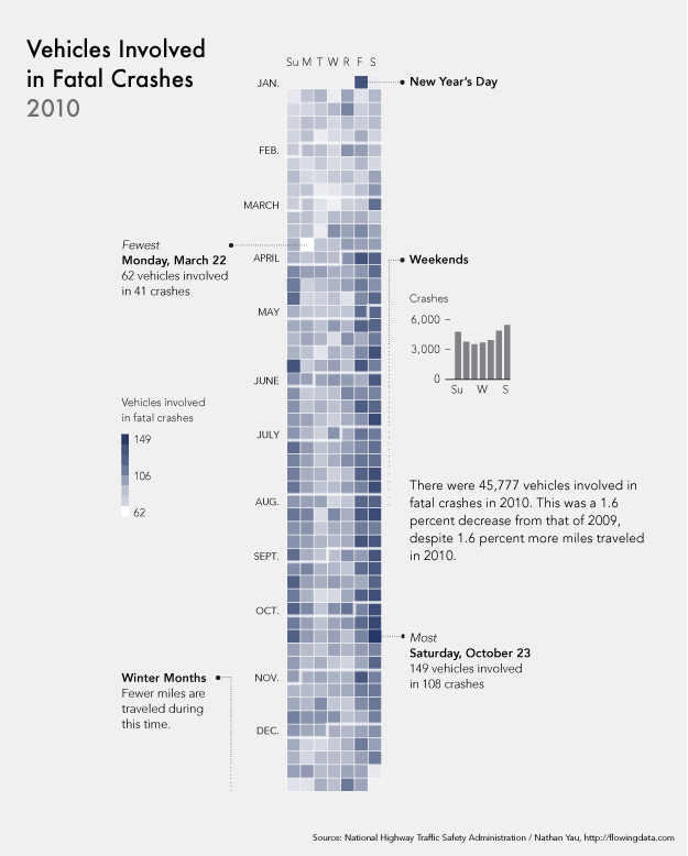
Calendar Visualization of Fatal Car Crashes

I really like this data visualization from Nathan Yau at FlowingData.comVehicles Involved in Fatal Crashes 2010 takes a new look at the statistics released by the U.S. National Highway Traffic Safety Administration.  Instead of plotting them on a traditional map, Nathan looked at the time data.

After seeing this map on The Guardian, I was curious about what other data was available from the National Highway Traffic Safety Association. It turns out there’s a lot and it’s relatively easy to access via FTP. What’s most surprising is that it’s detailed and fairly complete, with columns for weather, number of people involved, date and time of accidents, and a lot more.

The above shows vehicles involved in fatal crashes in 2010 (which is different from number of crashes or number of fatalities). This data was just released last month, at the end of 2011 oddly enough. It’s a calendar view with months stacked on top of one another and darker days indicate more vehicles involved.

- Nathan Yau

As was suggested by others in the comments on FlowingData, I agree that since the weekends have the higher incidence rate, starting the week with Monday and moving Sunday to the last column may show that a little bit clearer.

Nathan has made all of the data avaialble for anyone that would like to try a visualization themselves.  Student project?

Wednesday
Nov022011

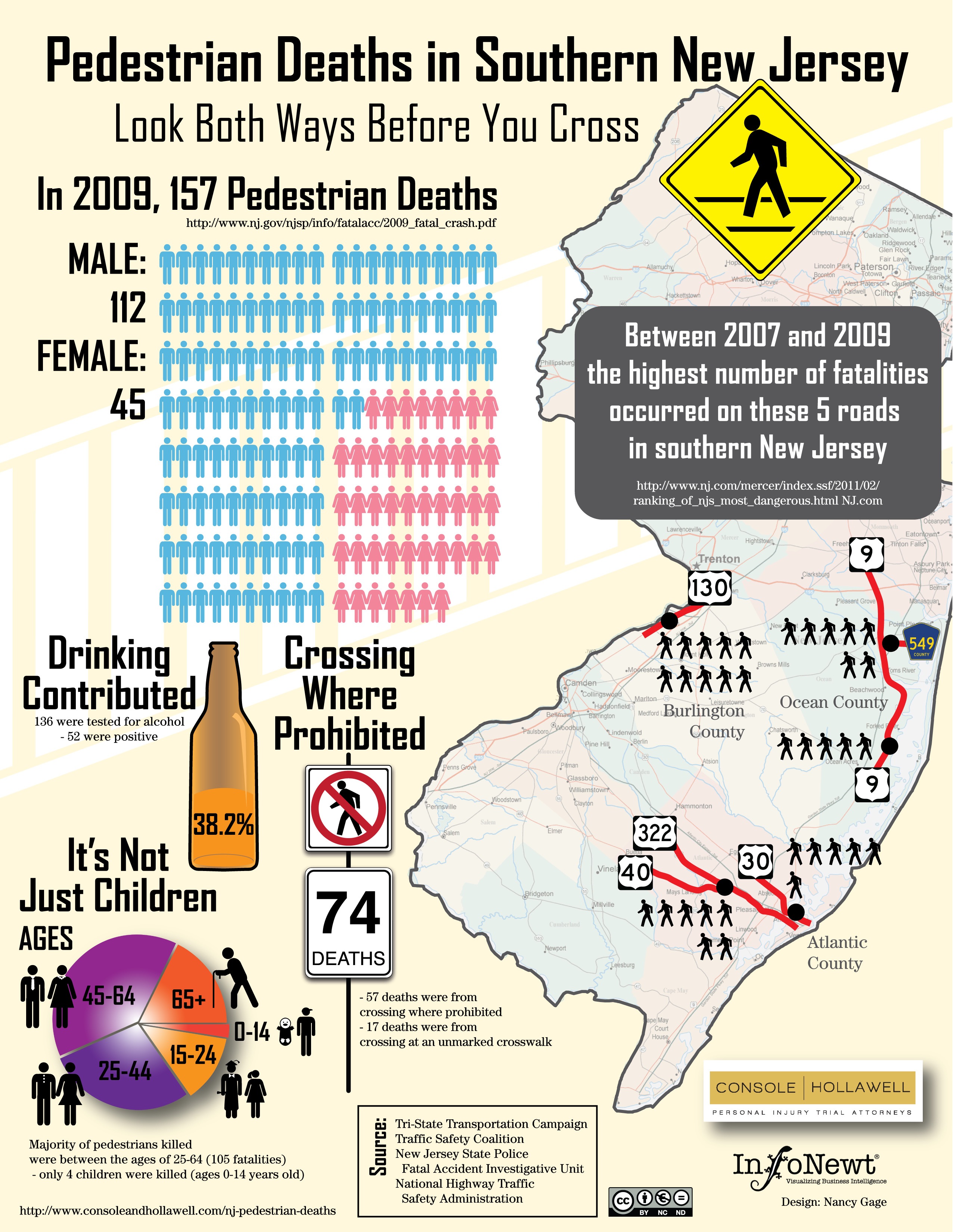
Client Infographic: Look Both Ways Before You Cross


Pedestrain Deaths in Southern New Jersey takes an infographic look at some usually inacessible and hard-to-find data from the different state department websites.  Console & Hollawell worked with InfoNewt and designer Nancy Gage to bring the data together into one infographic that tells a more complete story.

The New Jersey personal injury lawyers at Console & Hollawell receive calls on a daily basis from the unfortunate victims of car accidents across New Jersey and Pennsylvania. We are actively pursuing lawsuits in several cases. In an effort to bring attention to these dangers in New Jersey, we created the infographic below to help bring these statistics to light and ultimately help pedestrians maintain more awareness when crossing these dangerous New Jersey streets.

Although child deaths while crossing the street are the events that get the big headlines in the news, I was surprised that only 4 of the 157 deaths were kids.

Thursday
Jul142011

Distracted Driving Infographic

From the Christensen Law Firm in Utah comes the Cell Phones & Driving infographic that looks at the horrifying statisitics behind accidents and deaths caused by people using cell phones while driving in the U.S.

shocking facts about the realities of texting and driving in modern culture. It mentions, for example, that 18% of all fatal accidents are caused by cell phone use, and that 6 collisions occur every 10 minutes because of cell phones. In other words, keep the cell phone as far away from you as possible while driving, because frankly, becoming one these statistics is not an admirable achievement.

The design style is very crowded and busy, but I like the unique approach to using each number on the keypad as a statisitic.

“More than one in four Americans who download apps admit to using those apps while driving.”  On my iPhone, one of those apps is the TomTom GPS app, so of course I use it while driving!

Thanks to Jake for sending in the link!

Monday
Jun202011

Drunk Driving by the Numbers


The Real Effects of Drinking and Driving is a good infographic from CarInsuranceComparison.org.  It stays focused and tells one compelling story really well.  Some of the illustrations are just that, illustrations, when they could have visualized the numbers.

Thanks to Clyde for sending in the link!

Friday
Jun102011

White House Infographic: The Resurgence of the American Automotive Industry


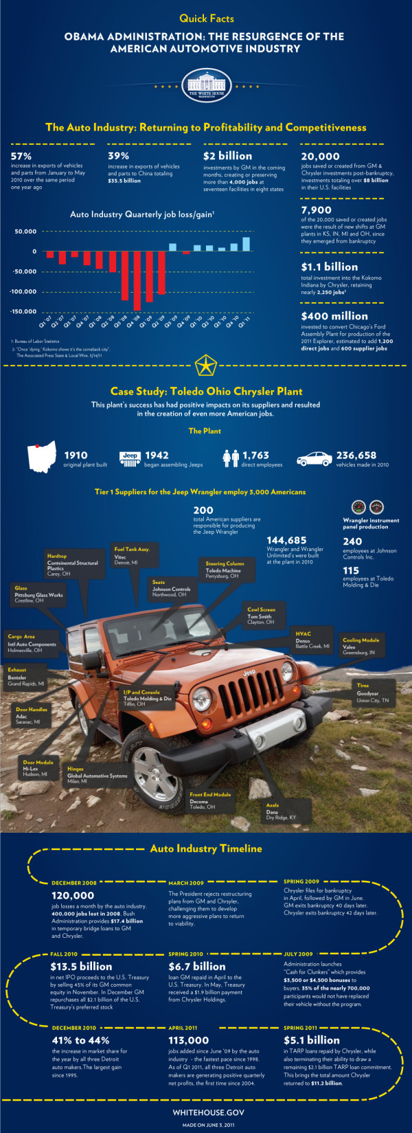
The team at the White House released The Resurgence of the American Automotive Industry infographic on the White House Blog last week in conjunction with President Obama’s visit to Toledo, OH and the JEEP manufacturing plant there.

Today, President Obama will travel to Toledo, Ohio where he will visit the Chrysler Group’s Toledo Supplier Park – an operation that employs more than 1,700 workers producing Jeep Wranglers, Jeep Liberties, and Dodge Nitros.  Just two years ago, Chrysler was filing for bankruptcy, and President Obama made the tough decision to support the restructuring of the company rather than allow it to fail – which would have cost tens of thousands of American jobs.

Today, Chrysler is repaying its government loans six years ahead of schedule and posted five consecutive quarters of operating profit.  Earlier this week, the National Economic Council released a new report on the resurgence of the American automotive industry.  Over the past two years, the auto industry has added 113,000 jobs - the fastest pace of job growth in the auto industry since 1998.

Check out this infographic that highlights some of the key successes in the auto industry since 2009.

I wrote a long critique of the last White House infographic about Obama’s Energy Plan (The Obama Energy Agenda: The White House attempts an #Infographic).  This one improves on some of the design issues I had with the last one.  I like that the White house is being consistent with the design style, and you can tell at a glance that this one is obviously in the family of official infographics from the White House.

Citing sources is still an issue for these infographics from the White House.  There are two sources cited and referenced, but many more statistics are included without any source.  For example, where does the “39% increase in exports of vehicles and parts to China” come from?  There are many statistics that could have been visualized to reduce the amount of text as well.  Listing a bunch of numbers in bold text doesn’t make for a good infographic design.

I love the inclusion of the Jeep photo with information mapped on top.  Much more interesting and engaging to the reader than what could have been a list of 17 suppliers, and more interesting than plotting them on a map of the U.S.

The timeline is pretty boring.  The dotted line could have been tire tracks, and way too much text that could have been data visualizations.

Thanks to Mary Kaye for sending me the link!

Friday
May202011

Expert Driving Techniques #infographic

Here’s a good one to start the weekend.  From imingle.com comes Expert Driving Techniques That Could Save Your Life.

This has got to be one of the longest infographics I’ve seen, so I shrunk it down a little bit to post here.  I know my readers like to see the whole infographics when I post them, but you can see the full-size version here.

Not many statistics or data visualizations, but really good driving advice and some good illustrations to make them easier to understand.  Some of the illustrations (like braking methods) look like data visualizations, but there’s no data behind them

Thanks to Brittany for sending in the link!

Monday
Jan102011

The (Visual) Evolution of the Batmobile


This is a really TALL infographic, but fun to read through nevertheless.  The Evolution of the Batmobile from Carinsurance.org (I wish they would credit the designer) is a visual timeline in the form of a comic book page looking at many (I’m sure they missed some, but not many) versions of the Batmobile from 1941 to 2010.  They also cover different versions from comics, television, movies, ads, posters and computer games.

The Batmobile has always been the trademark vehicle for Batman. However, throughout the history of the comic, the Batmobile has undergone some changes to its design and gadgets. Here’s an overview of some of the evolutions of the Batmobile.


Monday
Aug022010

Automotive Family Tree: Update, Interview and Poster GIVEAWAY! #autotree

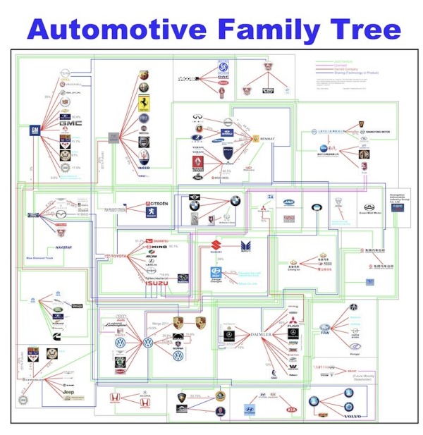
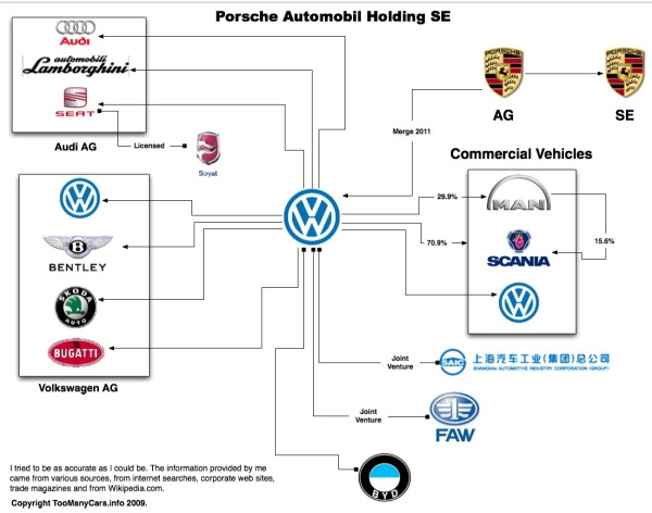
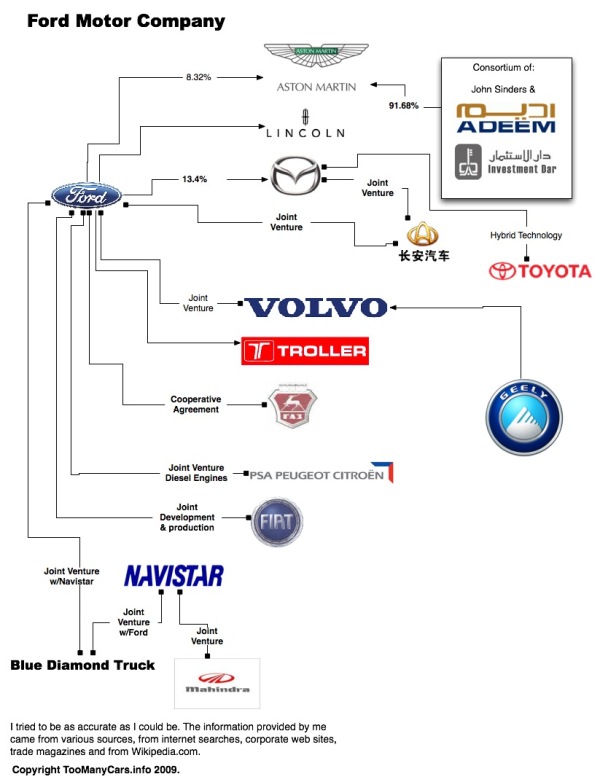
Andy Harris from TooManyCars.info has updated (a few times) his fantastic Automotive Family Tree map of who owns the car companies since the last time I posted about it a couple years ago.  The map is so big and detailed that you have to click on specific ownership corporations to zoom into just their connections.  The colored connection lines indicate the nature of each relationship (Joint Venture, License, Ownership or Sharing Technology).


You can enter to win a FREE copy of the printed poster by tweeting a link to this post on Twitter including the hashtag “#autotree” (without the quotes) by the end of the day on August 6th.  I’ve included the hashtag in the title, so you can enter by retweeting the post from my Twitter account.  One winner will be randomly chosen to receive a printed copy of the poster.  You have to be following me on Twitter so I can send you a direct message if you win.

The large version is available for a small donation to TooManyCars.info.  The PDF is available for $5, and the 36”x36” printed poster is available for $30.

Andy also agreed to answer a few interview questions about how he makes the Automotive Family Tree and it’s history.

Cool Infographics: What inspired you to create the Automotive Family Tree?

Andy Harris: About 8-10 years ago in a British auto magazine I saw a diagram showing the main connections between automotive manufactures (Ford owns Lincoln, GM owns Chevy, etc.). The more I thought about the diagram, the more info I wanted to know. I decided I want to learn HTML so I used the idea of the Automotive Family Tree as my learning curve.   


Cool Infographics: Do you do all of the design yourself?  What’s your background?

Andy Harris: I do all the design for the website and Automotive Family Tree myself. My day job is telecommunications engineering, however my background is in CAD. Bottom line, I draw maps showing where the telephone cable in the alley is located, type of cable, electronics, etc. I never really consider myself a design artist.   


Cool Infographics: What software applications do you use for the family tree?

Andy Harris: Because of my background in CAD, the large PDF is made using AutoCAD. But the smaller diagram for the website is done in OmniGraffle. So, my MacBook Air gets a work out switching between XP to use AutoCAD and OS X to use OmniGraffle.


Cool Infographics: How much traffic does having the infographic drive to your site, TooManyCars.info?

Andy Harris: When I first started my website, it was about car reviews. Then I switched to blogging a few years back. But the heart of my website has always been the Automotive Family Tree. This infographic is a major reason someone comes to my blog.


Cool Infographics: Are there any interesting places you know the poster is being displayed?

Andy Harris: The most interesting printed posted I sold to was someone in Russia and Turkey. My download PDF has also been sold around the world. But the most interesting request for the Automotive Family Tree was used in a Master Thesis from a student in Poland. However, one thing I’m proud of is being published in GQ magazine from Taiwan. The automotive industry is truly international!


Cool Infographics: What are some of the most surprising or interesting company relationships you’ve found by doing the family tree?

Andy Harris: I think the most surprising relationship in the family tree is the amount of change. There are joint-ventures everywhere because of the economy, and more and more sharing of technology between manufactures, making some strange bed-fellows. I’d say the new Renault-Mercedes-Benz connection is the most surprising.


Cool Infographics: How difficult is it to gather the company relationship data?

Andy Harris: I get this question many times, how long did it take you to make this? I really don’t like to think about it, but if I had to guess, 120 + hours in just gathering information, reconfirming, gathering more information, more confirmation and still gathering more information. I’ve recreated it two times. My first example was more simple and just using the major automotive manufactures from USA, Euro and Asia. Then as China grew, I added more automotive logos, more gathering of information and reconfirming. I’m not sure if it was difficult as much as time consuming. But putting this together became a labor of love.


Cool Infographics: What are the printing specs for the poster and why?

Andy Harris: I currently print at 36”x36”, I started as D-size or 24”x36”. As it grew 36”x36” was the most logical choice and the square print looks nice.


Cool Infographics: What’s the most interesting part of designing the Automotive Family Tree?

Andy Harris: I think one of the most interesting parts about the Automotive Family Tree, is the different types of people wanting to download the PDF. I’ve got request from a F1 engineering group, NUMMI manufacture marketing (before they closed), trading companies, automotive equipment manufacturers and oil companies. But not the petrol makers, think more like lubrications for engines and lubricants for manufacturing equipment. When I started this journey, I only wanted to inform the public that the automotive world is truly international, and now I get emails asking me to add more specialty manufacturers or even make custom inforgraphics.

Great job Andy!