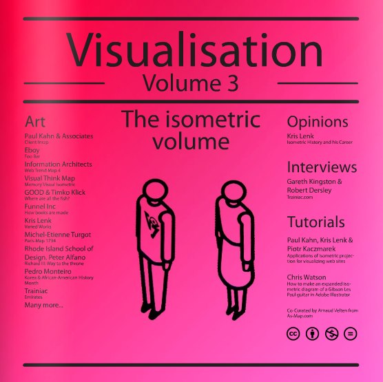
Chris was very gracious, and has also agreed to answer a number of interview questions about his work and publishing Visualisation Magazine:
Cool Infographics: How often do you publish the volumes of Visualisation Magazine, and how many in the future do you already have the topic planned?
Chris Watson: I’d like the volumes to be more regular in their publication, and hopefully more consistent, but I got delayed with this one as I had other things taking my time. Greg Smith at serialconsign.com said to me in an email ”Nothing is ever definite (datewise) when it comes to publishing, web or otherwise”.
Yes, I have some future volumes planned. The next issue was going to be a collaboration with Wes Grubbs at Pitch Interactive, but recently he has had to concentrate on work recently. We still have a potential list of contributors and work lined up to contact, including Greg for: Volume 5 | Large Data Visualisation: Form and Process
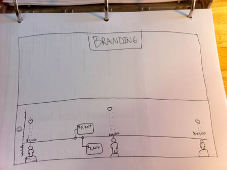
So, due to the delay, and wanting to keep it moving along, Logan Holmes, a colleague of mine, at the same college where I teach and just as passionate an admirer of infographics, suggested we do a volume on the less clinical, beautiful, finished, polished examples of data vis/infographics. Therefore, we thought let’s show the handmade, in-progress examples with less formal styles. They might be just humorous, making good observations of life, or challenging our visual thinking. http://visualisationmagazine.com/volume4_handmade.htm
The list is still being compiled and as yet no one is confirmed, but hopefully we can get permission for most of what we have seen.
Cool Infographics: How long does it take to put together an issue of Visualisation Magazine like The Isometric Volume?
Chris Watson: It probably takes 2 weeks to put together when you have all the content. Allowing time to not see it for about a week and then come back to it so you can see your typo’s and be more judgemental as to its overall look, order etc.
But as I do it as a ‘hobby’, meaning to say it doesn’t pay me like my teaching job does. I have to balance how many evenings I spend compiling, sourcing high-resolution files, rendering to the right file format for printers, etc. with how much time I spend with my partner. Overall, it ends up taking about 2 months, 10-12 weeks.
Cool Infographics: What are your thoughts behind selling the printed version, but making a complete online version available for free?
Chris Watson: It’s intriguing you ask that. My initial motivation to make the magazine was that I wanted a publication that was just on infographics and data vis because it is such a growing field with so many being produced. There are written journals such as IEEE with their vis week and there are conferences such as VizThink, but where is the style side?
You have one for typography – Eye, graphic design/advertising – Creative Review, illustration – Computer Arts and then their sister publication – Computer Arts Projects that varied their specialised content.
I would have loved to have printed it from the start, but just assumed you’d have to buy a bulk amount of copies. I thought I’d see if it got a following and then one day ask if they would buy, or invest in printing. Then, after circles with Pedro’s help we got lots of positive praise with thanks to you Randy for helping raise awareness on blogs. Many of them asked ‘is there any chance of getting it printed?’.
One of them pointed out that there was a Print-on-demand service called Magcloud in the US through LinkedIn. Shame they didn’t ship over the pond (back then, I haven’t checked since). Anyhow researched about print-on-demand, and developed a visual comparison here http://visualisationmagazine.com/blogvisualthinkmap/2009/10/self-publishing-visualisation.html
So I could make it available to print through Create Space and cost me a proof copy, not a bulk batch that I had to try and sell and hope there was a demand for it.
I left it free to view online because it was my original intention. It’s just great to see the work in print. I think Nathan at flowingdata.com about the same time started a print facility of just the posters, as apposed to a bound book.
I’d like a publisher to get behind it, market it, and print it bigger, as probably does anyone ;o).
Cool Infographics: What tools do you use to design and layout a volume.
Chris Watson: I use Adobe InDesign, Pedro was familiar with InDesign and I had trained with InDesign at college and being Adobe, the interface is familiar to Illustrator and Photoshop. I did the 1st volume/version on Adobe InDesign 2.0 and it has improved a lot to the CS4 version that it is rendered through now.
Photoshop renders the pictures and Create Space desires you to render your cover (front and back glossy outer cover) through it. Their template for trim sizes is in .psd format.
The style of the layout and design was influenced by NeueGrafik and the swiss/basel school of design with J M Brockmann etc. that both Pedro and I loved. Clean white space and Helvetica font to not interfere with the infographics/data vis work.

Cool Infographics: How receptive were the different designers to being included and giving you the information you needed?
Chris Watson: Oh, they are the reason it works. If they didn’t get back to me, I’d have no content. I don’t just want to feature them without permission and many instances I’d like higher resolution files for good quality prints. So huge thanks to everyone who contributes and responds back to my emails.
They are all generally very happy to feature their work. I don’t share their high res files with anyone other than the printers in a PDF, and you get some that go to above and beyond what I’d asked for to give me more content.
For instance, Arnaud from as-map.com on the last issue said, you should look and feature Paul Kahn’s work. Paul shared the passion for the magazine and sent me examples of his work (…& Associates), and a few images from a journal article that had been published. Then he mentioned I should look at Kris Lenk and speak to him about his work, as they both had created dynamic diagrams.
I contacted Kris and he sent me an article, images, work from his students at Rhode Island school of design. Same with Gareth at Trainiac. He sent me loads, chased down copyrights, answered an interview sharing great insights and got Rob, a designer/colleague to answer them as well.
So they are all very generous with their time, and work, which I’m very thankful for and I guess it gives them and their business/work further exposure, kudos.
Many of them only ask that I clearly point out the owners/authors, offset one or two images not to show the entire image of their work because they also sell it commercially. Some ask if I can send them a printed copy, which I’m trying to do with the slight amount of profit it makes. Needs to sell more to be able to order copies to be sent to people, as I don’t have any capital, just an abundance of time, enthusiasm and effort.
Cool Infographics: Was it difficult to coordinate the different Copyright and Creative Commons issues?
Chris Watson: Yes, to an extent. I recently got a template for a printed written agreement form to send to people to try and safeguard against legal action and I hope it never arises. I wouldn’t share or feature it without an email saying ‘yes ok’. The Circles and this Isometrics volumes were just people saying ‘yes, sure’.
To enable the online smooth nature of communication between me and the contributors, I found a fax to email site that people send to. I get it as a PDF file so they could sign. The agreement slows the process down, and people worry about what they are signing. So still not sure if I will use it, I have an email with them saying ‘yes use it’.
Not sure I have seen any instances of how the creative commons has stood up in court. Not with sites like Flickr.com and Behance.net integrating it to license their work with a ‘I trust it if they do’ sort of attitude. They are good because I want to share it, non-commercial, attributed to the author.

Cool Infographics: Where do you have them printed, what are the printing specs and why?
Chris Watson: After comparing in the link from question 5, I use Create Space, setup by Amazon. Let everyone anywhere order a copy.
They have, like many of the others, preset sizes, and I assume they have costed it that way. But I wanted the square format; I liked the other magazines previously mentioned such as Computer Arts Project and Creative Review. It’s sort of balanced and proportioned, much in the vein of NeueGrafik and a slightly cheaper end price for the buyer compared to A4 (less paper, less ink used I guess).
This square was 8.25 x 8.25 in their presets so had to tweak slightly to what I had original made for online. I think I did 10 x 10 (inch). It took a bit of farcing trying to interpret their specs for dimensions with margins and bleed areas. Maybe it’s just me, but I eventually realised where they wanted the margins and bleed space and thankfully it didn’t make it smaller by too much. I have a template now, so didn’t take as long for the Isometric Volume. I sacrificed a little of the white page space from around the designs, the edge of the page to the edge of a box, bold line/title. But overall, I was extremely pleased with the binding, cutting and colours printed (I struggled mind you with dense black areas such as Web Trend Map or the Oscars visual by Wes, It was hard to see the colour details).
Cool Infographics: How has the Issuu service to publish online worked for you?
Chris Watson: I liked it. I need to figure out how to get the Flash used by Issuu.com to display on an iPad and smart phones. I think you can wrap it in HTML5 in some way. I’ve seen a nice infographic I tumbled and need to investigate further.
You can get an app for Google Android to view publications as opposed to directly on my site, and I think they are making one for iPhone.
It’s good because I could customise it to remove certain functions from the interface such as downloading the PDF, embedding the whole document at their own site rather them view it at my site and hopefully subscribe to the mailing list to see future/previous issues.
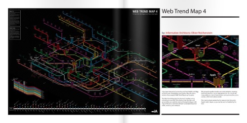
It has this nice zoom capability, which at the beginning was good. I’d like you to be able to zoom into visualisations that were really large and detailed such as the Web Trend Map and density designs work. It also let people share it through the Sharethis service or email to try to get the web 2.0 going and raise awareness of the publication.
Cool Infographics: What’s your favorite Isometric visualization?
Chris Watson: *smile* I’m not sure, its partly the reason I put them in a mag. There are various aspects of all the different ones featured.
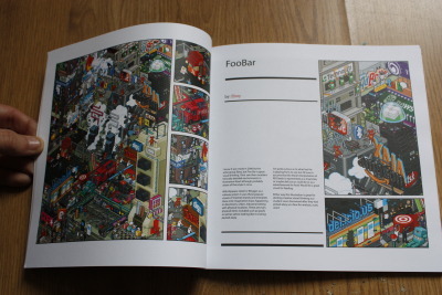
For instance I love the abstract creative nature of Eboy. It’s a very graphic design (I trained and teach graphic design). They might not communicate specific info with a clear message or comparison like an infographic, but I love the visualisation of the websites into abstract non-physical (i.e. the world wide web/digital) space. Like the Web Trend Map, it takes the Internet from a conceptual space to an impression of absolute almost physical space.
The width dimension with the stacks for stability in the Web Trend Map is so good.
Love the idea of files been given a space in the same way like with Paul Kahn’s work, that you can navigate and see them as a whole in your computer (…for them a website).
Love the physical space being depicted in a flow of processes with Funnel, Inc., and the complexity that Trainiac depicts and abstracts different departments in a business. The bold colors in a line graph with GOOD, inc. and Timko & Klick; very unique.
Arnuad’s CV style is brilliant too. With the color-coding of how the skills have built up to be him as they stack in the middle.
Bit of an evasion to the question, but I do love these different successes.
Cool Infographics: What can we expect from Chris Watson and VisualThinkMap in the future?
Chris Watson: Hmm… Busy, I might be sad but I keep trying to challenge how I visualise data, or visualise things that I think would greatly benefit. It’s strange but for a designer they are always striving to create new forms/reinvent old forms, create the new. It’s what drives me, so I try to make new forms, not just stylistically but that have function too.
I did a wayfinding project for a library at a college. Ultimately, they didn’t use it as I designed. I didn’t really get asked to; I just wanted to make it better and spent longer than expected to make the design work for the place. It didn’t sit well with me as planned to let them use it for free. I offered it to them really cheap but they didn’t want to pay. It’s a shame, but you can’t blame them. Will post the look of that soon with some of the thinking behind the project.
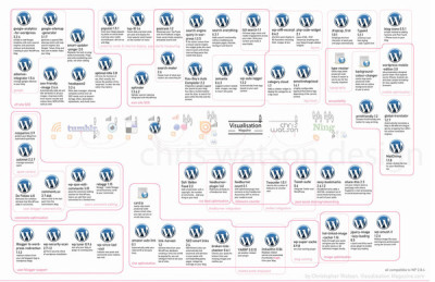
I have recently completed this project that I need to get round to posting and telling the Wordpress community. I want to see if they will use it, or consider it.
http://www.behance.net/gallery/My-Wordpress-Web-2_0/513412

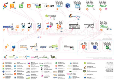
I revamped the My Web 2.0 graphic as I have come across new services that I use since its inception.
http://www.behance.net/gallery/My-Web-2_0/379498

Working on the next issue with Logan Holmes of Visualisation Mag – Handmade/Informal – Volume 4
I am collaborating with Logan on visualising poetry/creative writing with illustration/drawing and plan to make it into a bound book differently than that through Create Space.
Logan, myself and another colleague (photographer) are planning projects that do blow our mind and hopefully are realised in the future.


 Randy
Randy