About
Randy Krum
President of InfoNewt.
Data Visualization and Infographic Design

Infographic Design

Infographics Design | Presentations
Consulting | Data Visualizations

DFW DataViz Meetup

Join the DFW Data Visualization and Infographics Meetup Group if you're in the Dallas/Fort Worth area!

Search the Cool Infographics site

Custom Search

Subscriptions:


Feedburner

The Cool Infographics® Gallery:

How to add the
Cool Infographics button to your:

Cool Infographics iOS icon

- iPhone
- iPad
- iPod Touch


Read on Flipboard for iPad and iPhone

Featured in the Tech & Science category

Flipboard icon

Twitter Feed
From the Bookstore

Caffeine Poster

The Caffeine Poster infographic

Entries in book (36)

Friday
Feb052016

January Roundup of DataViz News

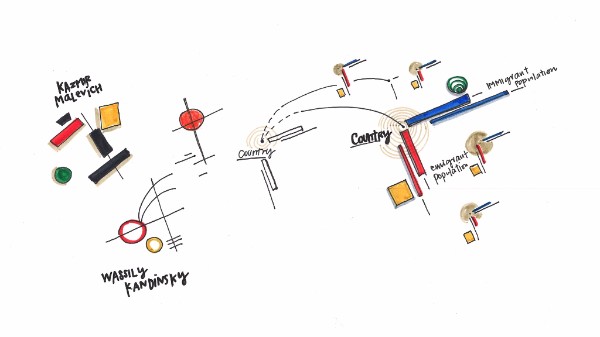
I sent this out to the Cool Infographics Mailing list previously, but I wanted to share on the blog as well. This will be a regular feature sent out to email subscribers, but I haven't decided if I will always post these on the blog as well. Thoughts?

If you're not a subscriber, you can join the email list HERE. I try to send only a few emails per month, and load with them valuable information on dataviz news, design tools, tips, upcoming dataviz events, giveaways, discounts, discussions and other valuable links.

Please tweet links to any DataViz news that should be included in future emails to @rtkrum


Roundup of DataViz Insights, Tools, Tips and News


  • Can a love of abstract art and infographic design be combined? They have more in common than we originally thought! This article by Giorgia Lupi delves into how this type of infographic was applied in explaining the "global brain drain."
  • A woman of many talents, Dona Wong, author of Wall Street Journal Guide to Information Graphics, tells all when it comes to creating infographics that have a purpose. With infographics, data needs to be more than just design. It should provide real insight into the findings, that are easily digestible for its viewers. Read more here if you’d like to apply her wisdom to the marketing world. She will also be speaking at the AMA Analytics with Purpose Conference next week. 
  • The New York Times has announced that Amanda Cox has been named has been named editor of The Upshot
  • Visually has now been acquired by Scribble Live, a leading content marketing platform, in the hopes of uniting data and creativity to reach target audiences more effectively.


Visme Graphic Design Mistakes By Non-Designers


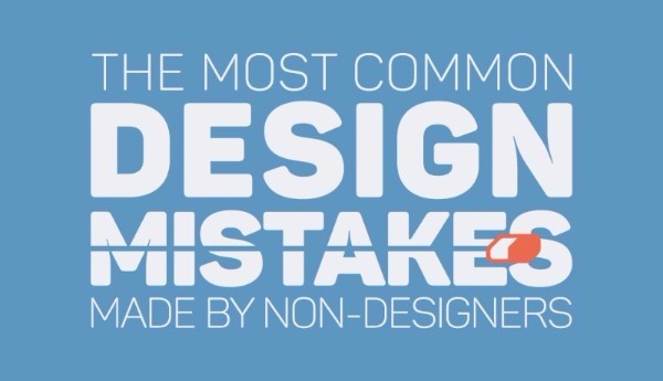
  • Don’t be making these design mistakes! If you’re a designer, or if you’re just getting your foot in the door, use tips from Visme to ensure that each design you make is a hit. Use discount code COOL30 for a lifetime discount 30% off your subscription.
  • Are you a Prezi user? If so, they’ve updated a new feature to create charts using your data. Check out their tutorial.
  • Your business can benefit from telling stories by visualizing data. Data Storytelling: Big Data's Next Frontier from James Kerr on Inc. provided 5 Tips to establish a necessary data storytelling environment for your business. 
  • IBM's free online dataviz site, manyeyes, was shuttered on Dec 31st, and the visualization tools are being rolled into IBM Watson Analytics over time. To learn more about what they’re offering see, click here.
  • KANTAR and Information Is Beautiful have announced the 2015 Information is Beautiful award winners! Check out the whole gallery.
  • Malofiej 24: Infographic World Summit registration is now open, with an impressive lineup of speakers coming March 6-11 in Pamplona, Spain.
  • The O'Reilly Strata+Hadoop World Conference will be taking place from March 29-31 in San Jose, CA. Use code AFF20 for 20% off tickets you can purchase here.
  •  has opened for the OpenVis Conference in April, which will be held in Boston. 
  • If you're in San Francisco, there will be a public workshop detailing storytelling using data with Cole Knaflic on February 8th.
  • A FREE one-day event in Miami, FL will be held on February 20 in celebration of World Information Architecture Day.
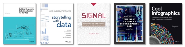
 

New DataViz Books:

Building Responsive Data Visualization for the Webby Bill Hinderman


Storytelling with Data: A Data Visualization Guide for Business Professionalsby Cole Nussbaumer Knaflic


Monday
Jan252016

Building Responsive Data Visualization for the Web

Building Responsive Data Visualization for the Web book cover

Building Responsive Data Visualization for the Web by Bill Hinderman is a new book that just came out in November. I had the pleasure of helping Bill as the Technical Editor on the book last year, and I can say it's a fantastic guide to structuring your data and building your code for interactive data visualizations that work perfectly on every screen size.

January Giveaway! This month I am giving away one signed copy to a randomly chosen winner. Register on the GIVEAWAYS page by 11:59pm CT on January 31, 2016 to be entered. A winner will be randomly selected on February 1st.

Data is growing exponentially, and the need to visualize it in any context has become crucial. Traditional visualizations allow important data to become lost when viewed on a small screen, and the web traffic speaks for itself – viewers repeatedly demonstrate their preference for responsive design. If you're ready to create more accessible, take-anywhere visualizations, Building Responsive Data Visualization for the Web is your tailor-made solution.

Building Responsive Data Visualization for the Web is a handbook for any front-end development team needing a framework for integrating responsive web design into the current workflow. Written by a leading industry expert and design lead at Starbase Go, this book provides a wealth of information and practical guidance from the perspective of a real-world designer. You'll walk through the process of building data visualizations responsively as you learn best practices that build upon responsive web design principles, and get the hands-on practice you need with exercises, examples, and source code provided in every chapter. These strategies are designed to be implemented by teams large and small, with varying skill sets, so you can apply these concepts and skills to your project right away.

Responsive web design is the practice of building a website to suit base browser capability, then adding features that enhance the experience based on the user's device's capabilities. Applying these ideas to data produces visualizations that always look as if they were designed specifically for the device through which they are viewed. This book shows you how to incorporate these principles into your current practices, with highly practical hands-on training.

  • Examine the hard data surrounding responsive design
  • Master best practices with hands-on exercises
  • Learn data-based document manipulation using D3.js
  • Adapt your current strategies to responsive workflows


I asked Bill to answer a few questions about his book:

Who is the book intended for?

The book is for a development and design team that is looking to shift toward responsive, mobile-first practices.  While it's certainly geared most toward data visualization projects, the book spends a hefty amount of time building responsive design tenets before then getting specifically into visualization.


What’s the most important thing to make a great data visualization?

In my mind, the most important thing in making a great data visualization is the output being actionable.  The goal of a visualization is always to make something more clear, right?  All of the data is already...there, in its raw form.  So the initial goal, the more achievable goal, is clarity. But making something clear, and then also making it actionable - that is - pushing the reader/viewer/user toward actually doing something with the data, is where greatness shows up.


Do you see everyone moving towards responsive data visualization, or are a lot of companies holding back?

No, I actually don't.  I see a huge amount of people holding back, really with the same reasoning that plagued responsive design in its early stages.  That being: "People don't want to do that on mobile."  Which is, quite frankly, ridiculous.  Every study Pew has put out (I reference plenty of them in the book) shows that as soon as someone is given the opportunity to do something on mobile, they do it.  Moreover, there's an increasing amount of mobile-only users, rather than simply mobile-first.  Very soon, desktop users are going to be seen as an antiquated, legacy type of use case, rather than the default.


What's the difference between Responsive Data Visualization and Responsible Data Visualization?

Responsive data visualization is the practice of building data visualizations in such a way that they adapt, respond to, and feel natural regardless of whatever device type a user is accessing them with, and whatever the data set looks like.  In this way, it is the responsible way to visualize data.  So...there isn't one, I suppose.


What do you mean in the book by “Think Small”?

So a concept that's very closely tied to responsive design is thinking mobile-first.  That is: designing first for your most limited use case: a small screen, a bad network, sloppy, finger-based gestures.  In data visualization, we actually have an even more limited use case: no screen at all.  That's where building a good API comes into play.  Thinking of the smallest, most limited use case, say, an external call to your API from a different website, and building toward that first.  That way, as you gain real estate, features, bandwidth, you are simply enhancing something that already has a great foundation.


What are your thoughts on D3.js and its future?

It's the best, and I love it and if I could, I would shower it with chocolates.  D3.js is, if you're able to devote a development resource to learning it, the absolute best way to create a visualization on the web, because it uses all the languages of the web.  Because it isn't some applet, or some plugin, or some...image, I suppose, it just works intuitively like you are building normally for the web.  Because of this, I think the future is bright.  Even if it were never to be updated again (which isn't the case), it would still implicitly grow in functionality as web languages evolve and grow around it.


What’s available for readers on the book website: http://responsivedatavisualization.com/?

The website has snippets from every chapter of the book, along with exercises and code samples that go along with the practice sections in the chapters.  All of the code links to GitHub, and can be forked, built locally, and compared with solutions.


Are you speaking at any upcoming presentations or webinars?

I am!  I'll be speaking at Strata + Hadoop World San Jose in March (http://conferences.oreilly.com/strata/hadoop-big-data-ca).


Where’s the best place to follow you online?

The best places to follow me online are my own website (billhinderman.com), LinkedIn (linkedin.com/in/williamHinderman), or Twitter (twitter.com/billHinderman).


Monday
Dec142015

DataViz Gift Guide 2015

Some of the best DataViz themed gifts for the holiday season, with some great deals and discounts as well.

BOOKS

DataViz Gift Guide 2015 Books


POSTERS

DataViz Gift Guide 2015 Posters

  • Timeplots.com - 20% OFF all infographic posters, Discount Code “coolinfo”
  • HistoryShots - Check out PopWaves, the updated History of Pop/Rock Music poster!
  • Pop Chart Lab - Running a 12-Days of Christmas sale in December


TOOLS

DataViz Gift Guide 2015 Tools

  • Visme.co - Free trial, 40% OFF first payment (monthly or yearly subscription), Discount Code “COOL40”
  • The Noun Project - Free with attribution or $9.99/month unlimited. Creating, Sharing and Celebrating the World’s Visual Language
  • IBM Watson Analytics - Free & Paid editions. Predictive analytics and data visualization. Analyze your data in minutes on your own without downloading software.


TRAINING

DataViz Gift Guide 2015 Training


CONFERENCES

DataViz Gift Guide 2015 Conferences

What else would you add to your DataViz wish list?

Tuesday
Oct132015

The Future, as Foretold in the Past

The Future, as Foretold in the Past infographic

The Future, as Foretold in the Past is a timeline of future events based on the stories of famous works of fiction. The article that released the infographic was from Brain Pickings; however, the creation story of the graphic is an interesting one. Giorgia Lupi saw the information just on a normal timeline on The Awl and turned it into what you see above.

There is a lot of information on the infographic, the legend above helps explain how it is organized.

Giorgia Lupi explains:

The visualization is built on a main horizontal axis depicting a distorted time-line of events (in fact we put them regularly, in sequence), starting our future-timeline in 2012. The y-axis is dedicated to the year the novel / book foretelling the event was published.

On the lower half of the visualization you can find the original quotes (shortened)

We then wanted to add further layers of analysis to our piece:

– finding out main typologies of foretold events (are they mainly social, scientific, technological, political?)
– discovering and depicting the genre of the book,
– and most of all, dividing them into positive, neutral or negative events.

Finally, good news, in 802,701 the world will still exist!


Thanks to Mike for sharing on Facebook: https://www.facebook.com/mikewirth/posts/10153557417821133

Tuesday
Jan202015

The Key to Infographic Marketing: The Psychology of the Picture Superiority Effect

In Ancient times, Cicero considered memory training to not just be a method, but a form of art. He felt strongly that training your memory was one of the most valuable things you could do to improve your capabilities as a speaker, and a citizen.  Even in ancient times, Cicero knew that remembering images was superior to remembering text alone.

People remember pictures better than words, especially over longer periods of time. This phenomenon as we know it today, is called the Picture Superiority Effect*. It refers to the notion that concepts that are learned by viewing pictures are more easily and frequently recalled than are concepts that are learned by reading their written word form counterparts.

What had been known to the Ancients throughout the centuries, has been quantified scientifically in our modern times. In my book, I included this quote from John Medina’s Brain Rules, to help explain the value of the Picture Superiority Effect. However, to make it visual I created this simple data visualization to help readers remember the power of visual information.

“Based on research into the Picture Superiority Effect, when we read text alone, we are likely to remember only 10 percent of the information 3 days later. If that information is presented to us as text combined with a relevant image, we are likely to remember 65 percent of the information 3 days later.” - John Medina, Brain Rules, 2008

Cool Infographics Picture Superiority Effect

via: coolinfographics.com/book

Advertisers have known this for years. Whether it’s been a simple application like the Yellow Pages (ads with pictures got more business) or giant billboards in New York’s Times Square. To see a real world example of how the Picture Superiority Effect works, check out this excellent coverage area map ad campaign from Verizon:

Verizon Coverage Map Infographic Ad

These maps show Verizon’s 4G LTE network coverage area, compared to the coverage area of their competitors. If you were only to get the text version, imagine how much of this paragraph explaining their coverage area you would remember 3 days after reading it:

“Among the four major wireless carriers, only Verizon’s 4G network is 100% 4G LTE the gold standard of wireless technology. Available in over 500 cities, Verizon 4G LTE covers almost 97% of the U.S. population. Experience the speed and power in more places.”

Now, take a look at the maps again. How much easier it is to see how the four major wireless carriers stack up against each other? It’s obvious Verizon covers the most area. Verizon takes it a step further, and has a link to a PDF highlighting their coverage in Alaska and an interactive map to view different parts of the country. All complete with map visualizations, of course.

However, there is another very important aspect of the Picture Superiority Effect that must be understood: It’s not just any image. It needs to be an image relevant to the content, which reinforces the message from your data. This works across all mediums of advertising, and of course, infographics.

In infographic design, the Picture Superiority Effect is extended to include charts, graphs, and data visualizations. Infographic designers use data visualizations and illustrations as the visual component of a design to trigger the Picture Superiority Effect, which can have incredible success getting the audience to remember the information presented.

Here is an great example from Dan Roam, author of the book, The Back of the Napkin, Solving Problems and Selling Ideas With Pictures, of how using images and text can help a designer understand which type of visualization is appropriate to use when communicating different types of information. Easy to understand, easy to remember.

Dan Roam Back of the Napkin <6><6> Rule

via: DanRoam.com

Infographics work so well because using text and images together helps people to retain the information. Remember, if it’s just words, people will only remember 10% of the information they read. But, if you combine the text with a relevant image, they are likely remember 65% of the information! While others may choose to work harder by crafting a perfectly written article or advertisement, it would be a smarter choice to use text and relevant images together.

Remember to “Make It Visual” if you want your audience to remember the information about your company’s products or services. You don’t have to be a professional designer either. You can make your content visual using a wide range of tools like the Adobe Creative Cloud suite, Microsoft PowerPoint, OmniGraffle, or online design tools like Visme.co or Tableau Public.


Sources:
*Nelson, D.L., Reed, U.S., & Walling, J.R. (1976). Pictorial superiority effect. Journal of Experimental Psychology: Human Learning & Memory, 2, 523-528.
Thursday
Aug142014

Coolness Graphed

Coolness Graphed


Coolness Graphed

Coolness Graphed.com has a collection of bar graphs that describes when certain actions are deemed “cool” or “uncool”. The three shown here are just a few examples from the website.

Coolness Graphed.com brings normal events together with a humorous flare by rating them in a “cool”/”uncool” bar graph. The bar graph works well with the events as a visual ranking system. No real values are needed.  Data visualization used brilliantly!  It only takes seconds for the audience to understand each one, and they are highly sharable in social media.

The site has been running for more than two years now, and keeps getting funnier!  Thanks to Jones for sending in the link!

Now also available in a book!

Wednesday
Aug132014

Shelf Help Best Business Books 

This infographic is an interactive navigation interface into the collection of the top 70 business books that Vikas Malhotra has read. His Shelf Help Best Business Books infographic posted on Media-Mosaic promises to get any reader on the high road of business mastery.

I have been a biblopath since college and being in business for 20+ years, have spent countless hours browsing business books in every bookstore that I could possibly locate. In those bookstores, reclining against a shelf, many a times I have been privy to animated discussions, over the business books that should be read. Executives and students, who wish to educate themselves are forever seeking and dispensing folk wisdom on books, its contents and their authors.

With this collection of 70 business books, spread across 14 categories, I have tried to cover the full spectrum of business knowledge that one needs. These books will immediately put anyone who invests time in pursuing them on the high road of business mastery. The best way of using this collection is to start with an area that interests you or in an domain where you are facing an immediate challenge and then over time, populate your overall conceptual library.

Also as far as I know, visually this is one of a kind, Business “Shelf Help” Collection.

In case you have any suggestions or ideas to make it better or if you think I have left out any major business publication please do let me know in the comments section below and I will be happy to consider those for inclusion.

I am seeing more infographics and data visualization used as navigation tools on websites.  In this case, each book cover image appears as you hover over the book on the shelf.  I would recommend adding a clickable feature so the audience can click on any book, and be taken to that book on Amazon.

As a side note, how many of these have you read?  I've only read 9 of the books that Vikas included in his collection.

Thanks to Media-Mosaic for sending in the link!

Wednesday
Jun252014

Who's Stealing eBooks?

Who's Stealing eBooks? infographic

Who’s Stealing eBooks? infographic from Who is Hosting This? looks at some of the data and opinions from experts about ebook piracy.  

Production and sales of eBooks increased rapidly in the last decade. Indie authors may have led the way, but bestsellers (and their publishers) soon joined the eBook revolution. Publishers begot lawyers;  copyrights, DRM, and royalties soon followed.

Who’s stealing eBooks, and who is paying?

What’s the future for digital rights management, and how does this affect publishers and authors? Our research into eBook piracy found some interesting statistics illustrated in the graphic.

With the release of the Cool Infographics book, I now have a personal reason to take this topic much more seriously.  As an author, of course I want as many readers as possible to be exposed to the book, but I also invested over a thousand hours writing the book and had to pass up paying design projects to get it done.

Saturday
Nov302013

Cool Infographics 30% Off at Amazon This Weekend ONLY!

Cool Infographics 30% Off at Amazon This Weekend ONLY!

This weekend ONLY, Amazon is offering 30% Off any one print book, and you can use this deal to get Cool Infographics at the lowest price yet!  The deal ends December 1st at 11:59pm PST.  Use the promo code “BOOKDEAL“ at checkout under the “Gift cards & promotional codes” section.

You can read the details and Terms & Conditions here.

When I looked on Saturday, Amazon’s retail price was listed at $25.08 (it changes daily), and with this discount you could get Cool Infographics for only $17.56.  That’s the lowest price I’ve seen anywhere!

Thursday
Nov212013

Finding Waldo by Visualizing Patterns

Where's Waldo BooksGraphic by Slate. Illustration by Martin Handford published by Candlewick Press.

Here’s Waldo is a great analysis and article by Ben Blatt on Slate.com about trying to determine a strategy for finding Waldo by visualizing patterns from the Where’s Waldo series of books.

In Chapter 1: The Science of Infographics of my new book, Cool Infographics, I cover that our ability to see patterns is a huge factor in why data visualizations and infographics are so effective.  Humans can see patterns and recognize differences where computers can’t.  You can read about this topic and more in the Free Sample Chapter available for download.

Illustrator Martin Handford published the first in his beloved series of Where’s Waldo books over 25 years ago.* The books challenge readers to find the titular cartoon man, clad in his trusty red-striped shirt and red-striped hat, as he hides in a landscape of red-striped red herrings. When attempting to find Waldo you can scan the page completely from top to bottom, or you can focus your search around certain landmarks where Waldo seems likely to be hiding (in a castle’s moat, riding a blimp). Neither approach is particularly efficient. Which got me to wondering: What if there’s a better way?

I sought to answer these questions the way any mathematician who has no qualms about appearing ridiculous in public would: I sat in a Barnes & Noble for three hours flipping through all seven Where’s Waldo books with a tape measure.

The map born of my experiment is below.

Mapping Waldo Locations

It may not be immediately clear from looking at this map, but my hunch that there’s a better way to hunt was right. There isn’t one corner of the page where Waldo is always hiding; readers would have already noticed if his patterns were so obvious. What we do see, as highlighted in the map below, is that 53 percent of the time Waldo is hiding within one of two 1.5-inch tall bands, one starting three inches from the bottom of the page and another one starting seven inches from the bottom, stretching across the spread.

Finding Waldo Patterns

Check out the complete story on Slate.com

Found thanks to a post by Mike Elgan on Google+!