About
Randy Krum
President of InfoNewt.
Data Visualization and Infographic Design

Infographic Design

Infographics Design | Presentations
Consulting | Data Visualizations

DFW DataViz Meetup

Join the DFW Data Visualization and Infographics Meetup Group if you're in the Dallas/Fort Worth area!

Search the Cool Infographics site

Custom Search

Subscriptions:


Feedburner

The Cool Infographics® Gallery:

How to add the
Cool Infographics button to your:

Cool Infographics iOS icon

- iPhone
- iPad
- iPod Touch


Read on Flipboard for iPad and iPhone

Featured in the Tech & Science category

Flipboard icon

Twitter Feed
From the Bookstore

Caffeine Poster

The Caffeine Poster infographic

Entries in design (479)

Friday
Jan162009

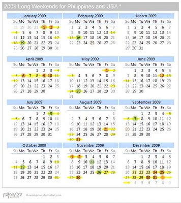
Long Weekends Calendar


The Long Weekends Calendar was created by thenonhacker (Alwyn Balingit) and posted on DeviantArt.com.  By plotting the holidays in both the U.S. and the Philippines, he has mapped out all the long weekends that need to be considered when creating project timelines involving people in both countries.

It's also good to plan vacation time...

Great job Alwyn!

Wednesday
Jan072009

The Evolution of Game Controllers


Damien Lopez has hade two great images showing the evolution of game controller design over the last few decades.  He also created another one showing the evolution of portable game systems.  This was supposedly the link to Damien's page, but its not working for me.

Thanks Dรกniel for sending in the link.

Saturday
Jan032009

Exploded iPhone T-Shirt


I just caught this over on Daring Fireball.  You can buy this t-shirt at www.explodedphone.com or you can see many more versions on CafePress.

Friday
Dec262008

Anamorphic Parking Garage Signage


These are images from the Eureka Tower in Melbourne, Australia.  Emery Studio (look at the "Placemaking" link) had the opportunity to use both the horizontal and vertical surfaces to design some anamorphic signage in the parking deck.  When viewed from the correct direction as you're driving, the words appear legible and lead you in the correct direction.  Viewed from another angle, the words appear as abstract lines and colors.


Thanks Ethyl for sending the link on Twitter!  Images are from the Kosmograd blog.

Monday
Dec152008

Ben Fry's Zipcode Project


Ben Fry is the author of Visualizing Data, and describes the ZipCode project in his book.  Each dot on the map is one zip code, and as you type a zip code, it highlights all of the dots that share that portion of the zip code.  You can turn on the "zoom" feature that zooms farther into the map for each digit you add.

This is built with the open source Processing tool that was recently released to the world as version 1.0.

Here are all of the zip codes that start with "6"


Thanks Steve for sending the link!

Here's a link to Ben's book on Amazon:

Thursday
Dec112008

The AI Landscape


From the Association of the Advancement of Artificial Intelligence (AAAI), a cool poster image designed by Giacomo Marchesi that lays out the different areas of AI development.

Thanks Zach!  Also can be found on digg.com

Tuesday
Dec022008

The Three Laws of Great Graphs

Back in July, Seth Godin posted his"three laws of great graphs" for PowerPoint presentations.  I may not agree with Seth's laws, but I thought it worth sharing for discussion.

1. One Story: While I don't agree for all infographics, I do agree with this specifically for giving PowerPoint presentation.  Steve Jobs is a master at this, or the master is whoever makes his keynote presentations.

2. No Bar Charts: I don't disagree that there are some horrible bar charts out there, but I don't think they should be eliminated altogether.  They have their place, and since they are the default chart in PowerPoint they often get used when another type of chart would be more appropriate.

3. Motion: I'll cautiously agree with this one.  Animation in PowerPoint is often distracting, but can be used as Seth describes.  Don't get caught up in slide transitions, but use animation to highlight the point you are trying to convey to your audience.

Monday
Dec012008

Voyager Infographic video


Voyager from Jaime Arvizu on Vimeo.

Jaime Arvizu, a student at the Vancouver Film School, sent me a link to this infographic video that he and his team mates (Tyler Lemermeyer and Leo Aguiar) created for their Motion Design class.  You can find a high resolution version at Jaime's blog.

Thanks for sending this in Jaime, I love it!

Wednesday
Nov262008

Welcome to the world baby...Processing


In my email yesterday I received a note announcing the release of Processing 1.0.  It's very exciting to see this project release to the world.  There have been many beta versions leading up to this release (162 versions in fact), but for those interested in creating your own infographics this is big news.  What is Processing, you ask?
Processing is an open source programming language and environment for people who want to program images, animation, and interactions. It is used by students, artists, designers, researchers, and hobbyists for learning, prototyping, and production. It is created to teach fundamentals of computer programming within a visual context and to serve as a software sketchbook and professional production tool. Processing is an alternative to proprietary software tools in the same domain.
Processing is free to download and available for GNU/Linux, Mac OS X, and Windows.
Some of the infographics I have highlighted here on Cool Infographics have been created with the earlier versions of Processing, and I'm hoping for more to come.

Wednesday
Nov192008

The history of olympic medals

 
Grace Lee is a Junior at Parsons, the New School for Design in New York City.  She went back and visually laid out all of the medals won be every country in every Olympics since Athens in 1896.  Across the bottom it also shows how many nations participated each year and how many athletes were involved.  This was a project in her Information Design class, and she did a fabulous job!
The games have always brought of this world together in peace, leaving behind any racial or cultural boundaries.  The Olympic games create a time when the world can be smaller and united as a human race, rather than separate nations.  With the summer games in Beijing, China, and the upcoming games in Vancouver, Canada, the Olympic games will continue to be a time of friendly competition.

Thanks Grace.  I love how this project turned out.

By popular request I have uploaded the full PDF version here.