About
Randy Krum
President of InfoNewt.
Data Visualization and Infographic Design

Infographic Design

Infographics Design | Presentations
Consulting | Data Visualizations

DFW DataViz Meetup

Join the DFW Data Visualization and Infographics Meetup Group if you're in the Dallas/Fort Worth area!

Search the Cool Infographics site

Custom Search

Subscriptions:


Feedburner

The Cool Infographics® Gallery:

How to add the
Cool Infographics button to your:

Cool Infographics iOS icon

- iPhone
- iPad
- iPod Touch


Read on Flipboard for iPad and iPhone

Featured in the Tech & Science category

Flipboard icon

Twitter Feed
From the Bookstore

Caffeine Poster

The Caffeine Poster infographic

Entries in food (83)

Monday
Aug102009

What is Your Wine Personality?


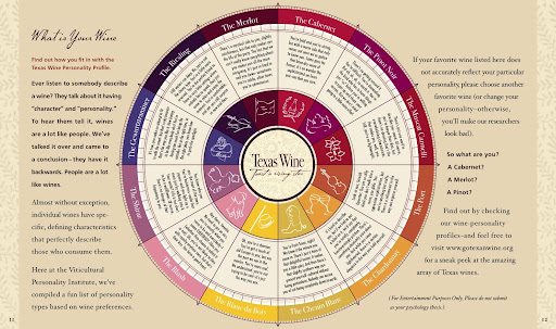
From the Texas Department of Agriculture at GoTexanWine.org, the Wine Personality Wheel comes from the Texas in a Bottle guide to Texas Wine (download as a pdf).  I love the sense of humor.
Ever listen to somebody describe a wine?  They talk about it having "character" and "personality."  To hear them tell it, wines are a lot like people.  We've talked it over and came to a conclusion - they have it backwards.  People are a lot like wines.
Here at the Viticultural Personality Institute, we've compiled a fun list of personality types based on wine preferences.
If your favorite wine listed here does not accurately reflect your particular personality, please choose another favorite wine (or change your personality - otherwise, you'll make our researchers look bad).

Looking around the GoTexanWine.org site, I also found a good, animated timeline (link) of the history of wine in Texas.


Eight federally approved Viticultural Areas currently exist in Texas. Eighty-five percent of wine from a Viticultural Area must be made from grapes grown within the area's boundaries. If the wine is a varietal, 75 percent of that wine must be made from the designated grape variety.

Thursday
Jul232009

Hellmann's - It's Time for Real [infographic video]

Thursday
Jun112009

Sugar Stacks: How Much Sugar is in your Food?


SugarStacks.com is a website dedicated to showing you how much sugar is in the food we eat.  Using a simple visual of stacked sugar cubes, you can see the sugar content of many different types of food.  I love that it's simple and visually gets one point across really well.  There are words on website, but you really don't need them.

We've used regular sugar cubes (4 grams of sugar each) to show how the sugars in your favorite foods literally stack up, gram for gram.  Compare foods, find out where sugar is hiding, and see how much of the sweet stuff you're really eating.


Found on Infosthetics.com, and as they note, the website doesn't differentiate between types of sugars, the white sugar cubes are used to represent them all.

Friday
May152009

Sushi Etiquette


This is from Food & Wine magazine (Sep 2005), and I’ve kept the hardcopy of this issue for the last four years because of this illustration.  I came across this magazine again today, so I thought I would share.  Apparently I eat sushi completely incorrectly, so I refer back occasionally to remind myself how to eat properly. (I love mixing the wasabi into my soy sauce!)


Here’s the link to the original “Sushi In America” feature from the magazine.  You can find these and many other illustrations from Peter Arkle on his website.


Mmmm, fatty tuna is one of the best!


Friday
Apr172009

Where's The Beer? (U.S. Breweries per Capita)


Found on SloshSpot.com, a U.S. map showing breweries per capita by state.  Drink up!

Friday
Jan302009

The Best Beer in America


Mike Wirth, The Beer Geek, created this map of award winning beers using 20 years of data of the Great American Beer Festival medal winners from 1987-2007. Originally created for the Lyke 2 Drink blog, it also shows the breweries with the most medals and the specific beers with the most awards.

Great work Mike!

UPDATE: Mike has put up an updated version of the Best Beer in America map.

Saturday
Nov012008

Wine Flavor Visualization

A great visualization by Carl Tashian on tashian.com that connects different wine types with the flavors and notes of each.
What is the relationship between wine varieties and flavor components? This visualization attempts to show the strength of these relationships. I culled descriptive flavor words from over 5,000 published wine tasting notes written between 1995-2000 in a major Australian wine magazine.
Via Information Aesthetics.

Thursday
Oct302008

The Future of Food


Wired magazine has a great series of nine infographics from the November issue about the world's food supply problems.
Forty years ago, advances in fertilizers and pesticides boosted crop yield and fed a growing planet. Today, demand for food fueled by rises in worldwide consumption of meat and protein is again outpacing farmers ability to keep up. It's time for the next Green Revolution.
Thanks for the link Ethel!  Here are a few more.  Check them all out on Wired.com.


Wednesday
Aug132008

BBC World Food Prices

The BBC online has a site dedicated to charting food prices around the world called : The cost of food: Facts and figures.  Mostly simple charts, but they've found a handful of really good information.  They could make these prettier, but they get the message across.  Each chart tells a simple story.

Thursday
Jun192008

Grocery Aisle Nutritional Values


Three different ways to view the grocery store from Wired Magazine Infoporn January 2008 (16.01) by Dan Marsiglio. Cost per Calorie, Calories by Weight and Sugar by Weight.

If you're trying to cut back on the sugar in your diet, stay away from the cereal aisle!