About
Randy Krum
President of InfoNewt.
Data Visualization and Infographic Design

Infographic Design

Infographics Design | Presentations
Consulting | Data Visualizations

DFW DataViz Meetup

Join the DFW Data Visualization and Infographics Meetup Group if you're in the Dallas/Fort Worth area!

Search the Cool Infographics site

Custom Search

Subscriptions:


Feedburner

The Cool Infographics® Gallery:

How to add the
Cool Infographics button to your:

Cool Infographics iOS icon

- iPhone
- iPad
- iPod Touch


Read on Flipboard for iPad and iPhone

Featured in the Tech & Science category

Flipboard icon

Twitter Feed
From the Bookstore

Caffeine Poster

The Caffeine Poster infographic

Entries in food (83)

Tuesday
Jun032008

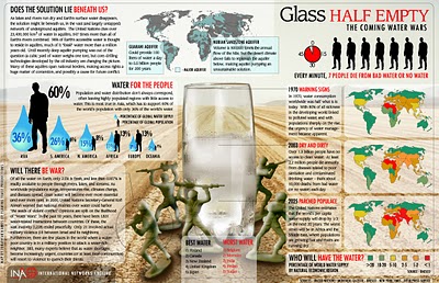
The Infographic that Saved a Million Lives


Great story from 37signals.com about a very simple infographic that motivated Bill and Melinda Gates to change the focus of their charity spending.

“No graphic in human history has saved so many lives in Africa and Asia,” says NY Times columnist Nicholas Kristof about an infographic in a ‘97 Times article that spurred Bill and Melinda Gates to take action on public health.

...But then bill confessed that actually it wasn’t the article itself that had grabbed him so much—it was the graphic. It was just a two column, inside graphic, very simple, listing third world health problems and how many people they kill. but he remembered it after all those years and said that it was the single thing that got him redirected toward public health.

Wednesday
Apr022008

Who Owns the Organic Food Companies?


Great chart by Phil Howard from Good Magazine showing which of the large food processing companies own some of the most popular organic food brands. Pepsi owns Naked Juice?

Found on digg.com after I heard about it on the diggnation podcast.

Sunday
Jan272008

The Marathon Meal


You have to walk 26.2 miles (a complete marathon!) to burn off the calories from a standard Thanksgiving meal, shown here broken down by each dish included. That extra piece of pumpkin pie is worth 5 miles!

This infographic is from Gary Newman Design, who does some fantastic work.

Tuesday
Jan222008

Nichloas Felton's 2007 Annual Report


Nicholas Felton has published his new 2007 Annual Report. I love the way he breaks down his own personal life into maps and charts. I had just posted about his 2006 Annual Report last month.

Wednesday
Dec262007

Nichloas Felton's Personal Annual Report

Nicholas Felton (www.feltron.com) has created his own personal 2006 Annual Report, looking back at his life during 2006 and using maps, charts, timelines and facts to visually track his activities. With pages dedicated to photos, travel, drinking, reading and food, he plots out his one-year history.

Friday
Dec072007

Cooking Infographics


Found on SimpleComplexity.net, Cookz (coo.kz) is a website under development that illustrates recipes with visual infographics. There is an example up now for chocolate chip cookies.

More details are found on flickr, under the user macro girl:

The visual equivalent of a thesis - work from my final semester in Visual Communications.

Friday
Sep282007

The Wine Advocate Vintage Guide


From eRobertParker.com, the online Wine Advocate Vintage Guide. Fascinating guide of wines from 1970-2005. Wines are grouped by region and year, and each group is scored and given a letter code to identify the current maturity status of those wines (like Ready to Drink, Too Old and Early Maturing). The color coding represents ranges of the numeric scores.

The guide is interactive, so clicking on any of the rating circles brings you to a list of the specific wines grouped together for that region. For the specific wines, you can see their individual name, score, maturity level and price range.

A PDF version of the guide is available here for download.

Monday
Aug132007

World Drinking Map


From drinkingmap.com, this map shows the legal drinking age by country. For the vast majority of the world 18 is the legal age. There are only a few countries like the U.S. that have a drinking age as high as 21.

Tuesday
Aug072007

World Fatness


Another good one from Wellington Grey. Obesity across the world shown visually. The size of the little person’s body represents the percentage of people in that country with a body-mass index over 30.

Wow…are we fat or what? Are you going to finish those fries?

Sunday
Aug052007

The Coming Water Wars


Another graphic from Jonathan Harris from his time at Princeton with the International Networks Archive. It's a couple years old, but absolutely still relevant. I believe this is from around 2003.

Added: Recently popular on Digg.com