About
Randy Krum
President of InfoNewt.
Data Visualization and Infographic Design

Infographic Design

Infographics Design | Presentations
Consulting | Data Visualizations

DFW DataViz Meetup

Join the DFW Data Visualization and Infographics Meetup Group if you're in the Dallas/Fort Worth area!

Search the Cool Infographics site

Custom Search

Subscriptions:


Feedburner

The Cool Infographics® Gallery:

How to add the
Cool Infographics button to your:

Cool Infographics iOS icon

- iPhone
- iPad
- iPod Touch


Read on Flipboard for iPad and iPhone

Featured in the Tech & Science category

Flipboard icon

Twitter Feed
From the Bookstore

Caffeine Poster

The Caffeine Poster infographic

Entries in food (83)

Thursday
Apr212011

Easter by the Numbers #infographic


A fun infographic from DegreeSearch.org, Easter by the Numbers takes an amusing look at chocolate Easter bunnies and other candy during the Easter holidy.

Here in the United States, we eat soooo much candy at Easter. Delicious chocolate eggs, chocolate bunnies, Peeps, jelly beans and more. It doesn’t take a healthcare degree to figure out what all that candy means for our bodies. If you want to keep the pounds off, stay away from the basket. But if you don’t care about the pounds, try the Cadbury Mini Eggs. Mmmm, delicious.

Can you find all 18 chocolate Easter bunnies in the infographic?

Thanks to Matt for sending in the link!

Monday
Mar072011

Comparing Apples to Oranges #infographic


Apples versus Oranges.


Designer Jess Bachman, in partnership with Smarter.org, has accomplished the seemingly impossible.  It’s common knowledge that comparing Apples to Oranges is so hard, it just isn’t done.  I’m thinking there’s a Nobel prize candidate here…  ;)

I’ve done it!  Apples to Oranges.  They say it shouldn’t be done, that it can’t be done.  But using the science and magic if infographics, I have done just that, compared apples to oranges.  The results are unsurprisingly surprising.  Little did I know that such botanical and culinary inequality existed in this modern age.  Prepare to be infographicalized.


Apples to Oranges.


Tuesday
Feb082011

What Kind of Pasta is on Your Plate? #infographic

What kind of pasta is on my plate?
What kind of pasta is on your plate? by Charming Italy

Came across this great family tree/decision tree to help you identify the different kinds of pasta from CharmingItaly.com.  What Kind of Pasta is on Your Plate? breaks the pasta types down into shape families and uses some nice visuals to help you identify your pasta.

I’m an avid reader of Coolinfographics.com - some of the infographics you mentioned on your blog inspired me to create one for our blog as well. Unlike the usual chart- and fact filled graphics, we decided to create a somewhat educational infographic. It highlights the most common and/ or popular types of pasta, and helps you to identify the type of pasta on your plate.

I wish they would hang this up in the pasta aisle in the grocery store!

Thanks to Paolo for sending in the link!

Thursday
Jan202011

The Illusion of Diversity: Visualizing the Soft Drink Industry


Very cool visualization from Philip H. Howard at Michigan State University called The Illusion of Diversity.  It’s fairly big and hard to read, so I dropped the image link into Zoom.it to create the zoomable image above.  You can see the high-resolution image here, or download the high-resolution PDF here.

Background
Three firms control 89% of US soft drink sales [1]. This dominance is obscured from us by the appearance of numerous choices on retailer shelves. Steve Hannaford refers to this as “pseudovariety,” or the illusion of diversity, concealing a lack of real choice [2]. To visualize the extent of pseudovariety in this industry we developed a cluster diagram to represent the number of soft drink brands and varieties found in the refrigerator cases of 94 Michigan retailers, along with their ownership and/or licensing connections.

Professor Howard’s team did a lot of legwork visiting stores to gather the data, recording 987 different varieties of soft drinks from 94 food retailers in the Lansing, Michigan area.


The statement “Three firms control 89% of US soft drink sales” really means that “89% of the drinks available come from only three firms”.  The distinction is subtle, but there is no sales data included.  This is just an ownership structure.

You also have pay attention to what you’re seeing.  The bubble sizes are mixed because the parent company bubbles are sized to the portion of drinks they control, but the size of the individual drink bubbles is consistent and doesn’t convey any meaning.  For the individual drink, the color-coding is what conveys meaning.

Conclusion
The illusion of diversity in the soft drink industry extends beyond obscuring ownership, as its products are primarily water and sweeteners. More research is needed on the links between pseudovariety and the consumption of energy-dense, nutrient-poor substances.

I noticed that this was created using OmniGraffle, which is a vector mapping application that I use a lot.

Found on Infosthetics.com and VizWolrd.com 

Wednesday
Nov032010

How Coffee Affects the Global Economy


How Coffee Affects the Global Economy is a new infographic on Mint.com and designed by Column Five Media.

We don’t technically need coffee to survive (though many would argue just the opposite), yet this popular pick-me-up fuels not only our daily energy levels, but the global economy as well. The coffee industry thrives in countries like Brazil, Vietnam and Colombia: the world’s leading coffee exporters. Meanwhile, coffee drinkers around the world love their daily morning brew like no other drink. In the United States alone, we consume more than 66 billion cups of coffee per year. Some of us love our java so much, in fact, that we even observe a national coffee holiday, September 29.

There are a handful of statistics included that aren’t visualized, which does seem odd.  For example, “40% of this coffee is now gourmet” could easily have been visualized.

Monday
Jul262010

How Does Diet Soda Cause Weight Gain? [infographic video]

Another great use of infographics, illustrations and visual examples used in a video to better communicate a message.  How Does Diet Soda Cause Weight Gain? is a video from Wellness-Works.net.  I wish they would credit the artist so we knew who made the video for them.

An informative, fun video about the importance of your food’s pH and its impact on your health.

Monday
Apr262010

Cooking for Engineers...recipe infographics! (and interview)

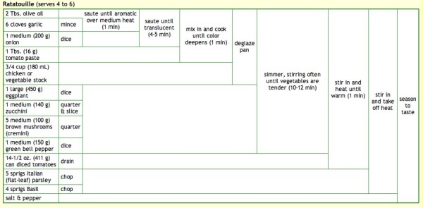
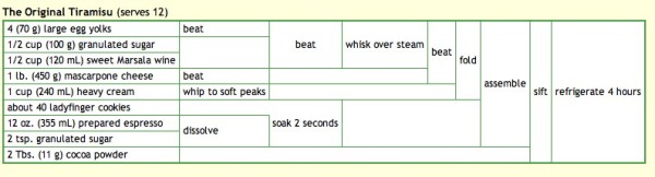
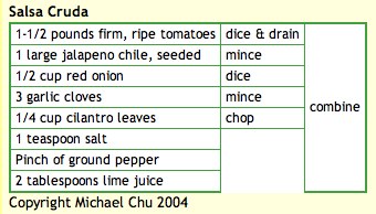
Michael Chu has been running the CookingForEngineers.com site for 6 years now, and he developed this infographic recipe table using HTML tables.  His recipe table is essentially a timeline of making that particular recipe, but also lists every ingredient, ingredient amounts, recipe instructions and the points in time they are added to the dish.  All in one, compact visual image.  Outstanding!

Michael also demonstrates each step of the recipes with pictures so you know what it should look like when you attempt the recipe.

Michael was also nice enough to answer a few interview questions I sent him:

Cool Infographics: What software applications do you use for the recipe graphics?

Michael: I use a text editor and write the HTML for the recipe tables by hand.  For the graphics used on my business cards and T-shirts and other merchandise, I copy and paste the browser rendered table into excel for some slight tweaking. Then I copy and paste into Adobe Illustrator for final adjustments.

Cool Infographics: What was your inspiration behind developing the recipe graphic?

Michael: I developed it on my own based on a shorthand notation that used for years to write down recipes on Post-It notes involving curly braces and actions scrawled on the side.

Cool Infographics: Have there been any recipes that have been particularly difficult to visualize?

Michael: Some recipes, especially ones involving discarding part of the ingredients and reintroducing ingredients at various points in time do not lend themselves to the recipe summary table.

Cool Infographics: What’s your most complicated recipe graphic?

Michael: It’s hard to determine… most recipes don’t come out all that complicated. The real trouble is that sometimes browsers act funny and start sticking in vertical or horizontal lines where they do not belong.

http://www.cookingforengineers.com/recipe/227/Ratatouille

http://www.cookingforengineers.com/recipe/60/The-Classic-Tiramisu-original-recipe


Cool Infographics: I keep calling it a recipe graphic, what do you call that visual style?

Michael: I call them either recipe summary tables or Tabular Recipe Notation (TRN).

Cool Infographics: Have you seen anyone else start to use that type of visual graphic for recipes?

Michael: After I started using it, I have had a few people email asking permission to use the format for their own recipe books, etc.

Cool Infographics: How long have you been running Cooking for Engineers, and have you been using that recipe graphic the whole time?

Michael: Cooking For Engineers has been up and running since June 2004 and we’ve been using the table from day one. Incidentally, the first recipe posted is this one:

http://www.cookingforengineers.com/recipe/53/Salsa-Cruda


Check out all of Michaels’ recipes at CookingForEngineers.com

Monday
Jan112010

The Caffeine Poster, How Much Caffeine Are You Drinking? [new infographic]


You are what you drink.  With so many drinks today claiming to be “energy drinks”, I wanted a little visual clarification, so I made The Caffeine Poster.  With coffee drinks on one side and canned cold drinks on the other, you can quickly see how much of a caffeine “hit” (in mg) you will get after consuming.  What’s especially interesting is many of the drinks have a very high caffeine mg/oz ratio, but the drink is so small you don’t get that much total caffeine.


I’ve been working on my own infographic for 6 months now off-and-on when I can make time.  I figured that I’ve been running this infographic blog for a few years now, it’s time to start putting up my own work.  Most of the data visualization I’ve designed are confidential to the company I make them for, so I wanted to create some infographics that I can publish on the blog.


The Caffeine Poster is supposed to help with one decision in your life.  If you’re going to grab a caffeine drink during the day (or evening), which drink should you consume?  I tried to stay focused on telling one story really well.  I’ve heard from others that this may make for a really good infographic, but may not make a great poster because a good poster would have a much deeper level of detail.  I like it, and we’ll see what king of responses I get.


I absolutely want to hear your feedback.  Please add your comments below or send me a note.  What do you think?  I’ve also got requests to print and offer this as a poster.  We’ll see if there is enough interest…

Also, I’m planning to post as “Making-of” article on what it took to create this infographic.


Making-Of The Caffeine Poster - Part 1

Making-Of The Caffeine Poster - Part 2

Making-Of The Caffeine Poster - Part 3


THANKS: A big thanks to Fast Company for posting about The Caffeine Poster on the Fast Company blog.  The Caffeine Poster was the most popular story of the week on Fast Company! 


You are what you drink!

Friday
Sep252009

Infographic Stickers for your Walls


From Hu2 Design, cocktail recipe infographics for your wall (drink not included).  They've created different ones for Rum, Tequila, Whiskey, Gin and Vodka that show the drink recipes for the common mixed drinks.  They're also available in different colors to help coordinate with your wall colors, and the website lets you see the color graphics on different wall colors to find what you are looking for.
Hu2 Vinyl Stickers are designed to be applied to any smooth surface including walls, windows & furniture. The vinyl’s are completely removable and leave no residue.
Also available is a cocktail ingredients by percentage infographic.


They also have bath tub level indicators, cable organizers, and things not to be forgotten as you leave your house.  In addition to the infographic stickers, they offer a bunch of fun, decorative and well designed wall decals as well.  Go check them all out at Hu2.com

Thanks Romain!

EDIT: You can also follow Hu2Design on Twitter!


Thursday
Aug272009

Beer Comparison: Porter vs. Stout (100% more infographic)


For those of us that enjoy dark beer, it may come as a surprise that there really is a technical difference between a porter and a stout beer.  The guys over of GeekBeer.com have attempted to explain it, along with this great infographic by Ethan John.  Ethan was kind enough to put the images up on his Flickr Photostream.


Great job Ethan!

Page 1 ... 4 5 6 7 8 ... 9 Next 10 Entries »