About
Randy Krum
President of InfoNewt.
Data Visualization and Infographic Design

Infographic Design

Infographics Design | Presentations
Consulting | Data Visualizations

DFW DataViz Meetup

Join the DFW Data Visualization and Infographics Meetup Group if you're in the Dallas/Fort Worth area!

Search the Cool Infographics site

Custom Search

Subscriptions:


Feedburner

The Cool Infographics® Gallery:

How to add the
Cool Infographics button to your:

Cool Infographics iOS icon

- iPhone
- iPad
- iPod Touch


Read on Flipboard for iPad and iPhone

Featured in the Tech & Science category

Flipboard icon

Twitter Feed
From the Bookstore

Caffeine Poster

The Caffeine Poster infographic

Entries in health (118)

Tuesday
Jun032008

The Infographic that Saved a Million Lives


Great story from 37signals.com about a very simple infographic that motivated Bill and Melinda Gates to change the focus of their charity spending.

“No graphic in human history has saved so many lives in Africa and Asia,” says NY Times columnist Nicholas Kristof about an infographic in a ‘97 Times article that spurred Bill and Melinda Gates to take action on public health.

...But then bill confessed that actually it wasn’t the article itself that had grabbed him so much—it was the graphic. It was just a two column, inside graphic, very simple, listing third world health problems and how many people they kill. but he remembered it after all those years and said that it was the single thing that got him redirected toward public health.

Tuesday
May132008

Microsoft HealthVault Xplaned


Microsoft enlisted our friends from Xplane to help visualize the theory behind the HealthVault system.

I would almost call this a 3D mind map the way it’s laid out.

Monday
Apr212008

The Fall of Tech on digg.com


From readwriteweb.com, an area chart showing the decline of Tech stories made popular on digg.com. Although initially the front page of digg.com was totally dominated by Tech stories and the primary users were tech geeks, the World & Business category is now the reigning king with the most stories made popular.

To put this into context, on 1 January 2006 tech stories made up 78% of the total popular stories (i.e. stories that made it onto the digg frontpage). By end of March 2008, that percentage had dropped to 18-20%.


Here you can see the same information charted as total number of stories made popular instead of percentages.


Saturday
Apr192008

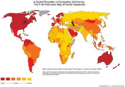
Map of World Happiness


From geostrategis.com, the world's first map of world happiness.

This world map on happiness was distributed through a Globe and Mail article by Sheryl Ubelacker (28/07/06). It is an interesting perspective, but primarily focused on the social side of well being. It provides a strong visualization but lacks the substance to become a strategic or policy significant map. This map was prepared by Adrian White, University of Leicester

Wednesday
Apr022008

Who Owns the Organic Food Companies?


Great chart by Phil Howard from Good Magazine showing which of the large food processing companies own some of the most popular organic food brands. Pepsi owns Naked Juice?

Found on digg.com after I heard about it on the diggnation podcast.

Saturday
Mar082008

See the World in Words

I thought this was really cool!

Sunday
Mar022008

What if...


Craig Robinson, from flipflopflyin.com, has created a graphic showing many of the different paths/branches his life could have taken. Clicking on each character icon reveals text describing the event or deviation from actual events.

Who hasn't at one time or another wondered how their life could've gone in other directions if different events had occurred or different choices been made? These are the ways my life could've deviated from its actual path (the top row).
" Craig dies at the age of 34, killed by an angry swan" I found incredibly funny.

Found on NiXLOG.

Saturday
Mar012008

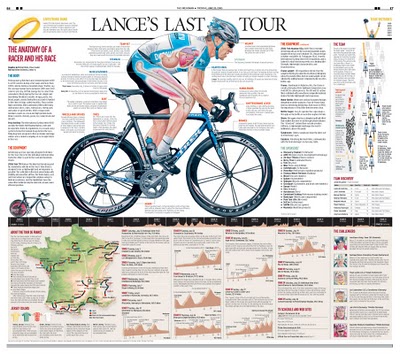
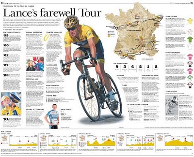
Lance's Last Tour


I found two good newspaper infographics from 2005 covering Lance Armstrong's last Tour de France on newsdesigner.com where you can get larger PDF files that make good posters. Both are two-page graphics (doubletrucks). The first is from The Oregonian (above), and the second is from the St. Pete Times (below).


Found on NiXLOG.

Tuesday
Feb192008

Meet The World, Infographic Flags


Meet The World is an infographic project that uses the colors of eight national flags to represent some of the current issues in the world.

Icaro Doria is Brazilian, 25 and has been working for the magazine Grande Reportagem, in Lisbon, Portugal, for the last 3 years. He is part of the team (with Luis Silva Dias, João Roque, Andrea Vallenti and João Roque) that produced the flags campaign which has been circulating the Earth in chain letters via e-mail.
I found the link to this on rc3.org.

Sunday
Jan272008

The Marathon Meal


You have to walk 26.2 miles (a complete marathon!) to burn off the calories from a standard Thanksgiving meal, shown here broken down by each dish included. That extra piece of pumpkin pie is worth 5 miles!

This infographic is from Gary Newman Design, who does some fantastic work.