


Sunday
Jan272008
Clarifying Cloning
 Randy
Randy
From The Genetics and Public Policy Center, an infographic demonstrating the difference between research cloning and reproductive cloning.

![]()

Join the DFW Data Visualization and Infographics Meetup Group if you're in the Dallas/Fort Worth area!

The Cool Infographics® Gallery:
How to add the
Cool Infographics button to your:

- iPhone
- iPad
- iPod Touch
Read on Flipboard for iPad and iPhone
Featured in the Tech & Science category


From The Genetics and Public Policy Center, an infographic demonstrating the difference between research cloning and reproductive cloning.

A series of infographics to help the parents of a new baby...sort of. Some of these are very funny, but some of them are very odd.
These are apparently a series of images from the book Safe Baby Handling Tips, by David and Kelly Sopp.

New infographic from nytimes.com depicting the 2,592 deaths in Iraq over the course of the entire year of 2007. The graphic is credited to Alicia Cheng, a graphic designer at mgmt. design in Brooklyn.The chart below — compiled from data provided by the American and Iraqi governments and news media organizations (the independent Coalition Casualty Count in particular) — gives information on the type and location of each attack responsible for the 2,592 recorded deaths among American and other coalition troops, Iraqi security forces and members of the peshmerga militias controlled by the Kurdish government.
I think this is an improvement over the "31 Days in Iraq" graphic because the new graphic identifies every death as a separate figure instead of grouping some together. There are also some differences in data, as the new graph doesn't include the Iraqi civilian deaths. So the "31 Days in Iraq" graphic showed over 1,900 deaths in January 2007, this new graphic only shows 163 deaths in January.And, sadly, civilian fatalities in Iraq last year were simply too numerous to represent on a single newspaper page.
I'll keep an eye out in early February to see if they publish one for the month of January as they have the last couple of years.

Gizmodo posted a number of the crazy images from the Japanese version of the Wii safety manual. These are hilarious!


Skull With Cigarette, 2007 [based on a painting by Van Gogh]
72x98"
Depicts 200,000 packs of cigarettes, equal to the number of Americans who die from cigarette smoking every six months.
I've become a big fan of Chris Jordan's work, especially the Running The Numbers series. I just noticed that he has added to the collection on his website with some new pieces! A friend of mine quit smoking this week, so in her honor I want to share one of the new artwork pieces.
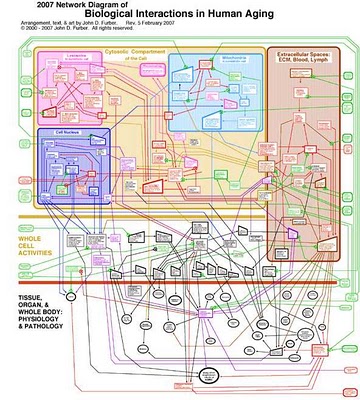
Created by John D. Furber at Legendary Pharmaceuticals, this is a visual representation of the biology behind aging using a network diagram. A large format image is available for printing here.
From VisualComplexity:John D. Furber of Legendary Pharmaceuticals has put together a visual model of aging referred to as 'The 2007 Network of Biological Interactions in Human Aging' that shows the interactions between various subcellular, cellular, extracellular matrix and organ system. This is a great representation of aging as it demonstrates no root cause but rather a network of problem areas that are interlinked. The goal of systems biology would be to flush this out in great detail allowing one to zoom in down to the specific genomic and proteomic components of aging. Systems biology would also pursue such a model to have a functional runtime component to it such that variables could be tweaked and changes introduced to predict impact elsewhere in the various biological networks.

Flu season is coming soon, so its about time to know your enemy. Graphic of the Flu virus from newscientist.com.
Kinda looks like a big squishy ball doesn't it?


From Many Eyes, this bubble chart shows the number of plastic surgery procedures per 100 people, by nation. Let's just say, the U.S. is one of the smaller countries measured this way.
 This map of Iraq from the NYTimes.com visually shows the over 1,900 people killed in Iraq during the month of January 2007.
"The map, based on data from the American, British and Iraqi governments and from news reports, shows the dates, locations and circumstances of deaths."The number has doubled since they did this for January 2006 which had around 800 deaths. Each figure represents an individual of the American forces, coalition forces, Iraqi forces, police officers or civilian death. The larger figures have numbers showing how many people they represent (which I think diminishes the visual impact). A smaller icon shows the cause of death. All the figures are connected to a location in the country.
I would have added some color coding too, but I'm guessing the NY Times had to keep it in black & white to print it in the newspaper.

You've seen these counters on highway billboards and other websites before. The World Clock from poodwaddle.com combines many of these counters together into one dashboard.
I've added a smaller version to the bottom of the right pane here on on the blog.
