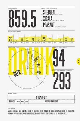
Nichloas Felton's 2007 Annual Report

Nicholas Felton has published his new 2007 Annual Report. I love the way he breaks down his own personal life into maps and charts. I had just posted about his 2006 Annual Report last month.
Join the DFW Data Visualization and Infographics Meetup Group if you're in the Dallas/Fort Worth area!

The Cool Infographics® Gallery:
How to add the
Cool Infographics button to your:
- iPhone
- iPad
- iPod Touch
Read on Flipboard for iPad and iPhone
Featured in the Tech & Science category

Nicholas Felton has published his new 2007 Annual Report. I love the way he breaks down his own personal life into maps and charts. I had just posted about his 2006 Annual Report last month.

Cool poster I found over at historyshots.com shows the altitudes reached by all of the U.S. and Russian launches leading up to the 1969 moon landing. From 1961 to 1969 the USSR and the United States were locked in a history-making race to land the first person on the moon. This detailed map explains the story of this titanic contest in a clear and informative manner.

New infographic from nytimes.com depicting the 2,592 deaths in Iraq over the course of the entire year of 2007. The graphic is credited to Alicia Cheng, a graphic designer at mgmt. design in Brooklyn.The chart below — compiled from data provided by the American and Iraqi governments and news media organizations (the independent Coalition Casualty Count in particular) — gives information on the type and location of each attack responsible for the 2,592 recorded deaths among American and other coalition troops, Iraqi security forces and members of the peshmerga militias controlled by the Kurdish government.
I think this is an improvement over the "31 Days in Iraq" graphic because the new graphic identifies every death as a separate figure instead of grouping some together. There are also some differences in data, as the new graph doesn't include the Iraqi civilian deaths. So the "31 Days in Iraq" graphic showed over 1,900 deaths in January 2007, this new graphic only shows 163 deaths in January.And, sadly, civilian fatalities in Iraq last year were simply too numerous to represent on a single newspaper page.
I'll keep an eye out in early February to see if they publish one for the month of January as they have the last couple of years.
 Nicholas Felton (www.feltron.com) has created his own personal 2006 Annual Report, looking back at his life during 2006 and using maps, charts, timelines and facts to visually track his activities. With pages dedicated to photos, travel, drinking, reading and food, he plots out his one-year history.

From aaplinvestors.net, more than a simple line chart of sales, its a timeline that highlights major events so you can easily visualize their impact. Even though its simple, I use this type of timeline all the time.

Infographic for the holiday season. This one definitely made me laugh. Back in the Middle Ages, St. Nicholas had a sidekick named Krampus who took care of the naughty children. Over the years as St. Nicholas evolved into today's Santa Claus, and left Krampus behind. Krampus didn't exactly fit into the Coca-Cola image of Santa Clause that we all know and love today.
Found on tevis.net. I would give credit directly to the authors, but I can't make out their names in the bottom right corner.

From Paul Nixon on nixlog.com. In 2005, Apple finally released products from both the Mac line and the iPod line that reached the masses. This created the Tipping Point Effect that has rocketed Apple products and stock in the last two years. Rock on!
The Sweet Spot. Until January 2005, Apple had no iPod or PC products that served the mass market. With the launch of iPod Shuffle and Mac mini they have finally converged two product paths with the mass market in mind. This will not only drive more iPod sales (via the Shuffle), but also fulfill the promised "halo" effect of the iPod products as PC users jump to the Mac mini.Thanks to Karen for the submission

Newsweek has a cool interactive timeline showing all of the 150+ missions sent into space. Its organized by year (of course) but also by object of destination (planet/moon/asteroid). You can click on a year and zoom in to see specific dates of each launch. Rolling your mouse over any dot gives you the name and details of the mission.
Found on Information Aesthetics.

The World Freedom Atlas, offers many different views of the world. Developed by Zachary Forest Johnson, his blog is here. The one above is the Raw Political Rights Score (darker is better) based on data from the Freedom House. Offering a bunch of datasets from a number of different sources, the interface is fantastically easy to use. Depending on the dataset, you can also view the data by year from 1990-2006.

Wired magazine calls infographics like this "infoporn". I guess you could call this a version of a bubble chart, but it shows a comparison of what people knew in 1989 vs. 2007. Separately it shows knowledge of three questions based on the respondent's usual source of news.
I can't tell how big the sample size was, or what type of people they interviewed. It quotes the source as the Pew Research Center for the People & the Press, but that alone isn't enough to make it credible.