About
Randy Krum
President of InfoNewt.
Data Visualization and Infographic Design

Infographic Design

Infographics Design | Presentations
Consulting | Data Visualizations

DFW DataViz Meetup

Join the DFW Data Visualization and Infographics Meetup Group if you're in the Dallas/Fort Worth area!

Search the Cool Infographics site

Custom Search

Subscriptions:


Feedburner

The Cool Infographics® Gallery:

How to add the
Cool Infographics button to your:

Cool Infographics iOS icon

- iPhone
- iPad
- iPod Touch


Read on Flipboard for iPad and iPhone

Featured in the Tech & Science category

Flipboard icon

Twitter Feed
From the Bookstore

Caffeine Poster

The Caffeine Poster infographic

Entries in history (262)

Monday
Sep242007

History of Computer Languages


O'Reilly has created a poster showing the 50-year history of computer languages from 1954 to 2004, available as a PDF. They have also been giving away copies of the posters at O'Reilly conferences. I love the links shown where older languages split or combined to create the newer languages over time.

I look back around 1990 when I was programming in college and see Fortran V, C++ and the birth of Visual Basic. I remember having to convince my engineering professors to let me program assignments in C++ instead of Fortran.

The original diagram was created by Éric Lévénez. Although O'Reilly is not updating the poster, Eric is keeping his original diagram up to date on levenez.com.

Monday
Sep242007

31 Days in Iraq

This map of Iraq from the NYTimes.com visually shows the over 1,900 people killed in Iraq during the month of January 2007.

"The map, based on data from the American, British and Iraqi governments and from news reports, shows the dates, locations and circumstances of deaths."
The number has doubled since they did this for January 2006 which had around 800 deaths. Each figure represents an individual of the American forces, coalition forces, Iraqi forces, police officers or civilian death. The larger figures have numbers showing how many people they represent (which I think diminishes the visual impact). A smaller icon shows the cause of death. All the figures are connected to a location in the country.

I would have added some color coding too, but I'm guessing the NY Times had to keep it in black & white to print it in the newspaper.

Saturday
Sep222007

Earth At Night


This satellite photo from NASA spans a 24-hour period showing the entire surface of the Earth in darkness. The lights obviously show the highest areas of concentration of civilization.

Note the Nile River delta, the Siberian Express railway route, the Australian coastal cities, and Africa, literally "the dark continent".
From Princeton's International Networks Archive, the old project of Jonathan Harris.

Sunday
Sep092007

The Wealthiest Americans Ever


From the NYTimes in July 2007, an interactive infographic ranking the Wealthiest Americans after you convert their fortunes to today's dollars using the relative share of G.D.P.

Scrolling your pointer over the photos or the fortune amount shows more detail of the individual. Lots of black & white portraits! Only current rich folk Bill Gates and Warren Buffet made the list with color portraits.

Friday
Sep072007

The Cosmic Calendar


This last December was the 10th anniversary of Carl Sagan's death. One of his most popular episodes of Cosmos was titled The Dragons of Eden where he first described his Cosmic Calendar. This website from discovery.com has a simple image showing the Cosmic Calendar as Carl described it. A few websites are selling posters of the Cosmic Calendar, like AllPosters.com.

The premise is that if you compress the entire history of the universe into a calendar year, homo sapiens only exist in the last 6 minutes, and the last second represents the last 400+ years of human history.

You can see Cosmos, and hear Carl describe it on YouTube here:

Sunday
Sep022007

World Clock Counter


You've seen these counters on highway billboards and other websites before. The World Clock from poodwaddle.com combines many of these counters together into one dashboard.

I've added a smaller version to the bottom of the right pane here on on the blog.

Thursday
Aug302007

Katrina's Blame Game


Following the Katrina Diaspora graphic, here's another one related to Hurricane Katrina that maps the blame from different key figures and celebrities. I found this on mylifestream.net and originally from nytimes.com in October 2005.

Monday
Aug272007

Katrina's Diaspora

Originally from the nytimes.com in October 2005, I found this map graphic on mylifestream.net. This shows the geographic distribution of applications to FEMA for aid from Katrina victims. Presumably, that means the application locations imply where displaced Louisiana residents moved to.

Sunday
Aug052007

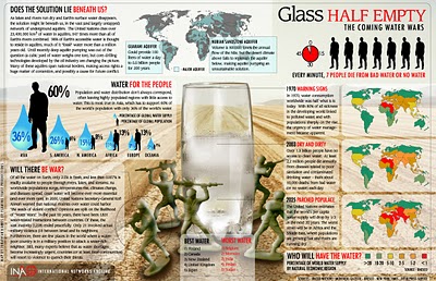
The Coming Water Wars


Another graphic from Jonathan Harris from his time at Princeton with the International Networks Archive. It's a couple years old, but absolutely still relevant. I believe this is from around 2003.

Added: Recently popular on Digg.com

Thursday
Aug022007

Imagining the Tenth Dimension


Ten dimensions are really hard for most people to understand. Especially since our lives are constrained to only four dimensions. This video from tenthdimension.com does an EXCELLENT job of using pretty simple animation and illustrations to explain the 10 dimensions of our universe.

This video is really good, even if you're not a physicist.