About
Randy Krum
President of InfoNewt.
Data Visualization and Infographic Design

Infographic Design

Infographics Design | Presentations
Consulting | Data Visualizations

DFW DataViz Meetup

Join the DFW Data Visualization and Infographics Meetup Group if you're in the Dallas/Fort Worth area!

Search the Cool Infographics site

Custom Search

Subscriptions:


Feedburner

The Cool Infographics® Gallery:

How to add the
Cool Infographics button to your:

Cool Infographics iOS icon

- iPhone
- iPad
- iPod Touch


Read on Flipboard for iPad and iPhone

Featured in the Tech & Science category

Flipboard icon

Twitter Feed
From the Bookstore

Caffeine Poster

The Caffeine Poster infographic

Entries in internet (195)

Wednesday
Nov142007

See My Voice


From the University of Sydney, Bachelor of Design Computing website, See My Voice was a project by one of the students in the program, Andrea Lau.

SeeMyVoice - Social Information/Data Visualisation (or infovis). SeeMyVoice visualises chat transcripts stored by MSN Messenger. It aims to highlight people's style of chatting and increase understanding of our online social interaction. Each person is represented by a coloured wave which ebbs and fluctuates according to message length and the time taken between messages.
Great job Andrea! That's exactly how IM conversations go.

UPDATE: Andrea has a complete website describing her work and the See My Voice project in much more detail.

Monday
Nov122007

Grokker


It's not new, but Grokker does a good job of searching multiple sites and mapping the data back to the user in visual form.

...a web-based enterprise search management platform that leverages the power of federated content access and visualization to maximize the value of information assets for enterprises, content publishers, libraries and other research-intensive organizations.

Monday
Nov052007

Visuwords


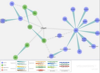
Visuwords is a new website that visually shows the relationships between words. More than an online dictionary or thesaurus. The relationships are shown graphically like a mind-map.

Visuwords™ online graphical dictionary — Look up words to find their meanings and associations with other words and concepts. Produce diagrams reminiscent of a neural net. Learn how words associate.
Found on LifeHacker.

Wednesday
Oct312007

Stranger Than Fiction

This video is the introduction to the movie Stranger Than Fiction, full of infographics. It's been around for a while, but I thought I would share it too.

Friday
Oct262007

Science Related Wikipedian Activity


A new visualization from the same group that did the earlier visualization of Wikipedia revision activity. This one focused on science and tech related articles. The mystery is the significance of the blue/green band that crosses the map.

Thursday
Oct252007

Map of the Internet (blacklisted)

Found on Information Aesthetics, this is a map of all 4,294,967,296 IP addresses in the world. Blocks of addresses are shown grouped together in squares based on the owner (ISP, corporation, goverment, university, etc.), and individual addresses are shown as grey dots. The IP addresses that are listed on the Spamhaus XBL blacklist are shown as red dots, representing suspect addresses.

Monday
Oct222007

Wikipedia Activity Visualization


From A Beautiful WWW, this image is a pretty good attempt to visualize the article revision activity on Wikipedia. An article explaining the visualization is here, but the image is a combination of images are from the most linked-to articles, and the size of the colored dots represent the amount of revision activity in the linked articles.

A really cool interactive version was made using the Google Maps API so you can zoom in and move around the graphic.

Wednesday
Oct172007

Americans Remain Woefully Ill-Informed


Wired magazine calls infographics like this "infoporn". I guess you could call this a version of a bubble chart, but it shows a comparison of what people knew in 1989 vs. 2007. Separately it shows knowledge of three questions based on the respondent's usual source of news.

I can't tell how big the sample size was, or what type of people they interviewed. It quotes the source as the Pew Research Center for the People & the Press, but that alone isn't enough to make it credible.

Tuesday
Oct092007

WiFi Detector T-Shirt

Another one for the "real world" infographics. This t-shirt from ThinkGeek will detect WiFi 802.11b or 802.11g wireless networks and display their signal strength on the front of the shirt. A great Christmas present for the geek in your family, for only $30.

It will amuse you, that I caught this one from Guy Kawasaki on Twitter.com, which linked to Truemors.com, which linked to BoingBoing.com, which linked to BoingBoingGadgets which finally linked to the original page on ThinkGeek.com. What a tangled web we weave...

Monday
Oct082007

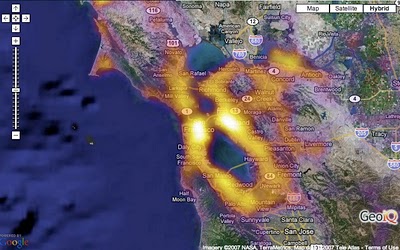
Population Heat Map


From CraigStats, the image above shows the population per square mile in the San Francisco area as a pseudo heat map. The site also has combined the apartment listings on Craig's List with Google maps to create pseudo heat maps showing the areas with the most apartments.