Who participates online?

A good one from BusinessWeek.com. This chart shows the participation in the various Web 2.0 activities by age group.
As part of Gen X, these graphs look like a tidal wave rising up behind me.
Join the DFW Data Visualization and Infographics Meetup Group if you're in the Dallas/Fort Worth area!

The Cool Infographics® Gallery:
How to add the
Cool Infographics button to your:
- iPhone
- iPad
- iPod Touch
Read on Flipboard for iPad and iPhone
Featured in the Tech & Science category

A good one from BusinessWeek.com. This chart shows the participation in the various Web 2.0 activities by age group.
As part of Gen X, these graphs look like a tidal wave rising up behind me.
 charts,
  internet,
  population,
  web
web 
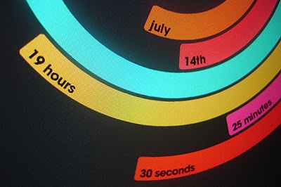
The Polar Clock, from Pixel Breaker, version 3 is now out as a screen saver for Mac and Windows. It's also available as a Mac OS X Widget.
I don't know why, but I love this clock. I'm mesmerized watching the seconds going around. With a little practice, you can visualize the time. I won't say this is the best way to visualize the time, but it's definitely fascinating.

O'Reilly has created a poster showing the 50-year history of computer languages from 1954 to 2004, available as a PDF. They have also been giving away copies of the posters at O'Reilly conferences. I love the links shown where older languages split or combined to create the newer languages over time.
I look back around 1990 when I was programming in college and see Fortran V, C++ and the birth of Visual Basic. I remember having to convince my engineering professors to let me program assignments in C++ instead of Fortran.
The original diagram was created by Éric Lévénez. Although O'Reilly is not updating the poster, Eric is keeping his original diagram up to date on levenez.com.

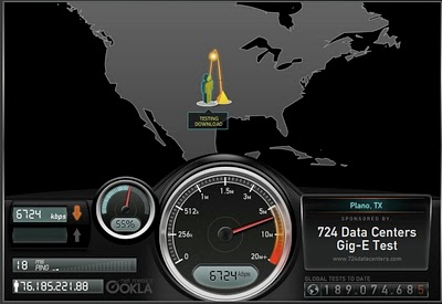
Speedtest.net does a great job showing you the data while testing your own internet connection speed. From locating a test server on the map, to animating the speedometer as the test runs. Without much text at all explaining what's going on, you understand the test, and the results.
Then you get the code to embed your results (see below) into a blog post, email or website. How fast is your connection?

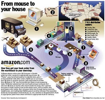
How does Amazon turn your online book order into a physical shipment to your doorstep? One of a handful of great infographics from Ron Oden on the ronoden.com site.
Check this one out! The graphic above is an embedded object from searchCrystal that lets you search multiple sources for images (or other forms of information). I've preloaded it to search for "inforgraphics" from GoogleImages, Flickr, AskImages, YahooImages and MSNImages. When you dig a little deeper, you can choose the different sources you are searching from, save searches, share results with others, etc.
The arrangement shows the overlap of the results from multiple sites. Simple navigation like scrolling over images enlarges them, and clicking takes you to the source image.
Also works for video, blogs, tags, news, etc...blah, blah, blah. We only care about images don't we?
 Three design firms took on the challenge of re-designing the Bloomberg terminal interface, and the results were fantastic. The challenge came from Portfolio.com. The original article is here, but the fantasy terminals are here with an interactive interface that lets you highlight and zoom in on particular features. The design above is from thehappycorp.com and is my personal favorite.
Bloomberg claims to be constantly improving their interface design, but it still looks like runs on DOS and is straight out of the 80's.

Here is the desing from IDEO.com:

And one from Ziba.com:

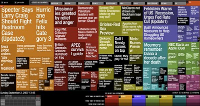
Marumushi.com has a fantastic News Map using the treemap visualization style. This is one of the best implementations of a treemap that I have found. Updated every 6 hours, it groups news stories (from the Google news aggregator) by overall category (technology, world, sports, etc.). You can choose to show the news map from 11 different countries, and the color shading of each block represents how old that particular news story is. Hovering your mouse over any square shows the whole title, and clicking takes you directly to the story.

From David Naylor's blog, a color map that includes all 16.8 million RGB colors.
![]()
This one is really interesting. Stamen Design took one day of digg.com and visualized the user activity. The explanation is really cool, and can be found here on content.stamen.com. Stamen works with Digg on a number of the tools available in Digg Labs.
Red dots represent people that have been on Digg for a while, yellow is a good mix, and blue is new users. So when a story is predominantly blue, it represents a story that is attracting a bunch of new users to Digg.