About
Randy Krum
President of InfoNewt.
Data Visualization and Infographic Design

Infographic Design

Infographics Design | Presentations
Consulting | Data Visualizations

DFW DataViz Meetup

Join the DFW Data Visualization and Infographics Meetup Group if you're in the Dallas/Fort Worth area!

Search the Cool Infographics site

Custom Search

Subscriptions:


Feedburner

The Cool Infographics® Gallery:

How to add the
Cool Infographics button to your:

Cool Infographics iOS icon

- iPhone
- iPad
- iPod Touch


Read on Flipboard for iPad and iPhone

Featured in the Tech & Science category

Flipboard icon

Twitter Feed
From the Bookstore

Caffeine Poster

The Caffeine Poster infographic

Entries in news (62)

Monday
Aug272007

Katrina's Diaspora

Originally from the nytimes.com in October 2005, I found this map graphic on mylifestream.net. This shows the geographic distribution of applications to FEMA for aid from Katrina victims. Presumably, that means the application locations imply where displaced Louisiana residents moved to.

Sunday
Aug262007

E-mail Analysis


Origianally from a NYTimes.com article in 2005, I found reference to this recently on Adam Smith, Esq. (A free registration to NYTimes.com is required to view the full size image)

Some Computer Science professors analyzed one week of e-mail traffic from Enron (about 500,000 emails) in May 2001 looking for patterns that would help investigators narrow down their search. This infographic is the result showing the email connections between employees

Saturday
Aug252007

Consumer Spending (5% on Tech Stuff)


From Wired magazine (issue 15.08) a treemap infographic of consumer spending in 2005. 5% of all consumer spending was on technology, and of course, Wired broke down that 5% into an expanded treemap.

Internet access +216%, Residential phone -25%. VOIP seems to be making an impact.

Tuesday
Aug142007

How to Spot a Handgun


Found on Edward Tufte's website. Edward posted a small collection of infographics from Megan Jaegerman during her time working for the NY Times. This graphic of Spotting a Hidden Handgun, was updated and revised for Edward's book, Beautiful Evidence.

Megan Jaegerman produced some of the best news graphics ever while working at The New York Times from 1990 to 1998.
-Edward Tufte, July 2007

Friday
Aug102007

World's Most Dangerous Drugs


Another good one from Healthbolt. Color coded by class, and ranked by overall harm to the human body.

Wednesday
Aug082007

2008 Presidential Campaign Finances


This interactive infographic from the New York Times website is really impressive. Using weekly data reported by the Federal Election Commission, it plots the contributions on a map of the U.S. and sizes the bubbles based on contributions from that city. It has data from every week since January 1st, so it will also "play" and animated version showing the contribution as time progresses (similar to the Trendalyzer that Google purchased from GapMinder).

You can also search for specific contributors to see which candidate campaigns they have contributed to, and how much they gave.

Sunday
Aug052007

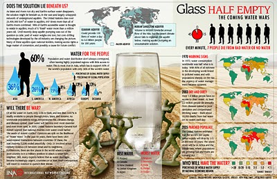
The Coming Water Wars


Another graphic from Jonathan Harris from his time at Princeton with the International Networks Archive. It's a couple years old, but absolutely still relevant. I believe this is from around 2003.

Added: Recently popular on Digg.com

Tuesday
Jul242007

Hans Rosling @ TED 2006

Hans Rosling is a professor from Sweden who is an expert in world health, but has pioneered some amazing ways to look at massive amounts of data. I mean truly AMAZING. I can think of at least a dozen uses for this software to help visualize changes over time. Don't let the topic scare you, this is incredible to watch.

The Trendalyzer software (recently acquired by Google) turns complex global trends into lively animations, making decades of data pop.
This video is one of the TED Talks videos from the 2006 TED Conference.

http://www.ted.com/talks/view/id/92

Sunday
Jul222007

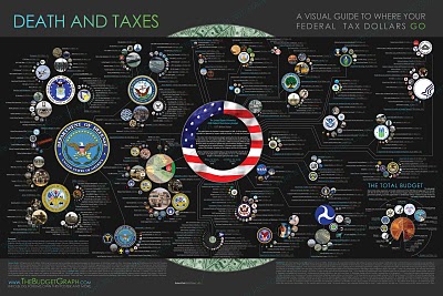
Death and Taxes 2008

NEW Death and Taxes infographic for 2008!


It is the 2008 Federal discretionary budget of the United States. is a representational poster of the federal discretionary budget; the amount of money that is spent at the discretion of your elected representatives in Congress. Basically, your federal income taxes. The data is from the President's budget request for 2008. It will be debated, amended, and approved by Congress by October 1st to begin the fiscal year.
So this is what the President is asking for, not the final budget. Compare this to the final 2007 discretionary budget from my earlier post.

An interactive Flash version is online at www.thebudgetgraph.com/poster.

Sunday
Jul222007

Jonathan Harris TED Talks 2007

Jonathan Harris is working on some cool, interesting, fascinating but weird stuff. This is his presentation at TED 2007 about We Are Fine and his new project Universe. You can see this on the TED site here.

Universe is now live at universe.daylife.com, and you can enter a news topic and watch it graphically associate all of the relevant stories in the media about that topic. This would be really cool for consumer products too, but sadly that doesn't exist.

The TED Talks are now available on iTunes as free video podcasts. I've been watching some older ones from 2002-2007.