Mapped Up - Visual News ScreenSaver
From lifehacker.com, MappedUp is a visual RSS Reader/ScreenSaver that displays the location of news stories on a pixel map of the world. MappedUp is a free download for Windows and Mac OS X.
Join the DFW Data Visualization and Infographics Meetup Group if you're in the Dallas/Fort Worth area!

The Cool Infographics® Gallery:
How to add the
Cool Infographics button to your:
- iPhone
- iPad
- iPod Touch
Read on Flipboard for iPad and iPhone
Featured in the Tech & Science category
Our friends over at XPLANE have done a fabulous video explaining what led up to the recent credit crisis in the U.S. economy. A great job simplifying a complex problem.
Thanks Parker, and great job to your team!
WATERCUBE: The Book is a complete monographic publication about the National Swimming Center for the Beijing Olympics 2008. With an exhaustive description about the Watercube we present a detailed study of the project. The book makes an holistic approach to the project that starts with a brief description of urban and social changes that China has been experienced in the last decade. These facts have encouraged the construction boom that made possible these kind of projects occur in cities like Beijing.
Here you can buy Watercube, by Ethel Baraona Pohl, on Amazon.com.
Special thanks to Ethel for sharing the images from her book, and allowing me to post them on Cool Infographics!

New interactive infographic by Shan Carter and Amanda Cox on nytimes.com that shows the voter margins between Democratic candidates Hilary Clinton and Barrak Obama. These are based on exit poll data.

Choose any of the sorting criteria on the bottom, and then you can see specific data about any particular state by hovering the mouse over the blocks. The top chart shows how Men voted overall, and the second chart is how voters with No College Education voted.
Thanks Les for sending in the link!

Check out WorldMapper! Above is a map of the world based on true Land Mass, but with WorldMapper, you can adjust the size of the countries based on whatever data you are trying to convey.
This is the world map based on Total Population:

This is the world map based on Total Computer Exports:

Alisa Miller, head of Public Radio International, talks about why -- though we want to know more about the world than ever -- the US news media is actually showing less. She uses WorldMapper to communicate her point about the state of today's news in the US.

Great graphic from NYTimes.com showing the subprime mortgage foreclosures as a percentage of all subprime mortgages by geographic region of the country.

Neat experiment by Dave Bowker over at Designing The News. The idea is to use pictgraphics to visualize news headlines in public places. Specifically in Europe, you could establish a universal set of icons over time that people who speak different languages could interpret and understand.

From the United Nations Environment Programme website, the Global Distribution of Water specifically highlights the scarcity of freshwater.
Found on digg.com

From readwriteweb.com, an area chart showing the decline of Tech stories made popular on digg.com. Although initially the front page of digg.com was totally dominated by Tech stories and the primary users were tech geeks, the World & Business category is now the reigning king with the most stories made popular.
To put this into context, on 1 January 2006 tech stories made up 78% of the total popular stories (i.e. stories that made it onto the digg frontpage). By end of March 2008, that percentage had dropped to 18-20%.

Here you can see the same information charted as total number of stories made popular instead of percentages.

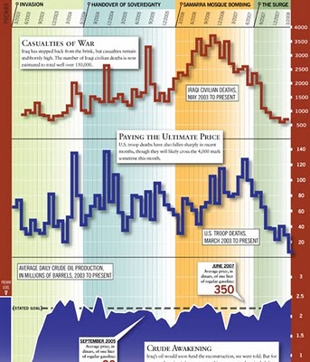
From foreignpolicy.com, a really tall chart showing statistical information covering the last five years of the Iraq war. I'm not sure I like the idea of this big chart that covers so many different types of data. The information on the bottom half of the chart tends to get lost to the reader.
