About
Randy Krum
President of InfoNewt.
Data Visualization and Infographic Design

Infographic Design

Infographics Design | Presentations
Consulting | Data Visualizations

DFW DataViz Meetup

Join the DFW Data Visualization and Infographics Meetup Group if you're in the Dallas/Fort Worth area!

Search the Cool Infographics site

Custom Search

Subscriptions:


Feedburner

The Cool Infographics® Gallery:

How to add the
Cool Infographics button to your:

Cool Infographics iOS icon

- iPhone
- iPad
- iPod Touch


Read on Flipboard for iPad and iPhone

Featured in the Tech & Science category

Flipboard icon

Twitter Feed
From the Bookstore

Caffeine Poster

The Caffeine Poster infographic

Entries in photo (47)

Thursday
Aug212008

Olympic Maps of Beijing


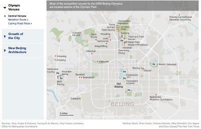
Let's not forget the Maps!  NYTimes.com has a number of interactive maps of the Beijing area showing the event locations, new architecture built for the Olympics, the demolition and expansion of the old city over the last 10 years, the new subway routes and some of the routes for the marathon and cycling events.

Friday
Jun062008

The Flickr User Model


Designed by Soldier Ant (his real name is Bryce Glass), the Flickr User Model attempts to map out the Flickr user experience. This is version 0.1, and I think he's working on version 0.3 now. Also linked on visualcomplexity.com

On his post on October 24, 2005, Bryce explains: "I've been doing some concept diagramming for work lately, and I've found myself enjoying it immensely. (...) However, since it's for work I can't share much of it. I did post some sanitized versions, with all the object-names obsfucated, but that just didn't seem wholly satisfying. So over the weekend I invested some time in a diagram that I can share with the internets: a simple Flickr user model (regrettably incomplete -- but I realized that if I tried to include the whole Flickr-verse that this diagram would go beyond labor of love and straight into excercise in folly)".
Thanks Rex for sending in the link!

Tuesday
Mar112008

Steve Jobs photo mosaic from Apple products


This one is just fun. Steve Jobs portrait photo mosaic made from Apple products and icons from OS X. Another version of this from the same artist was used in the March 17, 2008 issue of Fortune magazine.

Found on digg.com

Monday
Mar032008

The Calculators of HP poster


From the The Hewlett Packard Calculator Page.

This poster shows every HP calculator made starting with the famous HP-35. Each calculator is displayed with it's production start and end data, and it's project codename.
It's amazing how many of these I have actually used. This is similar to the Evolution of Apple Design...but with more buttons.

Monday
Feb182008

GE Ecomagination Blueprint Ads

GE is running The Blueprint Series of five print ads combining photos with an overlay of infographics. This works really nicely because they kept the infographics relatively simple.

Found on notcot.com.

Thursday
Jan102008

Digg These Pics


Really cool new feature over on Digg.com. Back in late 2007, they added an Images category so users could digg their favorite pictures. Now they've added an interactive image viewer in the Digg Labs that lets you see new images and pictures being dugg in real-time.

The only thing I don't like is that it doesn't let you add any search terms. You have to see all of the activity, and can't narrow it down it all.

Wednesday
Jan022008

Savvygraph your Amazon product searches


I can't tell if Savvygraph.com is part of Amazon.com, or if this is a separate company running this. It takes any Amazon.com search terms you enter and charts the results on an X-Y chart showing the Average Rating and the total Number of Ratings.

It's fairly interactive. You can limit the price range using the sliders at the top, and when you hover over any of the pins you get the product image. Clicking on the pin takes you to that item on Amazon.com. Clicking on any of the links on the right limit the search to a smaller subset based on your choice (like a particular brand).

EDIT: I did receive an email from the author who confirmed that the site is totally separate from Amazon.com. Thanks Dave.

Tuesday
Jan012008

Smoking Kills 200,000 Every 6 Months


Skull With Cigarette, 2007 [based on a painting by Van Gogh]
72x98"

Depicts 200,000 packs of cigarettes, equal to the number of Americans who die from cigarette smoking every six months.

I've become a big fan of Chris Jordan's work, especially the Running The Numbers series. I just noticed that he has added to the collection on his website with some new pieces! A friend of mine quit smoking this week, so in her honor I want to share one of the new artwork pieces.

Wednesday
Dec262007

Nichloas Felton's Personal Annual Report

Nicholas Felton (www.feltron.com) has created his own personal 2006 Annual Report, looking back at his life during 2006 and using maps, charts, timelines and facts to visually track his activities. With pages dedicated to photos, travel, drinking, reading and food, he plots out his one-year history.

Thursday
Oct182007

Plastic Bags


Here's another one from Chris Jordan. Is it art, or is it infographic?

The image shows 60,000 plastic bags, which is how many bags are used in the U.S. every 5 seconds! The picture currently on display at the Paul Kopeikin Gallery in Los Angeles is 5ft x 6ft large so viewers can step up close to see all of the details.