About
Randy Krum
President of InfoNewt.
Data Visualization and Infographic Design

Infographic Design

Infographics Design | Presentations
Consulting | Data Visualizations

DFW DataViz Meetup

Join the DFW Data Visualization and Infographics Meetup Group if you're in the Dallas/Fort Worth area!

Search the Cool Infographics site

Custom Search

Subscriptions:


Feedburner

The Cool Infographics® Gallery:

How to add the
Cool Infographics button to your:

Cool Infographics iOS icon

- iPhone
- iPad
- iPod Touch


Read on Flipboard for iPad and iPhone

Featured in the Tech & Science category

Flipboard icon

Twitter Feed
From the Bookstore

Caffeine Poster

The Caffeine Poster infographic

Entries in photo (47)

Friday
Mar082013

Shutterstock: Annual Design Trends 2013 Edition

Shutterstock: Annual Design Trends 2013 Edition infographic

Shutterstock has created their Shutterstock: Annual Design Trends 2013 Edition infographic. From the infographic, we learn what was hot in 2012, as well as expected trend for the coming year of 2013. Interesting fact: Infographic downloads from Shutterstock are up 525% from 2011! 

Here at Shutterstock, if there’s one thing we obsess over as much as inspiring imagery, it’s data. Add that to the fact that we license more images than anyone else, and you have a recipe for some pretty insightful trend forecasting.

We created our first design-trends infographic last year; this time, we took things up a notch, incorporating a lot more data, a lot more images, and a more in-depth look at what we see heating up in the year ahead.


Check out the full infographic, then read on for 10 of our own favorite takeaways.

The use of stock vectors, especially for data visualizations, is on a huge upward trend as more and more people are designing their own infographics and data visualizations.  I am very excited about this trend, as people are breaking away from the chart templates in MS Office to visualize their new data in new and different ways.

I would prefer to see all of the statistics visualized using the stock vector data visualizations from Shutterstock.  That would have been more in line with the growth trend they are showing.  Much better than just showing the numbers in text they way they have in this design.

The footer of the infographic is missing both a copyright statement (or Creative Commons license), and the URL directly to the blog post with the high-resolution infographic.  The URL they did include is just to the main blog page, and six months from now the infographic will be buried in the past blog posts.

Thanks to Danny for sending in the link!

Tuesday
Jan082013

The Ultimate Complete Final Social Media Sizing Cheat Sheet

The Ultimate Complete Final Social Media Sizing Cheat Sheet infographic


The Ultimate Complete Final Social Media Sizing Cheat Sheet by LunaMetrics is a huge (and very long) informational infographic that shows the readers all of the important image sizing requirements for the major social networks.

In June of this year, we published an infographic listing all of the sizing information for images on Facebook, Twitter, Google+, and Pinterest. It was a wildly successful piece of content, totally blowing our expectations out of the water. Unfortunately, while its popularity has flourished, nearly every social network instituted changes to their image sizes, rendering most of the information on the infographic out of date.

We knew we needed to update the information on the cheat sheet, but we weren’t comfortable with simply adjusting one or two figures on the blog post and leaving it as-is. We’d also received a lot of feedback, both on the design and information it contained. We decided to redesign the entire sheet and incorporate a few more social networks.

We also decided to permanently redirect the old sheet here, so that shared tweets, pins, likes, and so on, would lead to the correct sizing dimensions. Additionally, as sizing changes are implemented across social networks, we’ll actively update this sheet – meaning that if you use the embed code at the bottom to share this sheet on your own site, the image will automatically update with changes as they are rolled out. No more out-of-date information.

I love that all of the sizes are shown in correctly proportional rectangles!  Based on their claim, this infographic should also update correctly as they revise it to match the ongiong changes from all of the social networks.  

Some color of the official logos of the different social media networks at each section break would have been helpful to the reader.  The light typeface used at each section break is hard to distinguish from the rest of the design.

Found on Social Media and Social Good

Tuesday
Aug142012

The Lifespan of Storage Media

Crashplan has just released The Lifespan of Storage Media, a comprehensive guide to how long your data will last.  Designed by Mike Wirth with InfoNewt, this infographic compares the expected lifespans of popular media types used over the last 100 years to save different kinds of information: computer data, photos, videos and audio.  Do your 8-tracks still play?

As each new form of data storage comes on the scene, the market is at first enamored with its compactness, convenience and hoped-for data longevity. But invariably, the reality of physical vulnerability and a limited lifespan remains. Eventually, all media fails, but Cloud backup is forever.

This was a fantastic project to work on, and the data research was the most challenging piece.  We had to find data to support both an average expected life and an extended “with extreme care” life.  We certainly found some contradictory data sources, and ultimately used data we felt was the most commonly accepted in the industry.

Do you have old computer backups burned to CDs, tapes or even hard drives on your shelf?  Don’t count on being able to read the data from them too much longer!  The short lifespan for many of these types of media that people use everyday to archive their personal photos and videos was most surprising.

Thanks to the team at Crashplan for a great project!

Monday
Jun112012

It's All About The Images

It's All About The Images infographic

Here’s some irony for you. It’s All About The Images infographic from MDG Advertising relays information visually about the importance of relaying information visually.  Yes, it’s very meta.

Some say image is everything, and that’s especially true on the Internet where the shift to visual optimization is playing an increasingly important role in the recent phenomenon of photo marketing. In light of their numerous benefits for brands of all kinds, MDG Advertising developed an insightful infographic that illustrates the influence of images on a company’s business, branding, search, and social media efforts. For insight on optimizing images for content and commerce, along with advice on image optimization techniques, take a look at the following infographic to see why images can help make success a snap.

In our world, this information is true for posting infographics as well as photo images.

Thanks for sending in the link!

Friday
Feb172012

Shutterstock Global Design Trends 2011

The Global Design Trends 2011 infographic from Shutterstock shares some of the image usage data that only they have due to the nature of their business.

After 8 years, 17 million images and over 200 million downloads, Shutterstock has become one of the world’s leading marketplaces for visual media. We have artists and photographers from more than 100 countries, and customers in more than 150. But perhaps most significant about these milestones is that it has led to tens of thousands of image searches each day – giving us valuable insight into design trends around the world.

From vintage-themed photographs, to vibrant vector graphics, here’s an infographic detailing what visual stories were told over the last year.

I love that Shutterstock has some unique data internally that they are analyzing in aggregate and now sharing with the world.  It’s not complicated, but I love that they actually included some of the most downloaded images in the design.  They are showing the reader what was popular instead of just telling the reader about it.  My favorite section is the Evolving Visual Vocabulary showing how the meaning of the image keywords is changing over time.

They made a couple unusual publishing choices.  The image posted on the blog is 714px wide (an odd number) so the small text is blurry and pixelated.  I don’t think they have enough detailed data in this design for a zooming viewer, but if you click on the image from their blog post, it takes you to the full 3,300 pixel wide image loaded into Zoom.it.  They also link to the high-resolution JPG image file, and (a great idea!) a lightbox on Shutterstock that includes all of the images highlighted in the infographic.

A handful of statistics are just listed in text instead of visualized like they should be: 150 countries, 16 million downloads, 6 million downloads, 5 million downloads, etc.

A couple standard things missing that a lot of designers seem to consistently miss: a copyright statement, the URL for readers to find the original infographic landing page (the specific blog post on Shutterstock in this case), and a credit mention for the designer (Shutterstock is all about designers!).  I hope the team at Shutterstock paid the license fes for using these images in their infographic design!  No need for a Sources statement, since all of the data comes from their own site server data.

Thanks to Aaron for sending in the link!

Tuesday
Jan242012

The Cool Infographics 2011 Gallery...A Pinterest Experiment


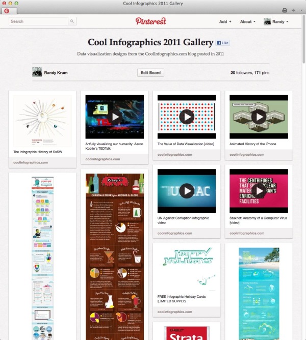
Check out the Cool Infographics 2011 Gallery!  I’m trying an experiment using Pinterest to create a one-page, visual gallery of the infographics I post.  On this board I have pinned every post from the Cool Infographics blog from last year, and it makes a really nice, visual way to browse through the infographics I have shared.  One of the reasons I wanted to play around with Pinterest is that it displays the entire (sometimes very long) infographic, not just a square thumbnail like many galleries.

In general, I keep the 10 most current posts on the front page of the blog.  Once they scroll off the front page, of course their traffic and visibility drops off dramatically.  I’m looking for a way to create a live, growing gallery of the infographic images so these great examples of design can continue to be easily discovered.

Because infographics is, by definition, a visual media, I think people would be more likely to find examples they like and inspiration for their own type of design if there was a better way to browse.  I’m not sure that Pinterest is the answer yet, but it’s certainly worth trying.  On the down-side, I haven’t been able to integrate the Pinterest PinIt button into the blog along with the other social sharing buttons.  Their button doesn’t seem to work with the Squarespace platform I use for the blog.

I am absolutely looking for feedback, so please leave your thoughts in the comments.

Cheers!

Wednesday
Jan182012

The Manual Photography Cheat Sheet

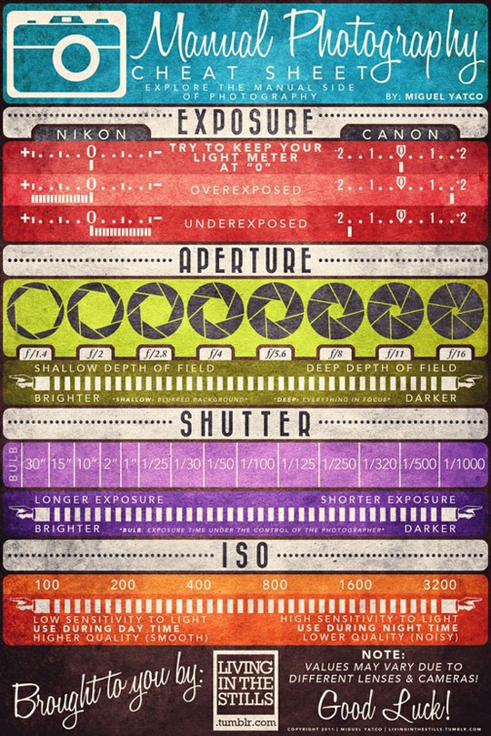
The Manual Photography Cheat Sheet by Miguel “Mig” Yatco is a very cool infographic for anyone who is ready to move off of Automatic Mode on their camera!  Yes, that means you!  Quit taking average photos with average settings!

No matter if you shoot with film or digital, understanding of these four aspects of photography are key to taking good shots.  I love how each one shows the reader the range of values, the impact of moving along the range to the pcitures and what the actual display looks like in the viewfinder on both Nikon and Canon cameras.

The only thing I would have liked to see was a visualization of the changes to depth of field.  How much range is in focus for each aperture setting?

Miguel has prints available on Zazzle.com.  You can buy a printed as a poster for $50, or as small as a 4”x6” card to carry around with you.  The standard size available is 23”x34.5”, but I wish the standard poster size was 24”x36” to fit in standard poster frames.

Great job Miguel!

Friday
Oct142011

Infographics in the Wild - Submit your photos!

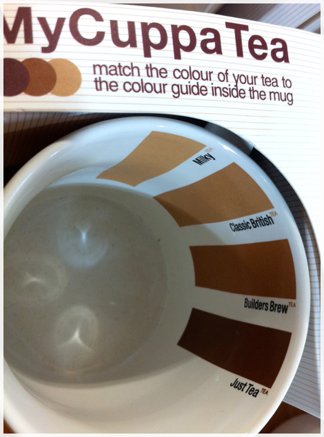
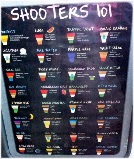
Infographics in the Wild is a new photo group on Flickr started by myself and Robin Richards (ripetungi.com). This photo group is open to everyone.  I post infographics from the Internet here on Cool Infographics almost every day, but there are many, many more examples to be found IRL (in real life) on signs, products, stores, airports, restaurants, etc.  We are asking you to submit any photos of infographics found “in the wild”.

Back in September, Robin posted about Infographics in the wild #1 that he had found around his location in the UK, and we started talking about the idea of starting a photo group where anyone could submit a photo.

I have set the requirement in Flickr that any submitted photos include a geo-tag location so we can also visualize all of the photo locations on the map - just because we all like seeing stuff like that!

Wednesday
May262010

The Top Cameras on Flickr [infographic]

From Column Five Media, comes a simple but elegant analysis of The Top Cameras on Flickr.

Wednesday
Mar312010

What's In MyBag?  [photos]


Chris Watson, from Visual Think Map, started a new network on Ning called “What’s In MyBag” for anyone to share photos of all the stuff they carry in their briefcase or bag.  It’s a fun, visual project that can share a lot of information within only one photo.

Join and share your own photo!