About
Randy Krum
President of InfoNewt.
Data Visualization and Infographic Design

Infographic Design

Infographics Design | Presentations
Consulting | Data Visualizations

DFW DataViz Meetup

Join the DFW Data Visualization and Infographics Meetup Group if you're in the Dallas/Fort Worth area!

Search the Cool Infographics site

Custom Search

Subscriptions:


Feedburner

The Cool Infographics® Gallery:

How to add the
Cool Infographics button to your:

Cool Infographics iOS icon

- iPhone
- iPad
- iPod Touch


Read on Flipboard for iPad and iPhone

Featured in the Tech & Science category

Flipboard icon

Twitter Feed
From the Bookstore

Caffeine Poster

The Caffeine Poster infographic

Entries in relative (157)

Wednesday
May282008

The world as you've never seen it before


Check out WorldMapper! Above is a map of the world based on true Land Mass, but with WorldMapper, you can adjust the size of the countries based on whatever data you are trying to convey.

This is the world map based on Total Population:


This is the world map based on Total Computer Exports:


Alisa Miller, head of Public Radio International, talks about why -- though we want to know more about the world than ever -- the US news media is actually showing less. She uses WorldMapper to communicate her point about the state of today's news in the US.

Monday
May262008

In the Shadow of Foreclosures


Great graphic from NYTimes.com showing the subprime mortgage foreclosures as a percentage of all subprime mortgages by geographic region of the country.

Tuesday
May202008

TweetWheel


I just found TweetWheel, and its really cool. Made by Augusto Becciu.

Enter a Twitter ID (I used my ID: rtkrum), and in real time it will generate a connection wheel built from 100 people that person is following. Hover the mouse over any of the names, and it will show the connections that that person is also following on Twitter.

It takes a few minutes to load the user data.

Friday
May162008

Global Distribution of Water


From the United Nations Environment Programme website, the Global Distribution of Water specifically highlights the scarcity of freshwater.

Found on digg.com

Monday
May052008

Where Does the Money Go?


From the nytimes.com, this graphic visually represents how average consumer spending breaks down, and the color code shows how much spending in that category has changed in the last year. For example, Gasoline is 5.2% of an average consumer's spending, and it has risen 26% from 2007 to 2008.

As far as I can tell, this is actually a treemap, but in a new shape. More details pop-up when you mouse over each of the individual shapes.

Thanks to Tony, for sending in the link.

Sunday
Apr272008

Who Owns the Car Companies? (UPDATE)


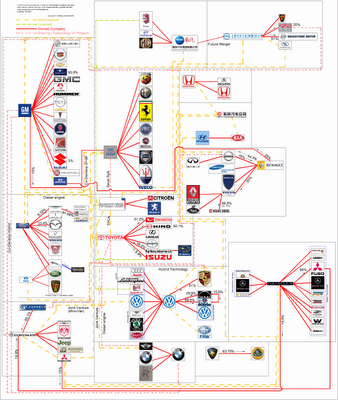
TooManyCars.com has updated their family tree style poster of how all of the car companies are related. The latest updates were as of 4/1/08. They have also changed to better software used to zoom into the poster. Each of rectangles you see on the images will zoom in close so you can read the details about the connections.

They've really done a good job tracking down the specific types of relationships and the ownership portions between the companies. High-res PNG or PDF files are also available.

Wednesday
Apr232008

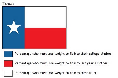
Know your State Flag Infographics


From calorielab.com, is a humorous take-off of the flag infographics from Icaro Doria (Meet the World, Infographic Flags). These infographics based on U.S. state flags, although probably politically incorrect, are very funny.

Thanks to Mark from calorielab.com for sending in the link.

Monday
Apr212008

The Fall of Tech on digg.com


From readwriteweb.com, an area chart showing the decline of Tech stories made popular on digg.com. Although initially the front page of digg.com was totally dominated by Tech stories and the primary users were tech geeks, the World & Business category is now the reigning king with the most stories made popular.

To put this into context, on 1 January 2006 tech stories made up 78% of the total popular stories (i.e. stories that made it onto the digg frontpage). By end of March 2008, that percentage had dropped to 18-20%.


Here you can see the same information charted as total number of stories made popular instead of percentages.


Saturday
Apr192008

Map of World Happiness


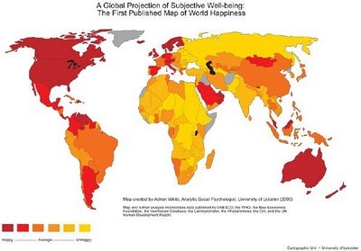
From geostrategis.com, the world's first map of world happiness.

This world map on happiness was distributed through a Globe and Mail article by Sheryl Ubelacker (28/07/06). It is an interesting perspective, but primarily focused on the social side of well being. It provides a strong visualization but lacks the substance to become a strategic or policy significant map. This map was prepared by Adrian White, University of Leicester

Monday
Apr142008

Treemaps for drive space

I don't think I've posted much about specific software programs, but there are a number of infographic programs that anyone can use. These two are programs that analyze what's on your hard drive, and show it you in a treemap display.

The one above is Disk Inventory X for the Mac (which I use), and the one below is WinDirStat for Windows. Both are free, and are real-life examples of how you can use infographics in your life. So take a minute, and clean off some of that old junk taking up space on your hard drive.