About
Randy Krum
President of InfoNewt.
Data Visualization and Infographic Design

Infographic Design

Infographics Design | Presentations
Consulting | Data Visualizations

DFW DataViz Meetup

Join the DFW Data Visualization and Infographics Meetup Group if you're in the Dallas/Fort Worth area!

Search the Cool Infographics site

Custom Search

Subscriptions:


Feedburner

The Cool Infographics® Gallery:

How to add the
Cool Infographics button to your:

Cool Infographics iOS icon

- iPhone
- iPad
- iPod Touch


Read on Flipboard for iPad and iPhone

Featured in the Tech & Science category

Flipboard icon

Twitter Feed
From the Bookstore

Caffeine Poster

The Caffeine Poster infographic

Entries in relative (157)

Wednesday
Jan212009

A New President - Wordle

Wordle: A New President

I don't think I've ever posted about Wordle.net. So I thought this word cloud of President Barack Obama's inaugural address yesterday would be a good example.

Wordle is a toy for generating “word clouds” from text that you provide. The clouds give greater prominence to words that appear more frequently in the source text. You can tweak your clouds with different fonts, layouts, and color schemes.

Monday
Jan122009

Halo 3 HeatMaps


A while back Bungie.net, the makers of the Halo series of games, started tracking data on their servers about how their different online multiplayer maps are preforming.  They converted the data on kills and deaths in the multiplayer games into heatmaps, and then started publishing the maps online for everyone to see.

The advantages to players are that you can see places to avoid (areas with the highest deaths), and the locations from where the most kills come from.  The map above shows the total data for the map called The Pit.  But you can narrow down the information based on the type of weapon used.  For example the map below shows the locations of the kills made with the sniper rifle.  Meaning that shooting from these locations have been the most successful.  (Also helpful if you keep getting killed by snipers and can't find them)


"Heatmaps are the Doppler Radar System of Death in Halo 3. We're tracking encounters, weapons used and their results in a given game, collecting that data and sharing it with players visually. The key here is 'the darker the red, the more frequent the deaths (or kills, depending on the parameters)'," Bungie explains in its weekly update.

Wednesday
Dec242008

The Tallest Building: Burj Dubai


The Burj Dubai is a construction project to build the world's tallest building in Dubai.  Their website has a nice interactive comparison to the other key skyscrapers in the world.  The photo-like images on a black background with the reflection is very similar to the Apple Computer photo slideshows.
The goal of Burj Dubai is not simply to be the world's highest building.  It's to embody the world's highest aspirations.  Burj Dubai looks different depending on where you're standing.  For those living nearby, it is a shining accomplishment - tangible proof of Dubai's central role in a growing world.
Thanks Alwyn!

Friday
Dec052008

The Species-Scape

Christopher Taylor posted this image on his Catalogue of Organisms blog, and it has raised a little controversey about the details.  The intent is that the relative size of each organism in the image is representative of the number of species in that group.  So the large fly represents the huge number of insect species.  Towards that intent, I believe the image succeeds, but I have read some disagreement about the specific numbers used to develop the image.

In case you're wondering where the mammals are, we're represented by the reindeer cowering underneath the mushroom.

Two very similar images with some differences are also available.  One from the University of Sydney:

And another on from Cornell University: (this link wasn't working for me)

No matter which is exactly correct (and there's no way to tell), you get the point how small number of species of mammals are compared to the others.

Thanks Kevin, for sending in the link!

Thursday
Nov132008

Seasonal Visual Timelines


Roberto Rovira, and assistant professor of landscape architecture at the Florida International University's, School of Architecture, was kind enough to allow me to share some of his work with the readers of Cool Infographics.
 
Working as a consultant, these seasonal timelines were developed to show the activities and the plants used in a proposal for a project he led called "Envisioning Hudson Square" on the Hudson River near Manhattan, NY.
 
The first one shows the time of year that different activities would be active in this green area during the year like bicycling, bird watching and ice skating.  It also shows the different wildlife that would be present during the year like blue heron, striped bass and snowy egrets. Using the visual timeline you can see how the different activities overlap and that there would always be some type of activity during the year.
 
The second timeline from the same project show the proposed plant and trees to be used in the project, and with the use of the visual timeline shows their color and appearance throughout the year.
 
Graphics by Roberto Rovira, RLA, with assistance from landscape designer Kelly Woodward. Roberto is Assistant Professor in Landscape Architecture at Florida International University (www.fiu.edu/~soa) and Senior Landscape Architect consultant for ArquitectonicaGEO (www.arquitectonicageo.com), a Miami-based landscape and planning firm. He led GEO's design team and developed the concepts for 'Hudson Square Prints Green!', a proposal for a 30-block New York City district on Manhattan's West Side, adjacent to the Hudson River.

Saturday
Nov012008

Wine Flavor Visualization

A great visualization by Carl Tashian on tashian.com that connects different wine types with the flavors and notes of each.
What is the relationship between wine varieties and flavor components? This visualization attempts to show the strength of these relationships. I culled descriptive flavor words from over 5,000 published wine tasting notes written between 1995-2000 in a major Australian wine magazine.
Via Information Aesthetics.

Wednesday
Oct292008

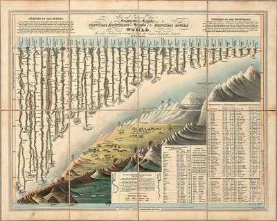
Classic infographic from 1823!


Here's a classic from 1823!  It a hand drawn infographic titled "Comparative Heights of the Principal Mountains and Lengths of the Principal Rivers of The World" by WR Gardner.  The high resolution image is on Flickr, but the post about the image is on bibliodyssey.blogspot.com.

This one makes a great poster!  Thanks Roi for sharing in the comments.

Sunday
Oct262008

Does Your Vote Matter?  YES!


Sticking with the stuff from GOOD magazine, this is one of the GOOD Sheets available for sale as a poster at Starbucks for a limited time.  I've been looking for some good election related graphics.  There are a ton out there, but I'm looking for the gems.

I hear all the time that people don't think their vote matters, and in some cases it may get lost in an election that isn't close or competitive.  However, you never actually know if a race is going to be close or not (unless there is only one candidate).

In some of our local elections, I've seen some decisions put up to vote that won by only 12 votes!

I'm not pushing any specific politcal opinion, just that everyone should get out and vote.  Early voting is already open in many areas, so do your part and be heard!

Monday
Oct202008

NEW Death and Taxes 2009 poster


New Death and Taxes infographic for 2009!  Interactive viewer let's you zoom in to see all of the details.
"Death and Taxes:2009" is a representational poster of the federal discretionary budget; the amount of money that is spent at the discretion of your elected representatives in Congress. Basically, your federal income taxes. The data is from the President's budget request for 2009. It will be debated, amended, and approved by Congress by October 1st to begin the fiscal year.

The poster provides a uniquely revealing look at our national priorities, that fluctuate yearly, according to the wishes of the President, the power of Congress, and the will of the people. If you pay taxes, then you have paid for a small part of everything in the poster. 
The Death and Taxes poster from 2007 was my initial post on Cool Infographics, so I'm very excited to see this update.  Now the 2009 version is available to purchase as a poster here.

Thursday
Oct162008

Brand Tags


BrandTags.net is a project by Noah Brier that gathers user input to create tag clouds for many of the biggest brands in our culture.  You can add your own input into the project on the main page, or browse brand results.  The example above is for Velveeta.

Page 1 ... 7 8 9 10 11 ... 16 Next 10 Entries »