About
Randy Krum
President of InfoNewt.
Data Visualization and Infographic Design

Infographic Design

Infographics Design | Presentations
Consulting | Data Visualizations

DFW DataViz Meetup

Join the DFW Data Visualization and Infographics Meetup Group if you're in the Dallas/Fort Worth area!

Search the Cool Infographics site

Custom Search

Subscriptions:


Feedburner

The Cool Infographics® Gallery:

How to add the
Cool Infographics button to your:

Cool Infographics iOS icon

- iPhone
- iPad
- iPod Touch


Read on Flipboard for iPad and iPhone

Featured in the Tech & Science category

Flipboard icon

Twitter Feed
From the Bookstore

Caffeine Poster

The Caffeine Poster infographic

Entries in scale (154)

Sunday
Sep092007

The Wealthiest Americans Ever


From the NYTimes in July 2007, an interactive infographic ranking the Wealthiest Americans after you convert their fortunes to today's dollars using the relative share of G.D.P.

Scrolling your pointer over the photos or the fortune amount shows more detail of the individual. Lots of black & white portraits! Only current rich folk Bill Gates and Warren Buffet made the list with color portraits.

Thursday
Sep062007

Running the Numbers


Chris Jordan has created some fantastic photographic artwork depicting the massive scale of some statistics about American life. This is where infographics actually become artwork.

The image above "Depicts nine million wooden ABC blocks, equal to the number of American children with no health insurance coverage in 2007." The complete image is 16 feet tall x 32 feet wide.

There are 17 different images available to view on his website. You can see the images magnified there to show the small pieces that each image is made from. Each image is based on an actual statistic about American life.

FYI: This series will be exhibited at the Paul Kopeikin Gallery in Los Angeles, opening Sep 8. More info at www.paulkopeikingallery.com.

Wednesday
Sep052007

Marumushi News Map


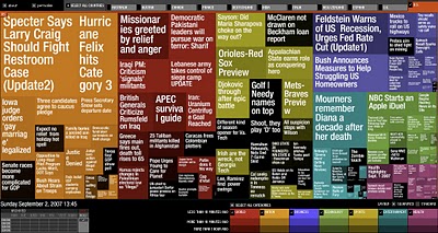
Marumushi.com has a fantastic News Map using the treemap visualization style. This is one of the best implementations of a treemap that I have found. Updated every 6 hours, it groups news stories (from the Google news aggregator) by overall category (technology, world, sports, etc.). You can choose to show the news map from 11 different countries, and the color shading of each block represents how old that particular news story is. Hovering your mouse over any square shows the whole title, and clicking takes you directly to the story.

Sunday
Sep022007

World Population Density


This is a prime example of how seeing the data visually is better than reading numbers. Here is a population density map from Wikipedia.

We have heard that China and India have most of the human population in the world, but here you can really see and understand how much. Reading that China's population is four times that of the U.S. is much harder than really seeing it on a map.

The Wikipedia page on World Population has some other great information too.

Sunday
Aug262007

Drawing Disney Characters


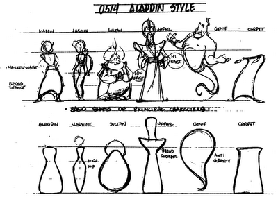
Silver Bullet Comics has an article for aspiring comic artists, but I found this little gem.

A very simple infographic demonstrating that characters much each have a distinctive shape that makes them recognizable even from a distance. Very similar to the “silhouette test” for good character drawings to be recognizable in silhouette.

Sunday
Aug122007

Starship Dimensions


As a follow-up to my earlier post on the Starship Comparison Poster, the Starship Dimensions website has a much more extensive library of sci-fi ships all shown to scale. There are so many here that the website is broken up into different pages from small scale up to "Big" scale. Click on the tabs across the top to pick a scale (100X, 10X, 1X, etc.).

Fantastic resource. Jeff Russell has done a great job accumulating the images and tracking down their relative sizes.

Wednesday
Aug082007

2008 Presidential Campaign Finances


This interactive infographic from the New York Times website is really impressive. Using weekly data reported by the Federal Election Commission, it plots the contributions on a map of the U.S. and sizes the bubbles based on contributions from that city. It has data from every week since January 1st, so it will also "play" and animated version showing the contribution as time progresses (similar to the Trendalyzer that Google purchased from GapMinder).

You can also search for specific contributors to see which candidate campaigns they have contributed to, and how much they gave.

Saturday
Aug042007

Executive Salary Comparison


Portfolio.com has a number of good interactive infographics on their News & Markets/Multimedia page.

This Salary Comparison is simple but hugely informative showing the difference in number and visual representation of size, but also over time as you move the slider on the left. In 2005 the difference between the average worker and the CEO is so large it doesn't fit on the screen anymore. But that is down from 2000 when the difference was the largest at 548x.

Sunday
Jul222007

Death and Taxes 2008

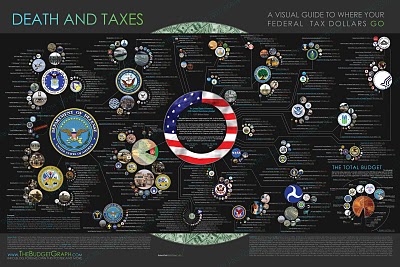
NEW Death and Taxes infographic for 2008!


It is the 2008 Federal discretionary budget of the United States. is a representational poster of the federal discretionary budget; the amount of money that is spent at the discretion of your elected representatives in Congress. Basically, your federal income taxes. The data is from the President's budget request for 2008. It will be debated, amended, and approved by Congress by October 1st to begin the fiscal year.
So this is what the President is asking for, not the final budget. Compare this to the final 2007 discretionary budget from my earlier post.

An interactive Flash version is online at www.thebudgetgraph.com/poster.

Thursday
Jul192007

The Size of Our World


This is a simple, but great infographic. How big are the planets? How big is our Sun? How small is the Earth? The site shows five different images on increasingly larger scales.

No numbers or measurements. Easy to understand. So simple, yet SO informative.

The Size of Our World