About
Randy Krum
President of InfoNewt.
Data Visualization and Infographic Design

Infographic Design

Infographics Design | Presentations
Consulting | Data Visualizations

DFW DataViz Meetup

Join the DFW Data Visualization and Infographics Meetup Group if you're in the Dallas/Fort Worth area!

Search the Cool Infographics site

Custom Search

Subscriptions:


Feedburner

The Cool Infographics® Gallery:

How to add the
Cool Infographics button to your:

Cool Infographics iOS icon

- iPhone
- iPad
- iPod Touch


Read on Flipboard for iPad and iPhone

Featured in the Tech & Science category

Flipboard icon

Twitter Feed
From the Bookstore

Caffeine Poster

The Caffeine Poster infographic

Entries in timeline (240)

Wednesday
Dec302009

The Last 10 Years...Visually


Great chart by Phillip Niemeyer over on NYTimes.com, Picturing the Past 10 Years.  Using icons and unique pictures, Phillip captures the key event of each year in 12 different categories.

Found on FlowingData, WeLoveDataVis, and it was tweeted but a few people on my Twitter list, Cool Infographics People.

Thursday
Dec242009

The Holiday Economy


Our Present Economy is a look at holiday spending from 1997-2007 with some specifics about 2007.  It doesn't say explicitly, but I believe this is for the U.S. only.  From GOOD Magazine, this Good Sheet was available at Starbucks during the holiday season in 2008.

I wonder how 2009 compares?

Thursday
Dec172009

The Simpsons 20th: Comedy [Family] Tree


The Simpsons celebrate their 20th anniversary this week on Thursday, and CNN Entertainment published this chart "The Simpsons Comedy Tree" on Monday.  A combination Nightingale Rose Graph (also called a polar area diagram), family tree and timeline, this simple chart connects the influences that impacted Matt Groening and the creators of the Simpsons as well as the shows that came after.
"The Simpsons" stands on the comedic shoulders of many that came before -- and has influenced countless works that have arrived since. Here are just a few of the roots of the "Simpsons" comedy tree and the branches of those it gave life to. (The following, illustrated by the doughnut at the top of the story, is by no means complete, and each member has its own, sometimes overlapping influences.) 
Thanks to Tony Hendra's "Going Too Far" for inspiration and cartoonist Art Spiegelman for having his fingerprints all over the place.
The article also includes descriptions of the actual influence for each of these shows.

Thanks for the link Matt!

Also:


For those Simpsons fans of you, here is also the poster created exclusively for Entertainment Weekly celebrating the release of the 20th season DVD set on Jan 12.  Dude, make sure to go look at the large, scrollable version.

Wednesday
Dec092009

The Origins and Paths of Epidemics


This world map shows the origins and spreading paths of Malaria, Leprosy and Small Pox. No legend, but the implication is that as the main arteries diminish in width down to small capillaries represents the number of infection cases.  Key dates and locations are also identified with event description.

There is no designer byline on the graphic, but map is credited to Haisam Hussein.  I don't see the map in the gallery on Haisam's website, but he is given credit for the map on Lapham's Quarterly.

Found on digg.com.

Monday
Dec072009

A Visual History of the Supreme Court - New Infographic Poster!


Today, I want to share the launch of Timeplots.com.  A new infographic site focused on designing visual timelines by Nathaniel Pearlman and Frank Hamilton.  The Timeplots.com site launched today highlighting their first project; a poster called “A Visual History of the Supreme Court of the United States”.

This large-scale (48″x32″) print displays the full sweep of American federal judicial history from 1789 to 2009. It combines biographical information on every Supreme Court justice with a visualization of the influence of U.S. presidents and their political parties on the Court over time, and includes vote counts and summaries of landmark cases.

Months of work went into researching the history of the Supreme Court, and that effort really shows through in the level of detail in this poster.


It’s a good thing they offer this as a large format poster, because the detail draws you closer to discover the events and landmark decisions that are the colorful history of the SCOTUS (Supreme Court of the United States).


I love that even on their About page, they created small, infographic timelines as a visual of their individual experiences and career histories.  Here’s Nathaniel’s:


Timeplots has also started a new service, Timeplots on Demand:

Timeplots’ dedicated staff is ready to work directly with you to honor your own organization—your company, school, nonprofit, team, church, or family—with a custom Timeplot of your institution’s history. Let us help you collect data, create memorable images, and visualize the developments of your institution.

Congratulations to both Nathaniel and Frank!


Wednesday
Dec022009

Ebay Visualizes Black Friday 2009 - Interactive infographic map


From ebay, a map of the transaction activity on Black Friday 2009 (the shopping day after Thanksgiving).  1 million transaction are mapped in the U.S. over the course of the day!
Activity Level Indicator The color of the point on the map indicates the number of transactions that occurred in the corresponding area.
Data Execution This transaction map was created as a study of the extensive activity that occurs in the eBay Marketplace on the biggest offline shopping day of the year. It is a visualization of all U.S.-based buyer and seller transactions on eBay on Black Friday, November 27, 2009 (12:00:00 AM to 11:59:59 PM EST). Although eBay is an international marketplace, this map is focused on U.S. data, as Black Friday is the traditional beginning of the holiday shopping season for the U.S.
It's an interactive, animated timeline, so you can watch the transactions grow throughout the day and zoom in to specific areas of the country by clicking on the map.  It's a flash animation, but there's a WMV movie file available for download too.

They also did a map of the even bigger 1.4 million transactions on Cyber Monday 2009.

Found on VizWorld


Monday
Nov232009

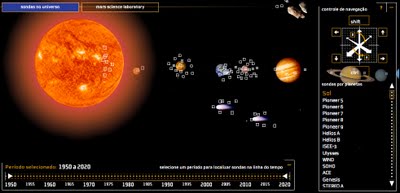
Probes in the Universe - cool interactive infographic


Space Probes is a very well-done interactive graphic about all of the space probes we have launched, visually placing the probes in orbit around the object they are observing.  You can move around the 3-D space with the keyboard controls, change the date range with the sliders on the bottom or go directly to a particular probe from the list on the right that is group by planet or object they are around.  When you mouse-over a particular probe you get more details and an image.


The article and the infographic are in Portuguese from Brazil, so I took the liberty of using the Google Translator for a little help.
The infographic "Space Probes" Super, produced by the team of Internet Editora Abril Jovem, took the silver medal in the category Online Malofiej, top prize in the world of computer graphics.
Thanks to Daniel for the link and a little more information:
It won Malofiej's silver medal (first place, no gold medal) this year. 
It's an infographic about all space probes launched until the date it was published (except Earth probes, which are too many). The info has information about each probe, including the organization(s) that sent it, the target planet(s) (or moons, asteroids, comets and the sun), launch date and mission details, as well as pictures for most of them. User can navigate through our Solar System using the mouse and/or keyboard. It's also possible to know the details of Mars Science Laboratory, the next NASA probe to visit the red planet. The info is in Portuguese, but anyone can understand it's features and learn a little bit about space exploration so far.

Tuesday
Nov102009

The Timeline of Michael Jordan


Created by Khoi Nguyen as a class project, The Timeline of Michael Jordan lays out the key events of his spectacular career with iconic images representative of each time period.  A little design work work makes what could be a simple timeline into a great infographic that draws the reader in.

Check out Khoi's blog/portfolio.


Great work Khoi!


Wednesday
Nov042009

XKCD: Movie Narrative Charts


Great post by the XKCD online comic series!  They occasionally post a infographic-style piece, and this one doesn't disappoint.

Created by Randall Munroe at XKCD, the Movie Narrative Charts plot the interactions between key characters on a timeline, grouping the character lines together when they are interacting in the movies.  He obviously spent some time working on these, and be sure to check out the detail in the full size version.


The last two are jokes, but the ones for Lord of the Rings, the original Star Wars Trilogy and Jurassic Park are real and very well done.  I love the Primer chart poke at trying to follow the movie!  Not as mainstream as the other movies, but it's definitely appropriate.  I'd love to see how Randall would chart Memento!

Thanks Tom for the email link!  Popular on the blogs, this was also found on Infothetics, FlowingData, SimpleComplexity, VizWorld and Fast Company.

Friday
Sep042009

New Hans Rosling video, using GapMinder (Must see!)

New TED Talk video of Hans Rosling talking to the U.S. State Department, "Let my dataset change your mindset".  Using the GapMinder software that was purchased by Google, Hans shows the third world isn't as far behind the U.S. as most people believe.