About
Randy Krum
President of InfoNewt.
Data Visualization and Infographic Design

Infographic Design

Infographics Design | Presentations
Consulting | Data Visualizations

DFW DataViz Meetup

Join the DFW Data Visualization and Infographics Meetup Group if you're in the Dallas/Fort Worth area!

Search the Cool Infographics site

Custom Search

Subscriptions:


Feedburner

The Cool Infographics® Gallery:

How to add the
Cool Infographics button to your:

Cool Infographics iOS icon

- iPhone
- iPad
- iPod Touch


Read on Flipboard for iPad and iPhone

Featured in the Tech & Science category

Flipboard icon

Twitter Feed
From the Bookstore

Caffeine Poster

The Caffeine Poster infographic

Entries in timeline (240)

Wednesday
Aug112010

Time Travel in Popular Movies and TV infographic

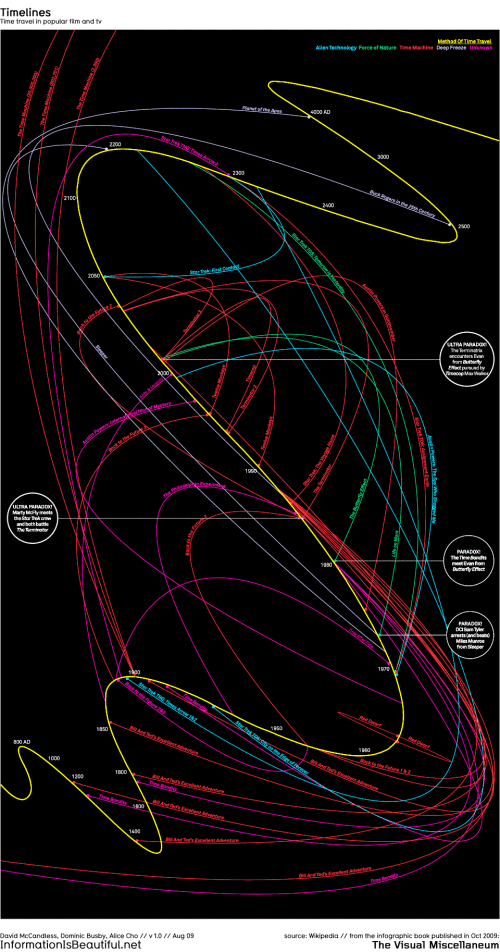
I couldn’t believe that I hadn’t posted this one by David McCandless from InformationIsBeautiful.net.  Timelines: Time Travel in Popular Film and TV is one of my favorites, and you can tell how much effort went into the design and getting the details right.

Here’s a visualisation of time travel plots in various films and TV programs. I had a lot of fun doing this!

This is a straight data visualisation, rather than information design. That is, it’s not particularly useful, nor useable, nor meaningful. The inspiration was the coolness of the idea, really. I was excited to see what shape all the plots would make, and whether it could be shaped into something beautiful.

What I really love about this image, though, is the idea that this information has never been seen before. Despite the fact that it exists, in some way,somewhere, wrapped in various plots, it’s never been given form. I have to say, it was a joy to untangle it all :)

David, I would love to help design one for Dr. Who!


Tuesday
Jul132010

Google's Social Media Timeline

From Mashable.com, Google’s Long History of Forays’s into Social Media is a timeline of acquisitions, deals and updates showing Google’s attempts to get involved in Social Media.

Google hasn’t had the best track record when it comes to social media attempts. Rather than a boring old list of past efforts, we decided to put together a graphical timeline with text by our very own Stephanie Marcus and graphics by Shane Snow.

Wednesday
Jun302010

Interactive 2010 FIFA World Cup Game Tracker


There are many World Cup infographics this year but I thought this 2010 World Cup Game Tracker from Positive Studio was really done, so I decided to share.

As football fever sets in we decided to make a very handy World Cup game tracker. There’s no need to ask your pals ‘who’s playing who’ anymore because this automatically updates daily with all of the fixtures & match results.

An interactive infographic that let’s you see the past results and the future scheduled games on a circular timeline.  The center arc shows you how much of the schedule has passed up to the current date, and there are clickable arcs for Group Matches, Last 16, Quarter finals, Semi Finals and the Final match.

Thanks to Mike Jenkins from Positive for sending in the link!

Friday
Jun252010

Timeline for Planet of the Apes

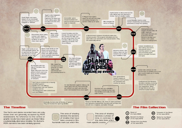
Created by Phil Laver, the Planet of the Apes Timeline of Events covers events across all five of the movies.

The facts and dates recorded here are only those that are generally accepted by POTA statisticians.  No reference to the comics or graphic novels have been given as these follow a substantially alternative timeline.  Tim Burton’s POTA narrative has been similarly ignored.

Phil also had his timeline infographic displayed during an exhibition, you can see a couple photos here.

Thursday
Jun242010

Google's History of Communication Infographic

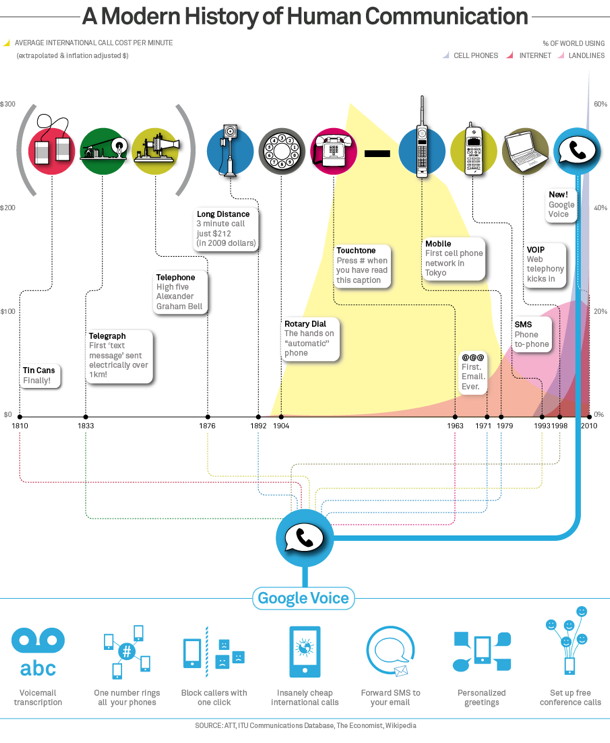
Google posted this infographic, A Modern History of Human Communication, on the Official Google Mobile Blog as part of their opening up the Google Voice service to everyone.  It’s no longer an invite-only service.

To put things in context, we created this infographic to visualize some recent history of human communication and how Google Voice uses the web to help people communicate in more ways than ever before (click the image for a larger version):


Thursday
Jun102010

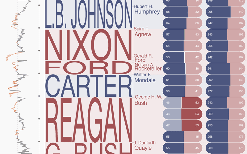
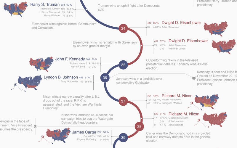
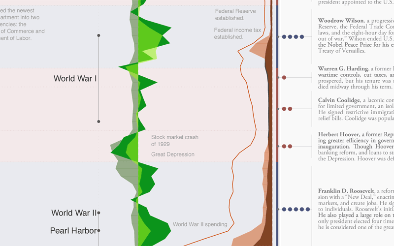
A Visual History of the American Presidency - new infographic poster


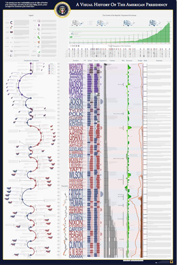
Timeplots has released their second infographic poster, A Visual History of the American Presidency.  Timeplots was launched by Nathaniel Pearlman and Frank Hamilton in December 2009 with the release of the Visual History of the Supreme Court infographic poster, which is now hanging in many schools, law practices and political offices.

This large-scale print is like nothing else available on the history of the American presidency. It places each president in historical context, visualizing a remarkable range of political, social, and economic measures to succinctly tell the story of the presidency. Narratives are displayed within the larger context of American political history by aggregating and annotating hard data on population, presidential elections, Congress, the Supreme Court, the Cabinet, the U.S. economy, and the federal budget and debt. The Timeplot provides a new lens into American political history; it is not intended to be absorbed at a glance, but rather to be visited and revisited over time.


A beautiful poster, and a very impressive infographic design.  Very Tufte-like in its infographic design, which is no surprise since Nathaniel was a student of Edward Tufte at Yale.  

At its heart, this is a fantastic mix of timelines.  Additionally, the poster is an incredibly detailed infographic that includes things like the time period of each President, the balance of Congress during each term, approval ratings, population growth, the U.S. GDP, the Federal Budget, unemployment, election cartograms and statistics, a biography of each President’s political history and so much more.


The high-resolution infographic is available on the Timeplots site using Zoomify, but it really shines as the printed poster.  You can order the printed 32”x48” poster from the Timeplots.com site for $45, or a smaller 24”x36” version for $30. 


Great job to the entire team at Timeplots!  Later today, I’ll post a behind-the-scenes interview with Nathaniel.

Friday
May282010

The Evolution of the Television - infographic timeline

The Evolution of the Television looks at the last 84 years of TV’s history.  Brought to us from the Sterling Satellite blog.

Did you know it took 13 years for television to reach 50 million users? TV has evolved from the time it started with just a few programs airing each day into 24/7 news and hundreds of stations to choose from.

People didn’t immediately embrace the new technology though. 10 years after its debut in 1936, the head of 20th Century Fox Darryl F. Zanuck (seeing TV as a competitor to movies) famous last words were predicting it would not catch on.  He said he thought “People will soon get tired of staring at a plywood box every night.”

But they have not.

Thanks to @Matt_Siltala for the link!

Thursday
Apr292010

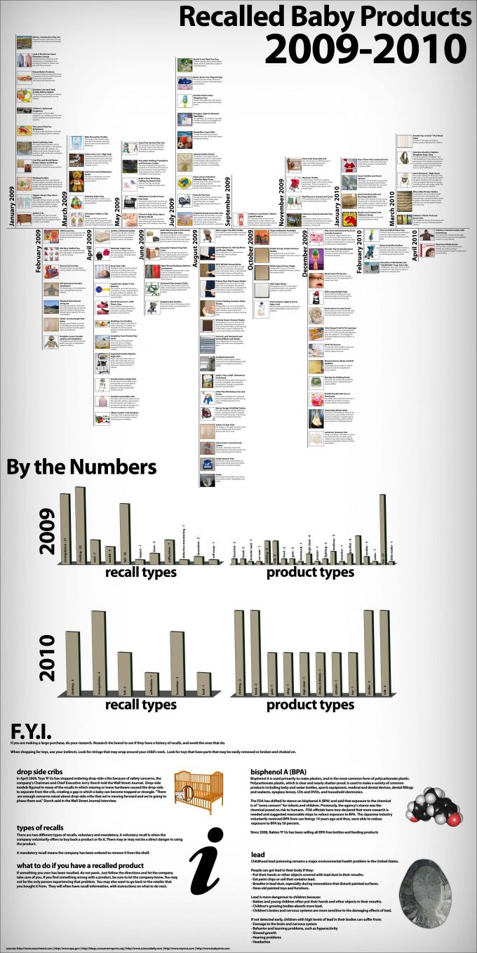
Recalled Baby Products infographic

The team at HugaMonkey.com has created this neat timeline of Baby Product Recalls in 2009 and 2010.  The timeline is the main feature, but they also broke down the recalls by injury and product type in the bar charts below.

Thanks Matt for the link!

Monday
Apr262010

Visualizing Tax Brackets

Steve and the infographic team from WeatherSealed.com bring us this great infographic that visualizes the historical U.S. income tax brackets.

Yes, in the 1950’s and 1960’s the top tier tax bracket was a staggering 90%!

To illustrate, Weather Sealed’s infographic team charted the historical U.S. income tax brackets for singles, adjusted for inflation, from 1910 to present.  The colors indicate the marginal tax rate: black for low, red in the middle, and yellow for high.  The horizontal axis is the tax year, and the vertical represents taxable income, log-scale, normalized to 2010 dollars with the Bureau Of Labor Statistics’ monthly CPI-U figures.  The bracket data comes from The Tax Foundation and the IRS, and the effects of Social Security, capital gains, AMT, and other tax varieties are not included.

Found on ChartPorn.org and VisualizingEconomics.com

Monday
Apr262010

Cooking for Engineers...recipe infographics! (and interview)

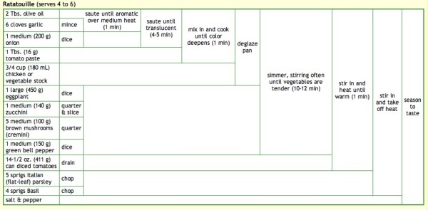
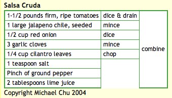
Michael Chu has been running the CookingForEngineers.com site for 6 years now, and he developed this infographic recipe table using HTML tables.  His recipe table is essentially a timeline of making that particular recipe, but also lists every ingredient, ingredient amounts, recipe instructions and the points in time they are added to the dish.  All in one, compact visual image.  Outstanding!

Michael also demonstrates each step of the recipes with pictures so you know what it should look like when you attempt the recipe.

Michael was also nice enough to answer a few interview questions I sent him:

Cool Infographics: What software applications do you use for the recipe graphics?

Michael: I use a text editor and write the HTML for the recipe tables by hand.  For the graphics used on my business cards and T-shirts and other merchandise, I copy and paste the browser rendered table into excel for some slight tweaking. Then I copy and paste into Adobe Illustrator for final adjustments.

Cool Infographics: What was your inspiration behind developing the recipe graphic?

Michael: I developed it on my own based on a shorthand notation that used for years to write down recipes on Post-It notes involving curly braces and actions scrawled on the side.

Cool Infographics: Have there been any recipes that have been particularly difficult to visualize?

Michael: Some recipes, especially ones involving discarding part of the ingredients and reintroducing ingredients at various points in time do not lend themselves to the recipe summary table.

Cool Infographics: What’s your most complicated recipe graphic?

Michael: It’s hard to determine… most recipes don’t come out all that complicated. The real trouble is that sometimes browsers act funny and start sticking in vertical or horizontal lines where they do not belong.

http://www.cookingforengineers.com/recipe/227/Ratatouille

http://www.cookingforengineers.com/recipe/60/The-Classic-Tiramisu-original-recipe


Cool Infographics: I keep calling it a recipe graphic, what do you call that visual style?

Michael: I call them either recipe summary tables or Tabular Recipe Notation (TRN).

Cool Infographics: Have you seen anyone else start to use that type of visual graphic for recipes?

Michael: After I started using it, I have had a few people email asking permission to use the format for their own recipe books, etc.

Cool Infographics: How long have you been running Cooking for Engineers, and have you been using that recipe graphic the whole time?

Michael: Cooking For Engineers has been up and running since June 2004 and we’ve been using the table from day one. Incidentally, the first recipe posted is this one:

http://www.cookingforengineers.com/recipe/53/Salsa-Cruda


Check out all of Michaels’ recipes at CookingForEngineers.com