About
Randy Krum
President of InfoNewt.
Data Visualization and Infographic Design

Infographic Design

Infographics Design | Presentations
Consulting | Data Visualizations

DFW DataViz Meetup

Join the DFW Data Visualization and Infographics Meetup Group if you're in the Dallas/Fort Worth area!

Search the Cool Infographics site

Custom Search

Subscriptions:


Feedburner

The Cool Infographics® Gallery:

How to add the
Cool Infographics button to your:

Cool Infographics iOS icon

- iPhone
- iPad
- iPod Touch


Read on Flipboard for iPad and iPhone

Featured in the Tech & Science category

Flipboard icon

Twitter Feed
From the Bookstore

Caffeine Poster

The Caffeine Poster infographic

Entries in timeline (240)

Wednesday
Oct272010

Client Infographic: The Visual History of Halloween

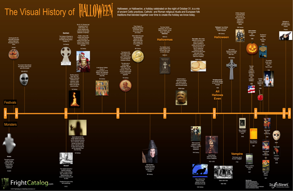
The Visual History of Halloween infographic poster


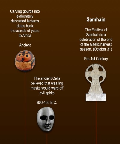
Parties, Costumes, Food, Ghosts, Vampires, Witches, Jack-O-Lanterns…oh my!  Halloween is one of the world’s favorite holidays, and The Visual History of Halloween brings all of the diverse history and influences together at last.  Estimated as a $6.9 Billion industry today, Halloween is actually the combination of at least six different festivals and celebrations from hundreds (even thousands) of years ago.  Click HERE to see the high-resolution version.

InfoNewt (my company) designed this one mainly focused on the historical foundation of Halloween.  I’m sure a completely separate timeline could be made just covering the last 100 years of commercializing Halloween, but I tried to stay away from most of that with this one.

This was actually a very fun project, and a perfect topic for an infographic because the information available is so diverse and scattered.  Of course, when you talk about history going back this far, there is also disagreement on what really happened.  So, I plotted the most commonly accepted events and dates I could find.  I had to pull from a handful of different sites to get all of the pieces to fit together.


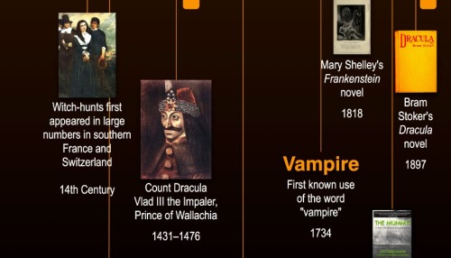
Ghosts, werewolves and witches have a long history.  It’s not until much more recent times that many of the other monsters we relate to Halloween appear.  Count Dracula, vampires, Dr. Frankenstein’s monster, The Mummy, Jason and all of the horror movie villains appear in the last 300 years.


My time to complete this project was short, but I believe I captured the most critical events in history.  Wouldn’t this make a great poster?

A big thanks to Erick and the team at FrightCatalog.com

Friday
Oct222010

Critical Thinkers Through History

From ThinkWatson.com, Critical Thinkers Through History is a nice visual timeline that show photos or images of some of the greatest critical thinkers in human history.

What do Sigmund Freud, Henry Ford, Frank Lloyd Wright, and Marie Curie have in common? They were great critical thinkers that all made their mark in history! Here’s a chart of some of the top critical thinkers through history. It’s not comprehensive by any means, but see if you agree!

Who else should be on the list?

I think the timeline should go back farther in time, although photos would be a problem.  Sun Tzu, Aristotle, Galileo, etc.

Thanks to Matt for sending in the link!

Tuesday
Oct052010

The Darwinian Evolution of Microsoft Windows


This is a cool infographic timeline, showing the Darwinian Evolution of Microsoft Windows from version 1.0 in 1985 up through the current Windows 7 in 2009.  Although it makes for a really tall infographic, I love seeing the visuals of the startup screens and the desktops.

Art is credited to Richard Cavolo, and the project is from TestKing.com (even though I can find no mention of it on their site).  It was posted on BitsandPieces.us

Wednesday
Sep292010

The World Without Apple


The World Without Apple, from Infographic Labs is a great design.  The main feature combines the history of Apple’s products in a timeline with its stock prices and new product introduction prices.  Also included are some statistics about the app store and all of the different aspects to Apple’s business.

The AppleGazette team asked us to analyse the complete product timeline and stock value of the Cupertino based company. The result is another stunning graphic, first published at AppleGazette.


Tuesday
Sep282010

Converging Flight Paths - Airline Merger Infographic

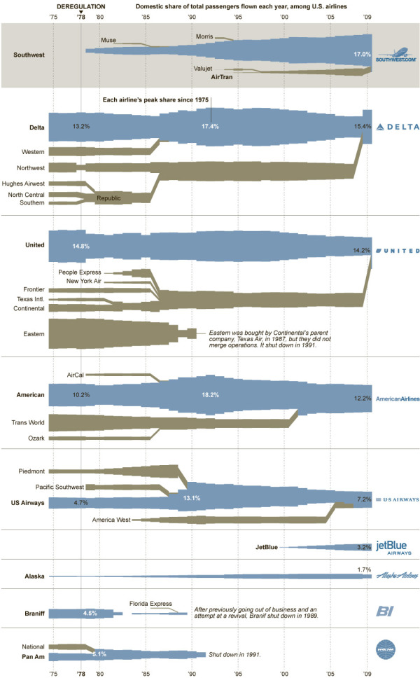
I really like this one from the NYTimes.com.  Converging Flight Paths visualizes the airline mergers over time from 1975 to today, but also shows the “Domestic share of total passengers flown each year.”

The deregulation of the airline industry in 1978 led to a wave of mergers that continues to this day. But even as the legacy carriers have been consolidating and growing, they have been losing market share to low-cost carriers. Two of them, SouthWest and AirTran, have just agreed to merge and carried the most domestic passengers in 2009 combined. But if international passengers were included, this ranking would be greatly rearranged.

By KARL RUSSELL/The New York Times.  Sources: American Transport Association (passenger data 1975-89); Bureau of Transportation Statistics (passenger data 1990-2009)

Link from Elliott Ng on Twitter.

Tuesday
Sep072010

GE Ecomagination Challenge “Powering the Grid” Visualized

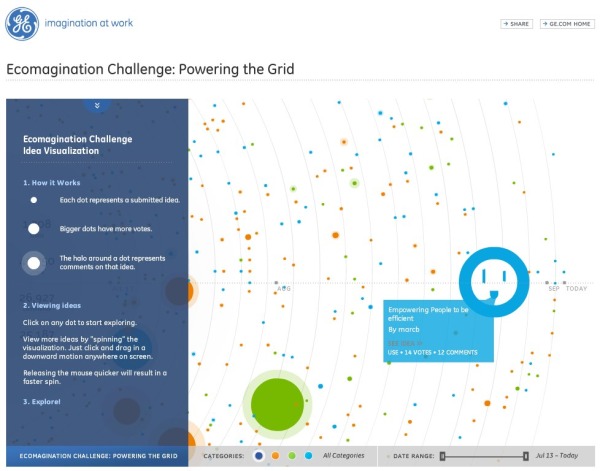
From GE, this is a visual interface/tracking system of the Ecomagination Challenge: Powering The Grid.

This is a data-heavy visualization.  Each submitted idea is a dot, and the concentric rings are a timeline expanding outward from July 2010 to today.  The dot colors represent the idea categories (Create Power, Connect Power and Use Power).  The size of the dot represents how many votes each idea has received and the additional halo around a dot represents the number of comments left by others on that idea.  I can’t tell, but I hope they use the values to calculate the “area” of each dot and not it’s “diameter”!

“…our data visualization teams have put their design skills to work on GE’s new “ecomagination Challenge: Powering the Grid.” Backed by $200 million in venture capital funds from GE and its partners, the goal is to find the best ideas from researchers and entrepreneurs that will help accelerate the adoption of smart grid technologies. But it can be a daunting task plowing through the more than 1,400 submissions to-date (and growing). So, as you can see in the data visualization, the entries have been represented graphically, with the circles representing clickable ideas.”

I really like the Solar Roadways idea!

Thanks to Megan for sending the link!

Wednesday
Sep012010

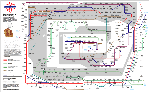
Subway Science: 500 Years of Great Scientists

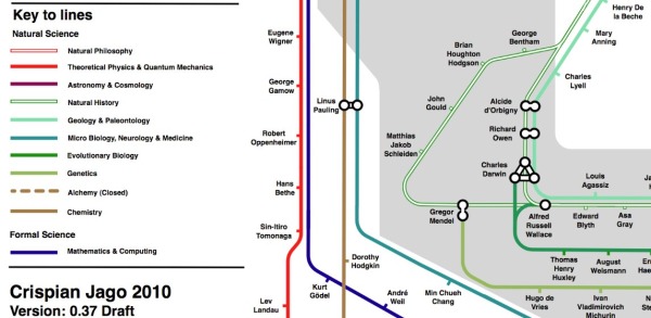
Crispian Jago created this great subway map of the top scientists in the last 500 years.  Subway Science plots the science celebrities by discipline (subway track), connections where appropriate and the shaded rings in the background show the timeline by century (the outer ring is the 20th century).  Sir Isaac Newton crosses 5 lines…either a great multi-tasker or ADHD.


You can see that Crispian has tagged this as DRAFT version 0.37, and he already has a huge number of comments on his Science, Reason and Critical Thinking blog post.  I expect there will be revised versions in the future.

Where’s Sheldon Cooper?!?

Found on Bad Astronomy and Visual Loop

Tuesday
Aug312010

30 Years of Asteroid Discoveries Animated

This is a very cool video animation, Asteroid Discovery From 1980 - 2010, of asteroid discoveries over the last 30 years.  Not only does it show the orbits of the asteroids in relation to the inner planets, it highlights them over time as they were identified and colors them according to how close to Earth their orbits will come.

The only visual inaccuracy is the size of the asteroids.  Since the asteroids have to be at least one pixel wide to appear in the animation, they are represented much larger compared to the planets than they really are.

View of the solar system showing the locations of all the asteroids starting in 1980, as asteroids are discovered they are added to the map and highlighted white so you can pick out the new ones. 
The final colour of an asteroids indicates how closely it comes to the inner solar system. 
Earth Crossers are Red
Earth Approachers (Perihelion less than 1.3AU) are Yellow
All Others are Green

Notice now the pattern of discovery follows the Earth around its orbit, most discoveries are made in the region directly opposite the Sun. You’ll also notice some clusters of discoveries on the line between Earth and Jupiter, these are the result of surveys looking for Jovian moons. Similar clusters of discoveries can be tied to the other outer planets, but those are not visible in this video.

As the video moves into the mid 1990’s we see much higher discovery rates as automated sky scanning systems come online. Most of the surveys are imaging the sky directly opposite the sun and you’ll see a region of high discovery rates aligned in this manner.

At the beginning of 2010 a new discovery pattern becomes evident, with discovery zones in a line perpendicular to the Sun-Earth vector. These new observations are the result of the WISE (Widefield Infrared Survey Explorer) which is a space mission that’s tasked with imaging the entire sky in infrared wavelengths. 

Currently we have observed over half a million minor planets, and the discovery rates show no sign that we’re running out of undiscovered objects.

Orbital elements were taken from the ‘astorb.dat’ data created by Ted Bowell and associates at 
http://www.naic.edu/~nolan/astorb.html

Music is ‘Transgenic’ by Trifonic: 
http://www.amazon.com/Emergence-Trifo…

Quite a few journalists, bloggers and tweeters are attributing this to NASA or Arecibo Observatory - while they do fine work they had nothing to do with this. If you write a story you can credit it to Scott Manley.

Found on FlowingData and VizWorld 

Friday
Aug272010

Google(graphic) - Google's Acquisition Appetite

From Scores.org, a data-heavy Google(graphic) by Jess Bachman, Google’s Acquisition Appetite.  Visualizing almost 10 years of Google’s acquisitions and investments, and there’s hardly a month that Google didn’t invest in something.

I like the multiple dimensions to the data.  Three columns show how the acquisition helped Google, the colors of each acquisition show what assets were gained, an additional circle shows the value of the acquisition (if it is known) and of course the timeline aspect.

Great job Jess!  I’d love to see you keep this updated somewhere.


Monday
Aug232010

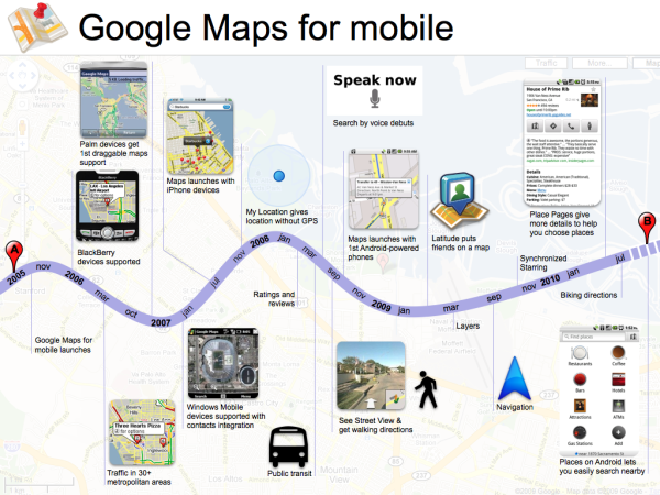
Google Maps for Mobile timeline

Last week, Vic Gundotra, Vice President of Engineering ay Google, posted the Google Maps for Mobile timeline on the Google Mobile Blog as part of his post on the history of Google Maps for Mobile Devices.