About
Randy Krum
President of InfoNewt.
Data Visualization and Infographic Design

Infographic Design

Infographics Design | Presentations
Consulting | Data Visualizations

DFW DataViz Meetup

Join the DFW Data Visualization and Infographics Meetup Group if you're in the Dallas/Fort Worth area!

Search the Cool Infographics site

Custom Search

Subscriptions:


Feedburner

The Cool Infographics® Gallery:

How to add the
Cool Infographics button to your:

Cool Infographics iOS icon

- iPhone
- iPad
- iPod Touch


Read on Flipboard for iPad and iPhone

Featured in the Tech & Science category

Flipboard icon

Twitter Feed
From the Bookstore

Caffeine Poster

The Caffeine Poster infographic

Entries in timeline (240)

Monday
Aug102009

What is Your Wine Personality?


From the Texas Department of Agriculture at GoTexanWine.org, the Wine Personality Wheel comes from the Texas in a Bottle guide to Texas Wine (download as a pdf).  I love the sense of humor.
Ever listen to somebody describe a wine?  They talk about it having "character" and "personality."  To hear them tell it, wines are a lot like people.  We've talked it over and came to a conclusion - they have it backwards.  People are a lot like wines.
Here at the Viticultural Personality Institute, we've compiled a fun list of personality types based on wine preferences.
If your favorite wine listed here does not accurately reflect your particular personality, please choose another favorite wine (or change your personality - otherwise, you'll make our researchers look bad).

Looking around the GoTexanWine.org site, I also found a good, animated timeline (link) of the history of wine in Texas.


Eight federally approved Viticultural Areas currently exist in Texas. Eighty-five percent of wine from a Viticultural Area must be made from grapes grown within the area's boundaries. If the wine is a varietal, 75 percent of that wine must be made from the designated grape variety.

Monday
Jul272009

Amazon Acquisitions infographic


Found on meettheboss.com, a decent infographic of the acquisitions that Amazon.com has made over the years.  Drawn like an org chart, I like that each branch represents another year, so it becomes a timeline.

Tuesday
Jul212009

The American Dream/Nightmare


I really like this one from gimmiethescoop.com.  It’s pretty simple (it’s a 3D column chart), but it get’s it’s point across well.  The accumulated debt for the average American continues to outpace their annual income.  The concept of living beneath your means is foreign to a lot of people.


Found a link on nerdmodo.com

Friday
Jul032009

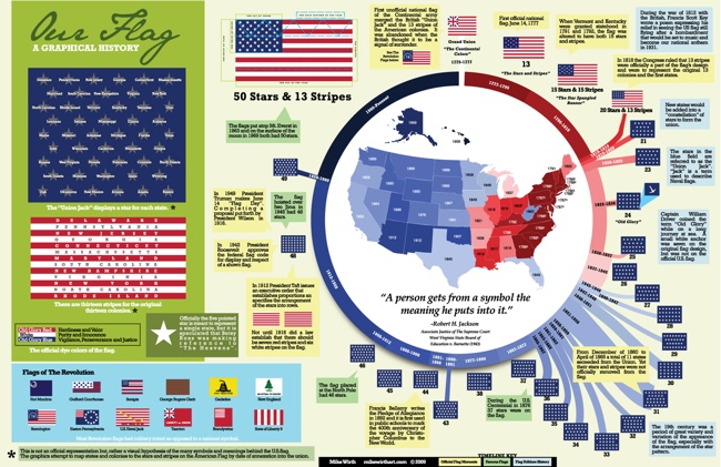
Graphical History of the American Flag


A great infographic for America's Independence Day from Mike Wirth.  The graphical history of the American Flag shows a circular timeline of when changes were made over the years and when stars were added.  I love additional information Mike included like the official folding pattern and the state each star represents by showing them chronologically.  Makes a great poster!


Tuesday
Jun232009

The Story (so far) of Twitter


Graphic designed for Manolith.com, by infoshot.  It’s a reverse timeline of Twitter.

Twitter, Twitter, Twitter. Seems every where you turn these days that little blue bird is staring you right in the face. But how did it all start? Where is it all going? Who’s to say really, except you I suppose, in 140 character bursts. In the meantime let’s take a look back on some milestones of microblogging.  Please do enjoy, The Story (so far) of Twitter. Start at the bottom and work your way up on this one.


Of course, I found this on Twitter!

Wednesday
May202009

Cape Hatteras Lighthouse: The Move of the Millenium


Found on MagaMaps.com, I like the multiple elements included in this infographic.  Plus, I remember this lighthouse, and I can't believe they actually moved it!

Tuesday
May192009

The Evolution of the Modern Skateboard


From The Odeus Skate Blog comes this timeline infographic showing the history of skateboard design.  I got my first skateboard in the 70's, so it already had the kicktail, but it was still really narrow.


Friday
Apr242009

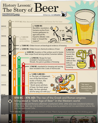
The History of Beer infographic


The History of Beer was published on Manolith.com.  I like the twist on a timeline infographic.  First, it's vertical instead of horizontal.  Then, it's actually four timelines in one highlighting different events in Science, Religion, Literature and Facts using the four colored tracks.

Design and layout by 600 Series Design, illustrations by Dan Zettwoch.

Check out some of the original sketches and story on Dan's blog.

Monday
Apr132009

A Century of Driving in America


From Good Magazine,  an infographic resembling a board game but in reality is a timeline.  Credits list Coleen Corcoran and Joe Prichard.

Thanks Alwyn for sending in the link!

Tuesday
Feb242009

Space Debris video


Sticking with the Space Debris theme, the ESA (European Space Agency) has this hi-res video on their website showing how crowded Earth orbit has become from 1968-2000.  Same issue as the image yesterday, that the objects are not to scale.  At this scale you would expect constant collisions, but at actual scale you wouldn't be able to see any objects at all.
In this animation, catalogued space debris are shown accumulating around Earth in 4-year increments, including payloads, rocket bodies, and fragments. While the debris objects are not shown to scale, the representation of their density is accurate.