About
Randy Krum
President of InfoNewt.
Data Visualization and Infographic Design

Infographic Design

Infographics Design | Presentations
Consulting | Data Visualizations

DFW DataViz Meetup

Join the DFW Data Visualization and Infographics Meetup Group if you're in the Dallas/Fort Worth area!

Search the Cool Infographics site

Custom Search

Subscriptions:


Feedburner

The Cool Infographics® Gallery:

How to add the
Cool Infographics button to your:

Cool Infographics iOS icon

- iPhone
- iPad
- iPod Touch


Read on Flipboard for iPad and iPhone

Featured in the Tech & Science category

Flipboard icon

Twitter Feed
From the Bookstore

Caffeine Poster

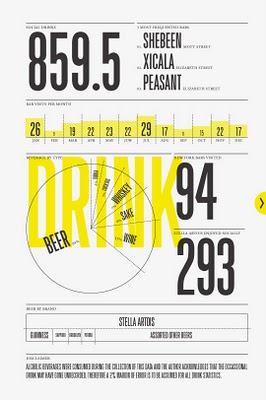
The Caffeine Poster infographic

Entries in timeline (240)

Sunday
Jan202008

Race to the Moon


Cool poster I found over at historyshots.com shows the altitudes reached by all of the U.S. and Russian launches leading up to the 1969 moon landing.

From 1961 to 1969 the USSR and the United States were locked in a history-making race to land the first person on the moon. This detailed map explains the story of this titanic contest in a clear and informative manner.

Wednesday
Dec262007

Nichloas Felton's Personal Annual Report

Nicholas Felton (www.feltron.com) has created his own personal 2006 Annual Report, looking back at his life during 2006 and using maps, charts, timelines and facts to visually track his activities. With pages dedicated to photos, travel, drinking, reading and food, he plots out his one-year history.

Sunday
Dec232007

Miraculous Logistics Behind Operation Christmas


Holiday Infoporn from Wired.com.

Here's our theory: There is, in fact, a nonsupernatural Santa. It's a transnational corporation with one mission-critical fulfillment goal: Every kid who celebrates the holiday gets a toy on Christmas eve.
Check out the side-scrolling timeline at the bottom. I think they should have included Chinese New Year.

Wednesday
Dec192007

Apple's Life Line


From aaplinvestors.net, more than a simple line chart of sales, its a timeline that highlights major events so you can easily visualize their impact. Even though its simple, I use this type of timeline all the time.

Saturday
Dec152007

Santa Claus vs. Krampus


Infographic for the holiday season. This one definitely made me laugh. Back in the Middle Ages, St. Nicholas had a sidekick named Krampus who took care of the naughty children. Over the years as St. Nicholas evolved into today's Santa Claus, and left Krampus behind. Krampus didn't exactly fit into the Coca-Cola image of Santa Clause that we all know and love today.

Found on tevis.net. I would give credit directly to the authors, but I can't make out their names in the bottom right corner.

Thursday
Nov222007

Timeline of Space Exploration


Newsweek has a cool interactive timeline showing all of the 150+ missions sent into space. Its organized by year (of course) but also by object of destination (planet/moon/asteroid). You can click on a year and zoom in to see specific dates of each launch. Rolling your mouse over any dot gives you the name and details of the mission.

Found on Information Aesthetics.

Monday
Oct012007

The Polar Clock


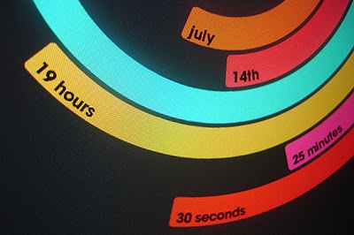
The Polar Clock, from Pixel Breaker, version 3 is now out as a screen saver for Mac and Windows. It's also available as a Mac OS X Widget.

I don't know why, but I love this clock. I'm mesmerized watching the seconds going around. With a little practice, you can visualize the time. I won't say this is the best way to visualize the time, but it's definitely fascinating.

Friday
Sep282007

The Wine Advocate Vintage Guide


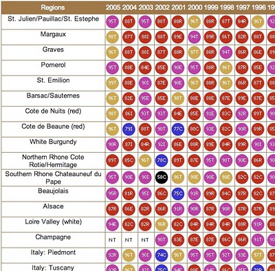
From eRobertParker.com, the online Wine Advocate Vintage Guide. Fascinating guide of wines from 1970-2005. Wines are grouped by region and year, and each group is scored and given a letter code to identify the current maturity status of those wines (like Ready to Drink, Too Old and Early Maturing). The color coding represents ranges of the numeric scores.

The guide is interactive, so clicking on any of the rating circles brings you to a list of the specific wines grouped together for that region. For the specific wines, you can see their individual name, score, maturity level and price range.

A PDF version of the guide is available here for download.

Friday
Sep282007

Travel Time Maps


From mySociety.org, time travel maps take into consideration the means of travel (car, rail, etc.) and the different paths available. Above is a map of London and shows time to travel from the center of town. The white contour lines represent half hour intervals, and the color coding has warm colors for the shortest times, and cool colors for the longest times.

The really interesting feature are the "islands". These small circles represent destinations that you can reach much faster than the surrounding area. Mainly stations for faster trains than have fewer stops.

Strangely similar in concept to an "event horizon".

Monday
Sep242007

History of Computer Languages


O'Reilly has created a poster showing the 50-year history of computer languages from 1954 to 2004, available as a PDF. They have also been giving away copies of the posters at O'Reilly conferences. I love the links shown where older languages split or combined to create the newer languages over time.

I look back around 1990 when I was programming in college and see Fortran V, C++ and the birth of Visual Basic. I remember having to convince my engineering professors to let me program assignments in C++ instead of Fortran.

The original diagram was created by Éric Lévénez. Although O'Reilly is not updating the poster, Eric is keeping his original diagram up to date on levenez.com.