About
Randy Krum
President of InfoNewt.
Data Visualization and Infographic Design

Infographic Design

Infographics Design | Presentations
Consulting | Data Visualizations

DFW DataViz Meetup

Join the DFW Data Visualization and Infographics Meetup Group if you're in the Dallas/Fort Worth area!

Search the Cool Infographics site

Custom Search

Subscriptions:


Feedburner

The Cool Infographics® Gallery:

How to add the
Cool Infographics button to your:

Cool Infographics iOS icon

- iPhone
- iPad
- iPod Touch


Read on Flipboard for iPad and iPhone

Featured in the Tech & Science category

Flipboard icon

Twitter Feed
From the Bookstore

Caffeine Poster

The Caffeine Poster infographic

Entries in timeline (240)

Monday
Apr212008

The Fall of Tech on digg.com


From readwriteweb.com, an area chart showing the decline of Tech stories made popular on digg.com. Although initially the front page of digg.com was totally dominated by Tech stories and the primary users were tech geeks, the World & Business category is now the reigning king with the most stories made popular.

To put this into context, on 1 January 2006 tech stories made up 78% of the total popular stories (i.e. stories that made it onto the digg frontpage). By end of March 2008, that percentage had dropped to 18-20%.


Here you can see the same information charted as total number of stories made popular instead of percentages.


Wednesday
Apr162008

Quake Family Tree

From Wikipedia, the Quake Family Tree shows the history of the Quake computer game engine and all of the other games that were built from each version using a mind map.

Found on digg.com

Wednesday
Mar192008

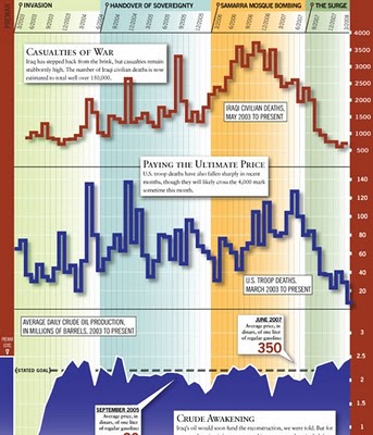
Iraq by the Numbers


From foreignpolicy.com, a really tall chart showing statistical information covering the last five years of the Iraq war. I'm not sure I like the idea of this big chart that covers so many different types of data. The information on the bottom half of the chart tends to get lost to the reader.

Saturday
Mar152008

The Ebb and Flow of Movies

From nytimes.com. This is a very cool way to visualize the spike in movie ticket revenue when movies are released in theaters, and then slow down quickly after the first week. The graphic covers 1986-2007, and when you look back you can only find a few movies that maintained high ticket sales for more than a couple weeks. Star Wars Episode 1 and Titanic both had high sales for almost 6 weeks. Highlight and click any "wave" to see the details for that movie.

Summer blockbusters and holiday hits make up the bulk of box office revenue each year, while contenders for the top Oscar awards tend to attract smaller audiences that build over time. Here's a look at how movies have fared at the box office, after adjusting for inflation.
Thanks for sending in the link Dániel!

Sunday
Mar022008

What if...


Craig Robinson, from flipflopflyin.com, has created a graphic showing many of the different paths/branches his life could have taken. Clicking on each character icon reveals text describing the event or deviation from actual events.

Who hasn't at one time or another wondered how their life could've gone in other directions if different events had occurred or different choices been made? These are the ways my life could've deviated from its actual path (the top row).
" Craig dies at the age of 34, killed by an angry swan" I found incredibly funny.

Found on NiXLOG.

Sunday
Feb242008

Conquest of Mount Everest


Cool infographic poster from historyshots.com showing the many expeditions leading up to the 1953 successful team to make it to the top of My. Everest.

Every major expedition before the successful climb of Mount Everest is detailed on the left side of the print. The circles provide an easy to view key into the history of each expedition including expedition length, type and height achieved. The flow of climbers from one expedition to another is tracked with graceful lines.

The right side of the print is devoted to the successful 1953 assault. The entire expedition is mapped showing the exact climbing history by altitude of each of the main phases of the assault. In addition, the weather for each day is provided.


Saturday
Feb162008

LEGO Brick 50th Anniversary Timeline


Neat timeline of the 50-year history of LEGO bricks. The photos of the bricks as they were in each time period really makes this a great timeline. Plus, LEGOs are just fun.

Found on digg.com

Friday
Feb152008

5,000 years of Faith


From mapsofwar.com, this is a 90-second flash video showing when the major religions formed and where they spread across the globe. Great combination of a map with a timeline.

Found on digg.com

Monday
Feb112008

The Timeline of "Cool"


Found on Wikipedia, this is the timeline of what was "Cool" from 1500 A.D. through today. Apparently, the Beatles aren't cool anymore...

Tuesday
Jan222008

Nichloas Felton's 2007 Annual Report


Nicholas Felton has published his new 2007 Annual Report. I love the way he breaks down his own personal life into maps and charts. I had just posted about his 2006 Annual Report last month.