About
Randy Krum
President of InfoNewt.
Data Visualization and Infographic Design

Infographic Design

Infographics Design | Presentations
Consulting | Data Visualizations

DFW DataViz Meetup

Join the DFW Data Visualization and Infographics Meetup Group if you're in the Dallas/Fort Worth area!

Search the Cool Infographics site

Custom Search

Subscriptions:


Feedburner

The Cool Infographics® Gallery:

How to add the
Cool Infographics button to your:

Cool Infographics iOS icon

- iPhone
- iPad
- iPod Touch


Read on Flipboard for iPad and iPhone

Featured in the Tech & Science category

Flipboard icon

Twitter Feed
From the Bookstore

Caffeine Poster

The Caffeine Poster infographic

Entries in visual (320)

Wednesday
May212008

Outdoor Pictogram Headlines


Neat experiment by Dave Bowker over at Designing The News. The idea is to use pictgraphics to visualize news headlines in public places. Specifically in Europe, you could establish a universal set of icons over time that people who speak different languages could interpret and understand.

Tuesday
May202008

TweetWheel


I just found TweetWheel, and its really cool. Made by Augusto Becciu.

Enter a Twitter ID (I used my ID: rtkrum), and in real time it will generate a connection wheel built from 100 people that person is following. Hover the mouse over any of the names, and it will show the connections that that person is also following on Twitter.

It takes a few minutes to load the user data.

Wednesday
May142008

Pac-Man Explained


I thought this was great. This one image tells the whole story of the Pac-Man video game. No further explanation needed.

Found on digg.com

Tuesday
May132008

Microsoft HealthVault Xplaned


Microsoft enlisted our friends from Xplane to help visualize the theory behind the HealthVault system.

I would almost call this a 3D mind map the way it’s laid out.

Friday
Apr252008

Kapitaal

What if the only things you could see in the world around you were brands and advertising? No walls, no people, no sidewalks...just ads. Apparently it would be more than enough to get around in the world.

This is an awesome video! Thanks to pascal for submitting the link in the comments to an earlier video post: See The World in Words

Wednesday
Apr232008

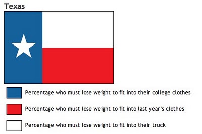
Know your State Flag Infographics


From calorielab.com, is a humorous take-off of the flag infographics from Icaro Doria (Meet the World, Infographic Flags). These infographics based on U.S. state flags, although probably politically incorrect, are very funny.

Thanks to Mark from calorielab.com for sending in the link.

Tuesday
Apr222008

One Day Poem Pavilion


Sort of crossing the line between infographics and art. A very cool project called the One Day Poem, from Experimental Typography. The geodesic structure is aligned to the sun, and perforated in a very specific pattern to show different parts of the poem over the course of a day, and even a different poem at different times of the year.

The specific arrangements of the perforations reveal different poems according to the solar calendar: a theme of new-life during the summer solstice. During summer solstice, the poem will contain the theme of “new life”. During winter solstice, the poem will be on “reflection and the passing of time.”
Found on digg.com

Wednesday
Apr162008

Quake Family Tree

From Wikipedia, the Quake Family Tree shows the history of the Quake computer game engine and all of the other games that were built from each version using a mind map.

Found on digg.com

Monday
Apr142008

Treemaps for drive space

I don't think I've posted much about specific software programs, but there are a number of infographic programs that anyone can use. These two are programs that analyze what's on your hard drive, and show it you in a treemap display.

The one above is Disk Inventory X for the Mac (which I use), and the one below is WinDirStat for Windows. Both are free, and are real-life examples of how you can use infographics in your life. So take a minute, and clean off some of that old junk taking up space on your hard drive.

Tuesday
Apr082008

On The Map


Found on notcot.com, On The Map is a cool project by Stefanie Posavec that maps the rhythm and flow of literary works into some stunning visual posters. Breaking a story down into chapters, paragraphs, sentences and finally individual words. Then color coded to capture the topics as they reappear throughout the story. The level of detail is really impressive. Click the images to see the high-resolution images from notcot.com.

Thanks Jonathon and Jason for sending the link.

Stefanie also created a number of additional visualizations of the same story.