About
Randy Krum
President of InfoNewt.
Data Visualization and Infographic Design

Infographic Design

Infographics Design | Presentations
Consulting | Data Visualizations

DFW DataViz Meetup

Join the DFW Data Visualization and Infographics Meetup Group if you're in the Dallas/Fort Worth area!

Search the Cool Infographics site

Custom Search

Subscriptions:


Feedburner

The Cool Infographics® Gallery:

How to add the
Cool Infographics button to your:

Cool Infographics iOS icon

- iPhone
- iPad
- iPod Touch


Read on Flipboard for iPad and iPhone

Featured in the Tech & Science category

Flipboard icon

Twitter Feed
From the Bookstore

Caffeine Poster

The Caffeine Poster infographic

Entries by Randy (1654)

Monday
Jun162008

The Cost of Gadgets


From Wired.com, this is really a 3-dimensional chart. I liked it because there are very few 3D charts that actually portray 3 dimensions of data. (This is actually 4D if you include the different products as a dimension) Usually 3D charts are just bad use of chart styles from PowerPoint. I also like the perspective from above. Although unusual, it helps to see the whole chart.

Friday
Jun132008

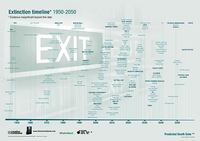
The Extinction Timeline 1950-2050


Richard Dawson from What's Next (www.nowandnext.com) created the Extinction Timeline with his predictions of what products and services will disappear in the next 50 years. Also available as a PDF here. Here are a few highlights:

  • 2018 DVDs
  • 2019 Libraries
  • 2025 Desktop computers
  • 2030 Reality TV (why so long?!?)
  • 2037 Glaciers
  • 2049 Physical Newspapers
Found on Digg.com

Thursday
Jun122008

WarCraft III DotA Poster


Created by Alwyn B., this hierarchical tree shows the complex Hero Item recipes for the WarCraft III MOD "Defense of the Ancients". As a fan and a player of the game, Alwyn painstakingly created his own infographic and then posted in on the Internet to share with other players. This makes a fantastic poster!

More than just the item combinations, the poster shows:

  • Shows the basic items and how to combine them to form better items.
  • Shows where to buy them, and for how much.
  • Mini Map that shows shop locations
  • Shop Item Layouts
When I looked today, this chart had been viewed over 100,000 times. Great job Alwyn, and thanks for sharing.

Wednesday
Jun112008

Democratic Party Voting Margins


New interactive infographic by Shan Carter and Amanda Cox on nytimes.com that shows the voter margins between Democratic candidates Hilary Clinton and Barrak Obama. These are based on exit poll data.


Choose any of the sorting criteria on the bottom, and then you can see specific data about any particular state by hovering the mouse over the blocks. The top chart shows how Men voted overall, and the second chart is how voters with No College Education voted.

Thanks Les for sending in the link!

Friday
Jun062008

The Flickr User Model


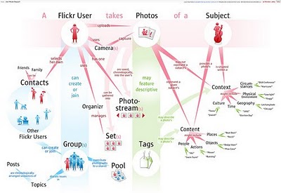
Designed by Soldier Ant (his real name is Bryce Glass), the Flickr User Model attempts to map out the Flickr user experience. This is version 0.1, and I think he's working on version 0.3 now. Also linked on visualcomplexity.com

On his post on October 24, 2005, Bryce explains: "I've been doing some concept diagramming for work lately, and I've found myself enjoying it immensely. (...) However, since it's for work I can't share much of it. I did post some sanitized versions, with all the object-names obsfucated, but that just didn't seem wholly satisfying. So over the weekend I invested some time in a diagram that I can share with the internets: a simple Flickr user model (regrettably incomplete -- but I realized that if I tried to include the whole Flickr-verse that this diagram would go beyond labor of love and straight into excercise in folly)".
Thanks Rex for sending in the link!

Wednesday
Jun042008

Greenwashing


From Futerra Communications:

Our Greenwash Guide (PDF) was born out of a desire to help communications professionals get their green messaging right. The majority of Greenwash is the result of over-eager communications campaigns that lack environmental rigour rather than malicious intent.
Found on Melodies In Marketing, thanks Mario!

Tuesday
Jun032008

The Infographic that Saved a Million Lives


Great story from 37signals.com about a very simple infographic that motivated Bill and Melinda Gates to change the focus of their charity spending.

“No graphic in human history has saved so many lives in Africa and Asia,” says NY Times columnist Nicholas Kristof about an infographic in a ‘97 Times article that spurred Bill and Melinda Gates to take action on public health.

...But then bill confessed that actually it wasn’t the article itself that had grabbed him so much—it was the graphic. It was just a two column, inside graphic, very simple, listing third world health problems and how many people they kill. but he remembered it after all those years and said that it was the single thing that got him redirected toward public health.

Monday
Jun022008

Beware of Search Spider Traps


Another good SEO infographic on making sure your website is friendly to search spiders from Elliance.com. Don't forget, you can sign up to receive their weekly infographic email.

Wednesday
May282008

The world as you've never seen it before


Check out WorldMapper! Above is a map of the world based on true Land Mass, but with WorldMapper, you can adjust the size of the countries based on whatever data you are trying to convey.

This is the world map based on Total Population:


This is the world map based on Total Computer Exports:


Alisa Miller, head of Public Radio International, talks about why -- though we want to know more about the world than ever -- the US news media is actually showing less. She uses WorldMapper to communicate her point about the state of today's news in the US.

Tuesday
May272008

Approach to Creating Experiences


Found on Think>Draw>Make, the Approach to Creating Experiences is from David Armano from the very influential Logic + Emotion.

It’s a high-level attempt to document an approach to designing an interactive experience within an agency setting.