


Monday
May262008
In the Shadow of Foreclosures
 Randy
Randy
Great graphic from NYTimes.com showing the subprime mortgage foreclosures as a percentage of all subprime mortgages by geographic region of the country.

![]()

Join the DFW Data Visualization and Infographics Meetup Group if you're in the Dallas/Fort Worth area!

The Cool Infographics® Gallery:
How to add the
Cool Infographics button to your:

- iPhone
- iPad
- iPod Touch
Read on Flipboard for iPad and iPhone
Featured in the Tech & Science category


Great graphic from NYTimes.com showing the subprime mortgage foreclosures as a percentage of all subprime mortgages by geographic region of the country.

Why not? One more infographic video Sprint ad for weekend. This features Sprint's relationship with AAA to help stranded motorists.

Great infographic video ad for Sprint Nextel by Superfad.
What to do when you are stranded in the woods with the eminent danger of a bear just around the corner? Just use your Sprint Nextel phone to call for help. Superfad brought this case study and others to life. Watch how real people use the Sprint Nextel Direct Connect system to get the job done right.Found on See What You Mean, an infographic blog I just learned about. Thanks Richard!
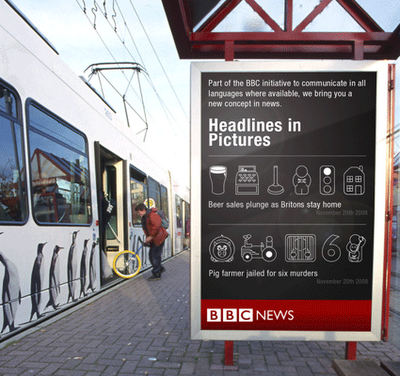
Neat experiment by Dave Bowker over at Designing The News. The idea is to use pictgraphics to visualize news headlines in public places. Specifically in Europe, you could establish a universal set of icons over time that people who speak different languages could interpret and understand.

I just found TweetWheel, and its really cool. Made by Augusto Becciu.
Enter a Twitter ID (I used my ID: rtkrum), and in real time it will generate a connection wheel built from 100 people that person is following. Hover the mouse over any of the names, and it will show the connections that that person is also following on Twitter.
It takes a few minutes to load the user data.
 Ritwik Dey charted out his life from age 6 to 24 as an infographic timeline project, and shared it on Flickr.
I just discovered Visual Think Map, which is where I found a link to the LifeMap. I added it to my blogroll on the right.

I'm headed to Nuremberg, Germany (also know as Nürnberg) for a trade show this week. Anyone in the area want to meet for a drink? Send an email to my Gmail account.

From the United Nations Environment Programme website, the Global Distribution of Water specifically highlights the scarcity of freshwater.
Found on digg.com
 Cool infographic video: airport by iain anderson (as shown in oz digital shorts in the sydney film festival 2005)
Found on funwithstuff.com

