About
Randy Krum
President of InfoNewt.
Data Visualization and Infographic Design

Infographic Design

Infographics Design | Presentations
Consulting | Data Visualizations

DFW DataViz Meetup

Join the DFW Data Visualization and Infographics Meetup Group if you're in the Dallas/Fort Worth area!

Search the Cool Infographics site

Custom Search

Subscriptions:


Feedburner

The Cool Infographics® Gallery:

How to add the
Cool Infographics button to your:

Cool Infographics iOS icon

- iPhone
- iPad
- iPod Touch


Read on Flipboard for iPad and iPhone

Featured in the Tech & Science category

Flipboard icon

Twitter Feed
From the Bookstore

Caffeine Poster

The Caffeine Poster infographic

Entries by Randy (1654)

Wednesday
Jul022008

Map of Local Gas Prices

GasBuddy.com has a cool interactive temperature map of gas prices across the U.S. and Canada that allows you to zoom in to the street level to see prices at specific gas stations.  Prices are all removed from the database when they become over 72 hours old to keep the map current.


Thanks for sending in the link Karen!

Friday
Jun272008

Big Blue Marble: Water and Air

Found on infosthetics.com, phiffer.com and boingboing.net

Global water and air volume. Conceptual computer artwork of the total volume of water on Earth (left) and of air in the Earth's atmosphere (right) shown as spheres (blue and pink). The spheres show how finite water and air supplies are. The water sphere measures 1390 kilometers across and has a volume of 1.4 billion cubic kilometers. This includes all the water in the oceans, seas, ice caps, lakes and rivers as well as ground water, and that in the atmosphere. The air sphere measures 1999 kilometers across and weighs 5140 trillion tonnes. As the atmosphere extends from Earth it becomes less dense. Half of the air lies within the first 5 kilometers of the atmosphere.

Credit: Adam Nieman / Photo Researchers, Inc

I'd love to see one more showing all of the oil in the world.

The original appears to be here at PhotoResearchers.com

Wednesday
Jun252008

The Summer of Pool Shows


Another page of quirky charts from Andrew Kuo that I came across from October 2007. These try to represent information about the 2007 summer's series of concerts at Brooklyn's McCarren pool.

Found on CoolHunting.com

Tuesday
Jun242008

Pessimist's Guide to Summer Festivals

A full page of different chart styles by Andrew Kuo on nytimes.com. A number of Andrew's quirky charts have been showing up in the NY Times lately.

When he was 15, in 1992, the artist Andrew Kuo tagged along with his older brother to the second year of Lollapalooza in Stanhope, N.J. It was Mr. Kuo’s first summer festival, and he was so excited that he bought the albums by most of the bands on the bill beforehand. Then, halfway through the show, after sets from Pearl Jam (his favorite) and the Jesus and Mary Chain, “I didn’t want to be there anymore,” he said. “I felt like I was being held captive.” Thus began his lifelong ambivalence toward outdoor festivals. “When you finally get to the picnic, there’s ants everywhere,” Mr. Kuo said. Here’s a pessimist’s guide to the summer festival season, which kicks into high gear with the Bonnaroo Music and Arts Festival on Thursday in Manchester, Tenn. Mr. Kuo will be home napping.
Thanks Sandhya!

Monday
Jun232008

Obama Funding Graphic


A small poster from our friends at XPLANE,

How Obama Reinvented Campaign Finance Barack Obama is the first major candidate to decline participation in the public financing system for presidential campaigns. He’s found a more effective way to raise money — by leveraging the power of the American people through online Social Networks.
Available as a PDF formatted for printing on 11x17 paper.

Saturday
Jun212008

Fly Through Airport Security


"How to...Fly Through Airport Security" illustration by Jason Lee from Wired Magazine, March 2008 (16.03).

You might as well check your dignity curbside. Soon you'll be shoeless and flustered, spilling comics across the floor as you dig your MacBook from the depths of your duffel. But take a deep breath, frequent fliers: It is possible to pass security with your ego intact. Here's how.

Friday
Jun202008

Gerd Arntz


Gerd Arntz (1900-1988) was a German artist with a political activist focus. Many of his infographics, as well as his Isotype project to create a universal set of icons for signs, are available at www.gerdarntz.org. This infographic poster shows the New York City population explosion from 25,000 in 1767 to 9.5 million in 1930.

Thursday
Jun192008

Grocery Aisle Nutritional Values


Three different ways to view the grocery store from Wired Magazine Infoporn January 2008 (16.01) by Dan Marsiglio. Cost per Calorie, Calories by Weight and Sugar by Weight.

If you're trying to cut back on the sugar in your diet, stay away from the cereal aisle!

Wednesday
Jun182008

Car HUD from the future


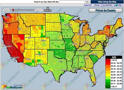
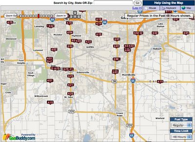
From the January 2008 (16.01)Wired Magazine; Artifacts from the Future, by Chris Baker. This future automobile HUD has some really cool features like a DUI driver identified ahead, in-car video chat, live GPS map with directions and a coupon for the Starbucks at the next exit. He's doing 90MPH, eating an energy bar and he's in the slow lane! For California, there definitely aren't enough cars on the road!

Looks a lot like a bunch of widgets on the desktop of your PC. It definitely seems too cluttered, but I think it was necessary to fit it on a narrow magazine page. I love that it seems to use a multiple-blink interface. Check out the calendar appointment in the top left: "...blink 3 times to reschedule."

If only this future were closer. I'm a real fan of car HUD interfaces. It's one of those promised technologies that still haven't become reality.

Tuesday
Jun172008

Code Swarm: Eclipse


code_swarm - Eclipse (short ver.) from Michael Ogawa on Vimeo.

Created by Michael Ogawa. Check out the website describing the project here.

This visualization, called code_swarm, shows the history of commits in a software project. A commit happens when a developer makes changes to the code or documents and transfers them into the central project repository. Both developers and files are represented as moving elements. When a developer commits a file, it lights up and flies towards that developer. Files are colored according to their purpose, such as whether they are source code or a document. If files or developers have not been active for a while, they will fade away. A histogram at the bottom keeps a reminder of what has come before.
Thanks Alwyn for sending in the link!