


Monday
Aug112008
Awesome Medical Visualizations
 Randy
Randy
Really neat promotional video for Hybrid Medical Animation. These guys do some amazing work.

![]()

Join the DFW Data Visualization and Infographics Meetup Group if you're in the Dallas/Fort Worth area!

The Cool Infographics® Gallery:
How to add the
Cool Infographics button to your:

- iPhone
- iPad
- iPod Touch
Read on Flipboard for iPad and iPhone
Featured in the Tech & Science category


Really neat promotional video for Hybrid Medical Animation. These guys do some amazing work.

Found on CartoonBrew, this circular chart from 1943 shows the development process of an animated film through the different roles within the Disney organization. Not exactly an org chart, this is more of a process map.
How do they make those drawings move? This chart, an separate pull-out from the 1943 booklet, The Ropes At Disney’s (see below), explains the whole process.You’ll note that it all starts with “Walt”. And his main focus was “Story” and “Direction”.
Can you tell I’m going to Walt Disney World today?

NameTrends.net is a fantastic interactive site that charts and maps the popularity of baby names over the last century in the U.S. You can look at the most popular names, or search for specific names to see their results. The chart above shows the top 20 baby names from the 2000's decade (10 boys and 10 girls). You can see that those names also had some popularity at the end of the 19th century.

The site also allows you to map the name popularity by state. The slider across the top allows you to see the geographic distribution by year.
Found on Information Aesthetics.

Last week, Guy Kawasaki posted a good interview with Dan Roam on his blog.
Do you recognize this picture? It's how Southwest Airlines was pitched.
To provide more insight into the process of visual thinking, I tapped Dan Roam. He is the author of The Back of the Napkin: Solving Problems and Selling Ideas with Pictures. In this interview he explains why and how to use visual thinking in your business. Click here
to read it. To learn even more about visual thinking, be sure to read his book.
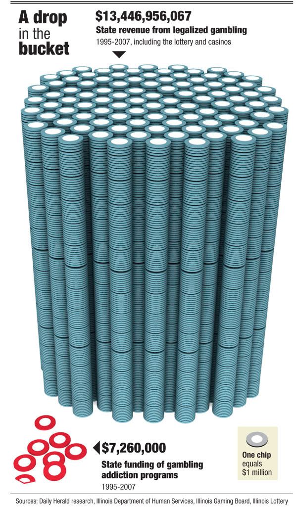
I love this very simple but powerful visual comparison of the gambling revenues and the money spent on gambling addiction support programs. The author is only trying to communcate one point, and gets his message across very stongly. I believe it was done by Tim Broderick, from the Daily Herald.
Found on InfographicsNews.blogspot.com. Looks like
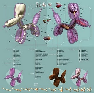
Now here's an odd poster by Jason Freeny depicting the internal anatomy of balloon animals. Check it out along with his other works at Moist Productions. I especially liked that he included visual instructions on how to create the balloon animal at the bottom.
Thank Torquil for sending in the link!

From the Man Vehicle Lab at MIT, an infographic poster from professor Dava Newman and illustrator Cam Brensinger. The poster shows the technology development in spacesuits and some future design concepts.
Really cool use of visualization tools to create this music video for Radiohead's "House of Cards".
Check out this link to a different version on Google that lets you move the video image around while its playing. and the "making of" video that shows the laser scanners they used.
Radiohead just released a new video for its song "House of Cards" from the album "In Rainbows".
No cameras or lights were used. Instead two technologies were used to capture 3D images: Geometric Informatics and Velodyne LIDAR. Geometric Informatics scanning systems produce structured light to capture 3D images at close proximity, while a Velodyne Lidar system that uses multiple lasers is used to capture large environments such as landscapes. In this video, 64 lasers rotating and shooting in a 360 degree radius 900 times per minute produced all the exterior scenes.
Watch the making-of video to learn about how the video was made and the various technologies that were used to capture and render 3D data

Over on Think>Map>Draw, Michael DiTullo, the Design Director for Converse, shared his thoughts about design and sketched this parallel design process between the intended design process and the actual design process.
Sketch image: 2008 copyrighted Michael DiTullo and released under a Creative Commons Attribution-Noncommercial-No Derivative Works 3.0 Unported License.
A few readers have written emails to me asking about what software to use to create infographics. My needs are pretty simple for my day job, so I only have a handful of tools that I use loaded onto my MacBook. But the graphics I create are fairly simple, and don’t use massive amounts of data.
Yes, I included MS Office in the list because there are some really cool things you can do with Excel and PowerPoint. I’ll post some examples in the future.
What software do you use?
Post about your favorite software in the comments and share your “must have” software with everyone here.
