


Saturday
Jan052008
The Japanese Wii Safety Manual is Crazy
 Randy
Randy
Gizmodo posted a number of the crazy images from the Japanese version of the Wii safety manual. These are hilarious!

![]()

Join the DFW Data Visualization and Infographics Meetup Group if you're in the Dallas/Fort Worth area!

The Cool Infographics® Gallery:
How to add the
Cool Infographics button to your:

- iPhone
- iPad
- iPod Touch
Read on Flipboard for iPad and iPhone
Featured in the Tech & Science category


Gizmodo posted a number of the crazy images from the Japanese version of the Wii safety manual. These are hilarious!

I can't tell if Savvygraph.com is part of Amazon.com, or if this is a separate company running this. It takes any Amazon.com search terms you enter and charts the results on an X-Y chart showing the Average Rating and the total Number of Ratings.
It's fairly interactive. You can limit the price range using the sliders at the top, and when you hover over any of the pins you get the product image. Clicking on the pin takes you to that item on Amazon.com. Clicking on any of the links on the right limit the search to a smaller subset based on your choice (like a particular brand).
EDIT: I did receive an email from the author who confirmed that the site is totally separate from Amazon.com. Thanks Dave.


Skull With Cigarette, 2007 [based on a painting by Van Gogh]
72x98"
Depicts 200,000 packs of cigarettes, equal to the number of Americans who die from cigarette smoking every six months.
I've become a big fan of Chris Jordan's work, especially the Running The Numbers series. I just noticed that he has added to the collection on his website with some new pieces! A friend of mine quit smoking this week, so in her honor I want to share one of the new artwork pieces.
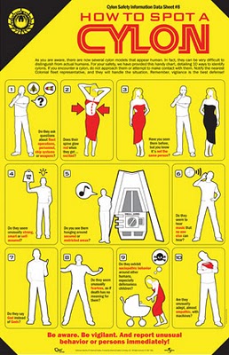
This poster for fans of the new Battlestar Galactica is for sale over at QMx for $19.95, so there isn't a high resolution file available. Although, I would propose an image that we could read better would help sell more posters. In the spirit of airline emergency procedure cards, 10 ways to identify a Cylon among us.
Be Aware. Be Vigilant.
EDIT: I noticed this is now available at Amazon too:
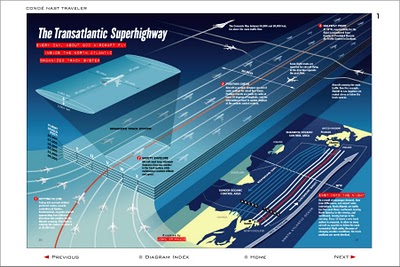
I never really thought about it, but I'm sure the flight patterns over the Atlantic are actually this tightly controlled. Now the news that President Bush made some of the military flight paths available over the holidays makes more sense. The Transatlantic Superhighway is one of the diagrams on John Grimwade's Information Graphics site.
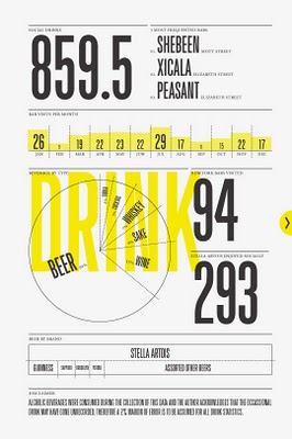 Nicholas Felton (www.feltron.com) has created his own personal 2006 Annual Report, looking back at his life during 2006 and using maps, charts, timelines and facts to visually track his activities. With pages dedicated to photos, travel, drinking, reading and food, he plots out his one-year history.


Holiday Infoporn from Wired.com.Here's our theory: There is, in fact, a nonsupernatural Santa. It's a transnational corporation with one mission-critical fulfillment goal: Every kid who celebrates the holiday gets a toy on Christmas eve.
Check out the side-scrolling timeline at the bottom. I think they should have included Chinese New Year.

The family took our first Disney Cruise this year, which was fantastic! Here’s a great cut-away graphic of the Disney Wonder, but the other ship, the Disney Magic is almost identical. This graphic is a little out of date, because some things have changed. The ESPN Skybox is now a teen area called The Stack or Aloft depending on which ship you’re on.
The ship is actually quite large, so the spacial representation of locations is really helpful. You can get turned around very easily.
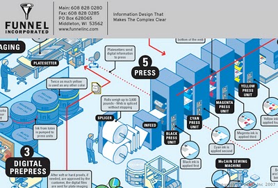

This is one of the example infographics from Funnel, Inc. I got a postcard from them offering infographic holiday cards, FREE while supplies last. You won't find the link on their website, but the direct URL is http://www.funnelinc.com/holiday. Order yours quick!
By the way, the example infographic above is "How Books are Made" and shows the entire process to print books at Webcrafters, Inc. in Madison, WI.

From aaplinvestors.net, more than a simple line chart of sales, its a timeline that highlights major events so you can easily visualize their impact. Even though its simple, I use this type of timeline all the time.
