


Friday
Feb082008
How many employees does Google have?
 Randy
Randy 16,805 full-time employees worldwide as of December 31, 2007, Google says. Here on blogscoped.com visualized with one icon per person. It's a big image.
Found on Infosthetics.

![]()

Join the DFW Data Visualization and Infographics Meetup Group if you're in the Dallas/Fort Worth area!

The Cool Infographics® Gallery:
How to add the
Cool Infographics button to your:

- iPhone
- iPad
- iPod Touch
Read on Flipboard for iPad and iPhone
Featured in the Tech & Science category


16,805 full-time employees worldwide as of December 31, 2007, Google says. Here on blogscoped.com visualized with one icon per person. It's a big image.
Found on Infosthetics.
 Another infographic advertisement from Elliance.com to share around your office. How do the different Web2.0 services available today address the different needs within a company? An ideal graphic to share with the people in your organization that don't really understand how they can use these new web services.
Elliance is posting a weekly series of infographics on their site to help explain their services.
 Elliance.com is posting a weekly series of infographics to help explain and advertise their SEO services. These graphics talk directly to corporate individuals that want better websites, but don't design websites themselves.
A great way to use infographics to talk to your target customers, and I think it shows how well Elliance knows their target audience.
Thanks Christy!
An infographic video from GOOD Magazine, a quick 3-minute video that shows who has the nukes, how many they have, and how much damage would one nuke hitting the Empire State Building cause.
Found on tunequest.org

Wired magazine has this infographic flow chart of what happens after someone posts on their blog. From aggregators to text scrapers, your posts live a life of their own on the Internet.
You click Publish and lean back to admire your work. Imperceptibly and all but instantaneously, your post slips into a vast and recursive network of software agents, where it is crawled, indexed, mined, scraped, republished, and propagated throughout the Web.It's on their multimedia section of the website, but the only multimedia aspect it has is zoom, which is a little disappointing.
Thanks Oliver for sending me the link!

Another one from Beau and Alan Daniels at beaudaniels.com that I really liked. Superior Coffee is half blueprint, half illustration that helps communicate the Superior Coffee strategy of delivering a better coffee to customers and is used at trade shows. A good way to visually show the technical aspects behind a product.

Humorous infographic that visually explains some of the common golf terms from Beau and Alan Daniels at beaudaniels.com, where you can find a number of good examples of their infographic work.
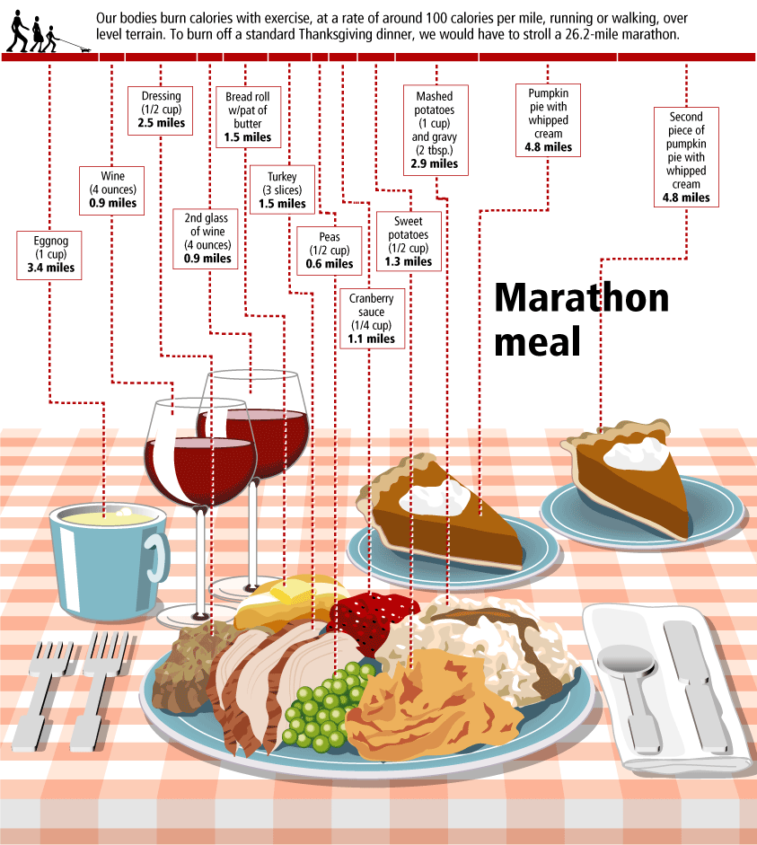
You have to walk 26.2 miles (a complete marathon!) to burn off the calories from a standard Thanksgiving meal, shown here broken down by each dish included. That extra piece of pumpkin pie is worth 5 miles!
This infographic is from Gary Newman Design, who does some fantastic work.

From The Genetics and Public Policy Center, an infographic demonstrating the difference between research cloning and reproductive cloning.
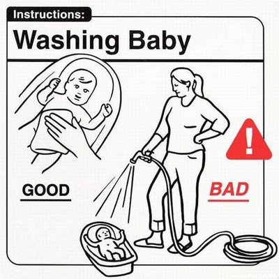
A series of infographics to help the parents of a new baby...sort of. Some of these are very funny, but some of them are very odd.
These are apparently a series of images from the book Safe Baby Handling Tips, by David and Kelly Sopp.
