About
Randy Krum
President of InfoNewt.
Data Visualization and Infographic Design

Infographic Design

Infographics Design | Presentations
Consulting | Data Visualizations

DFW DataViz Meetup

Join the DFW Data Visualization and Infographics Meetup Group if you're in the Dallas/Fort Worth area!

Search the Cool Infographics site

Custom Search

Subscriptions:


Feedburner

The Cool Infographics® Gallery:

How to add the
Cool Infographics button to your:

Cool Infographics iOS icon

- iPhone
- iPad
- iPod Touch


Read on Flipboard for iPad and iPhone

Featured in the Tech & Science category

Flipboard icon

Twitter Feed
From the Bookstore

Caffeine Poster

The Caffeine Poster infographic

« The Science of Salary | Main | 10 Infographics and Visualization Apps for iOS »
Thursday
Sep082011

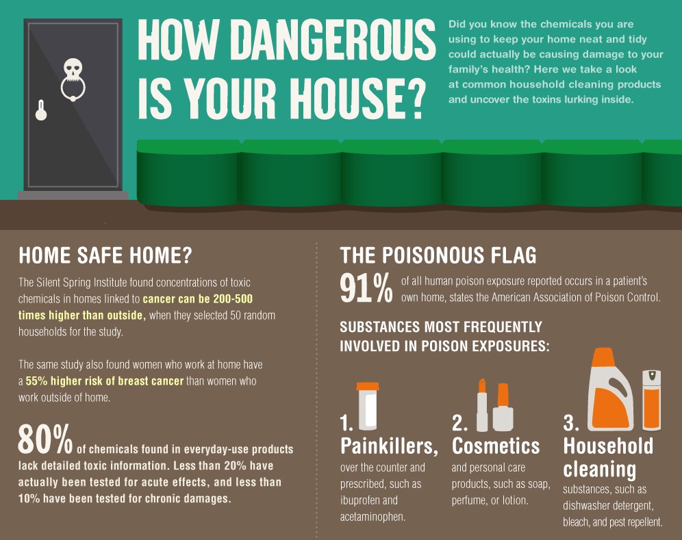
How Dangerous Is Your House?


How Dangerous Is Your House? is a new infographic from Ecomom.com, and designed by Column Five Media.  I love the content in this one!  In fact it reminded me to talk with my son about some of these, however, the overall design has WAY too much text.  Most readers will skim or skip over most of the text explanations.  Why aren’t the statisitics visualized?

Thanks to Jarred for sending in the link!


PrintView Printer Friendly Version

EmailEmail Article to Friend

Reader Comments (3)

Hi, I'm a teacher. Wow, "How Dangerous is your House" is such a rich task for students. Thanks.
September 8, 2011 | Unregistered CommenterDatab
Very cool, I like the home remedies listed at the bottom!
September 8, 2011 | Unregistered CommenterInfographics
While I enjoyed the graphic, I must caution against the use of Olive Oil as furniture polish. It will turn rancid and leave your surfaces covered with all kinds of bacteria.
September 11, 2011 | Unregistered CommenterJosh Monroe
Comments for this entry have been disabled. Additional comments may not be added to this entry at this time.