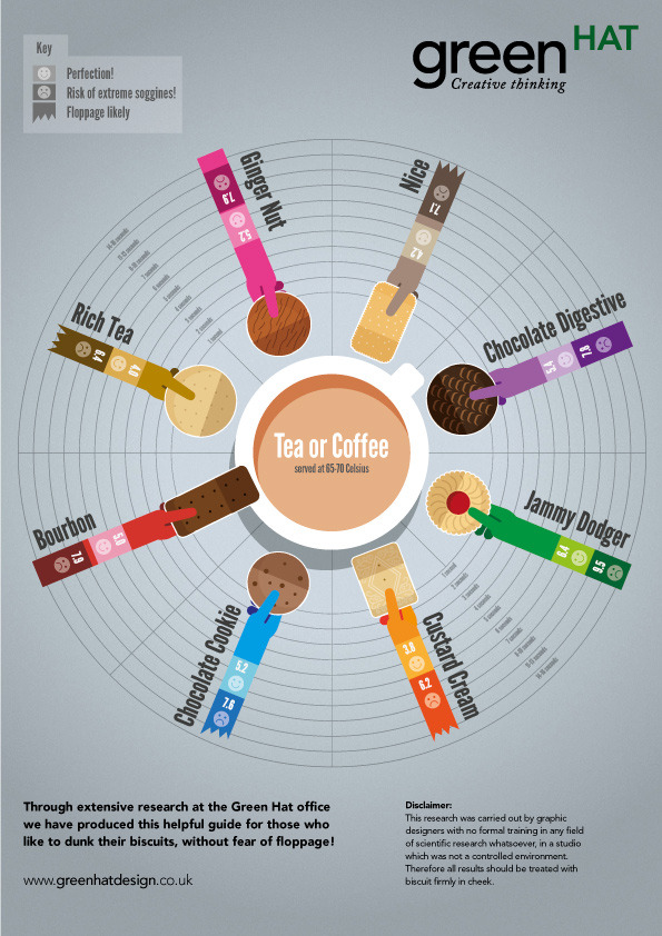
Tea & Biscuit Dunking Guide
The Tea and Biscuit infographic from Green Hat Design in the UK shows avid dunkers of biscuits the proper timing to keep their favorite snacks in the tea or coffee to conquer floppage and avoid the disappointment of contamination! Also available as a high-resolution PDF.
This biscuit infographic is based on 8 of our favourite UK brands which helps us (and others) to get the best out of his (or her) biccy when dunking it in hot tea or coffee, while at the same time assisting the user to avoid… floppage. That unfortunate moment that the biscuit suddenly gives way and contaminates your beverage. Nasty. We feel many could actually benefit from such details. I know it has changed my life.
This one is a fun topic. Apparently the biscuits in the UK are so hard you have to dunk them to eat them… :)
The radial design works well to show three values for each biscuit, and is easy for the reader to compare them. The illustrations work well, even though readers in the U.S. (myself included) won’t recognize any of the biscuits.
A couple things are missing from a Marketing Infographic design perspective. It needs a title! I made up the “Tea & Biscuit Dunking Guide” because it didn’t have a good title of its own. There should be some type of license statement, and in this case I would suggest Creative Commons.
The PDF file is hosted on the Green Hat Design site, but the infographic isn’t displayed anywhere. t’sI hard to share a PDF compared to how easy it is to share an image file online. It REALLY needs it’s own official landing page on the Green Hat Design site to display the infographic, and be the one place you want everyone else (like this blog) to link to. They had uploaded it to visual.ly, and I linked to it there, but that shouldn’t be the primary landing page if they want to drive traffic to their site and awareness to their brand.
Thanks to Steve for sending in the infographic!


 Randy
Randy

Reader Comments (1)