


 Randy
Randy

Who has the Oil?

I caught this on Digg, it's a map from civicactions.com. There's some good debate in the comments on Digg about the accuracy of the map.
The size of the country represents the relative amount of oil reserves in each country, and teh color of the country represents how much oil is consumed by that country.
See My Voice

From the University of Sydney, Bachelor of Design Computing website, See My Voice was a project by one of the students in the program, Andrea Lau.
SeeMyVoice - Social Information/Data Visualisation (or infovis). SeeMyVoice visualises chat transcripts stored by MSN Messenger. It aims to highlight people's style of chatting and increase understanding of our online social interaction. Each person is represented by a coloured wave which ebbs and fluctuates according to message length and the time taken between messages.Great job Andrea! That's exactly how IM conversations go.
UPDATE: Andrea has a complete website describing her work and the See My Voice project in much more detail.
Grokker

It's not new, but Grokker does a good job of searching multiple sites and mapping the data back to the user in visual form.
...a web-based enterprise search management platform that leverages the power of federated content access and visualization to maximize the value of information assets for enterprises, content publishers, libraries and other research-intensive organizations.
Flight Explorer Snapshot

Reader submission (thanks Karen).
On the NATCA (National Air Traffic Controllers Association) website is this U.S. map showing every airline flight currently in the air. The information is delayed by 5 minutes. Also, the graphic isn't interactive, so you can see any information about the dots (like which flight it is).

You can also zoom into nine select cities to see the flights in the air and the flight numbers. So the next time you're lying in the grass with your kids (in one of the major cities) looking up at the sky, you could (if you wanted to) figure out where that airplane is going.
See also: Flight Patterns
Visuwords
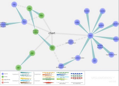
Visuwords is a new website that visually shows the relationships between words. More than an online dictionary or thesaurus. The relationships are shown graphically like a mind-map.
Visuwords™ online graphical dictionary — Look up words to find their meanings and associations with other words and concepts. Produce diagrams reminiscent of a neural net. Learn how words associate.Found on LifeHacker.
Infographic Video Advertisement
Found on Uswim, a French company developed an ad campaign around the infographic video style we saw in the Royksopp video.
It had such an impact that a few years later Areva, the French nuclear giant, wanted to use it for their advertising. Being denied it by the Norwegian pop group they finally went for the hit “Funky Town” on a video that looks very similar (as it was done by the same French art collectif H5 that did Royksopp’s video).
Their objective was to show Areva’s expertise in the energy sector (see their corresponding website using Flash animation) as part of the branding campaign of a company anticipating to go private (still waiting because of internal French politics). The choice of animated graphics was to reinforce the educative aspect on Areva’s business and avoid the harsh reality of images of nuclear plants. In a way the almost childish graphics (almost like a comic strip) make it look like a video game of some sort, some kind of SimCity. It was very successful and the idea was again used in a slightly different angle (accelerated special effects video) by EDF (another French energy giant) in a commercial
I found the link to Uswim on Simple Complexity.
The World Freedom Atlas

The World Freedom Atlas, offers many different views of the world. Developed by Zachary Forest Johnson, his blog is here. The one above is the Raw Political Rights Score (darker is better) based on data from the Freedom House. Offering a bunch of datasets from a number of different sources, the interface is fantastically easy to use. Depending on the dataset, you can also view the data by year from 1990-2006.

Stranger Than Fiction
This video is the introduction to the movie Stranger Than Fiction, full of infographics. It's been around for a while, but I thought I would share it too.