About
Randy Krum
President of InfoNewt.
Data Visualization and Infographic Design

Infographic Design

Infographics Design | Presentations
Consulting | Data Visualizations

DFW DataViz Meetup

Join the DFW Data Visualization and Infographics Meetup Group if you're in the Dallas/Fort Worth area!

Search the Cool Infographics site

Custom Search

Subscriptions:


Feedburner

The Cool Infographics® Gallery:

How to add the
Cool Infographics button to your:

Cool Infographics iOS icon

- iPhone
- iPad
- iPod Touch


Read on Flipboard for iPad and iPhone

Featured in the Tech & Science category

Flipboard icon

Twitter Feed
From the Bookstore

Caffeine Poster

The Caffeine Poster infographic

Thursday
Oct172013

What is the Debt Ceiling?

What is the Debt Ceiling infographic

What is the Debt Ceiling? from WorldSolo Index does a good job of using the combination of charts and text to make a complex issue more understandable to the readers.

The US Debt Ceiling is explained. The US is expected to reach its borrowing limit by Oct 17, 2013 if the borrowing limit is not raised. This infographic breaks down the debt ceiling in detail.

Good design that focuses on telling one story really well.

Found on Visually

Wednesday
Oct162013

The Ultimate Loss

The Ultimate Loss infographic

The Ultimate Loss infographic from Confused highlights some of the most famous SciFi characters that are the last survivors of their home worlds destruction.

Sci-Fi characters who survived their planets’ destruction.

It’s a popular theme laced throughout science fiction movies and television shows: characters who survive the loss and utter destruction of their home worlds.  Here’s a look at some of the most notable sci-fi survivors.

Knowing the infographic image will be shared on other sites, this design is missing some crucial information in the footer.  The biggest omission is a mention or logo from the company that published it, Confused.com.  The footer should also include a copyright statement, and the URL to the infographic landing page where readers can find the original full-size version.

Found on visualnews.com

Tuesday
Oct152013

The Power of Colorful Customers

The Power of Color infographic

The Power of Color infographic from Pega is about treating each customer as an individual. Each individual has their own colors and CSPs can paint their customer processes to make them more specific, more relevant, more proactive, and more effective for the individual customer.

By applying color to all of their customer processes at the moment of truth, communications service providers can take the next best actions relevant to each customer. Doing this over the life times of their subscribers delivers exceptional value to both customers and service providers.

There’s a lot of text in this design, and the use of the colors as metaphor for specific customer attributes is a little bit confusing.  Otherwise this is fantastic information, and easy for the reader to follow.  The footer should include a copyright statement, and the URL link back to the infographic landing page som readers can find the full-size original version.

Thanks Caitlin for sending in the link!

Monday
Oct142013

The Magnificent Multitude of Beer

The Magnificent Multitude of Beer infographic poster

The Magnificent Multitude of Beer is a cool new poster design from Pop Chart Lab.

This wall map is the most complete charting of beer ever, breaking down ales and lagers into over 100 delicious styles from hoppy IPAs to fruity lambics, and including over 500 individual beers as notable examples of each style as well as glassware recommendations. The Magnificent Multitude of Beer captures the proud work of hundreds of breweries around the world, clocks in at a staggering 60 inches by 40 inches, and is the perfect finishing touch for your man cave or lady lair.

SALE today only!  The team at Pop Chart Lab has a 15% OFF Everything sale for Columbus Day (October 14).  Use the code COLOMBO at checkout to get the discount.  The code is valid until 12:30pm EST tomorrow.

Monday
Oct142013

The Modern Workforce

The Modern Workforce infographic

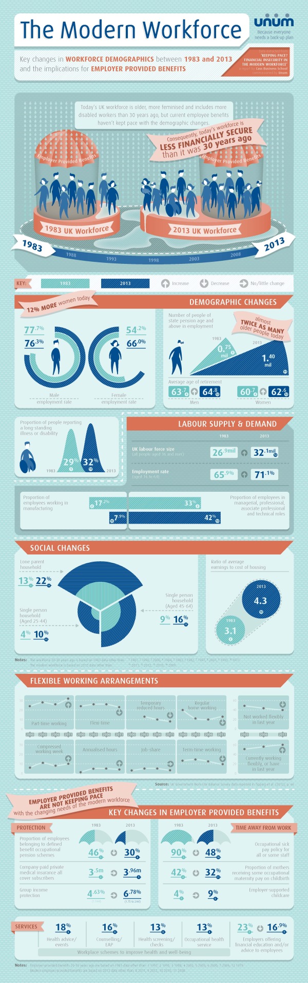
The Modern Workforce infographic from unum shows that the workforce demographic has changed in the last 30 years, but the benefits have not evolved to support this. There are more women, disabled, and older people in the modern workforce, but the protection, time away from work, and services given to employees are not keeping up.

The research finds significant gaps have opened up between employer-provided benefits and the protection required by today’s workforce. At a time when the demographics of the modern workforce are shifting towards employees that have a greater need for financial benefits, the research shows that the ratio of wages to employee benefits is outdated.

As a result, we’re more likely to fall into financial difficulty than we were 30 years ago. And, if we’re in financial difficulty we’re less productive, so it’s in an employer’s best interests to better protect their people.

We’ve published research called Keeping Pace? Financial Insecurity in the Modern Workforce with Cass Business School. It paints a picture of how the make-up of our workforce has changed. It also makes recommendations about what employers should do to better protect their people.

The infographic has some great data from their case study research, but the design could have done a better job making the information easier to understand for readers.  Many of the visualizations don’t match the data from the study.

For example, the pie slices shown in the Demographic Changes section changed their radius instead of their angle.  This creates a false visualization because the area of a pie slice with twice the radius is much larger than the data values.  So, the visualization is displaying a much larger increase than the data actually shows.  This design mistake with the radii was repeated in the Social Changes section, so that visualization doesn’t match the data either.

Unum also created a motion graphic video to share some of the research findings as well.  I would have recommended tying these two content types together, using the same design assets in both.  They already have the data visualizations from the static infographic, so use them in the video as well.


Thanks to Ed for sending in the link!

Friday
Oct112013

Zombies vs. Mobile Storage Containers

Zombies VS Door to Door Storage infographic

The Walking Dead return this weekend! Why should you buy a mobile storage unit? Because in the event of a zombie apocalypse, you’d be prepared! With this comical visual, Door to Door uses zombie apocalypse scenarios in it’s 10 Ways to Use a Door to Door Storage Mobile Storage Container in the Event of a Zombie Apocalypse (long title!) infographic to point out the strengths of their storage units.

Bottom Line: If you’re prepping for the zombie apocalypse or, you know, looking to move somewhere new or store your belongings, visit us at www.DoorToDoor.com.

Definitely a fun way to use an infographic to raise your brand awareness!

Thanks to Jayson for sending in the link!

Friday
Oct112013

xkcd - Tall Infographics

xkcd - Tall Infographics

The Tall Infographics design from Randall Munroe at xkcd literally made me laugh out loud.  As he mentions in the text:

“‘Big Data’ doesn’t just mean increasing the font size.”

Very similar to something I repeat here on Cool Infographics all the time.  “Big fonts are not data visualizations!”

However, the format of the Tall Infographic is here to stay.  The tall format fits nicely in the content area of most websites and blogs, and the user experience of scrolling vertically is much easier than scrolling horizontally.

Found on Gizmodo and Stats Chat

Wednesday
Oct092013

An Infographic Profile of the Modern Travel Blogger

An Infographic Profile of the Modern Travel Blogger

An Infographic Profile of the Modern Travel Blogger from the Sandymount Hotel in Dublin, Ireland, takes a closer look at answering the question “Who are these travel bloggers?”

As today marks the start of the TBEX European Conference – the world’s largest gathering of travel bloggers, writers and new media content creators – we thought we would celebrate their choice of Dublin as this years’ venue with an infographic profile of the modern travel blogger.

Today and tomorrow, Dublin will play host to scores of travel bloggers and writers, but what makes a contemporary travel blogger? It’s an interesting and pertinent question – it’s a demanding occupation (albeit a fun one!) and one that requires a huge amount of hard work, dedication and the potential of not making a huge amount of money, at least in the formative years.

So what’s the average profile of the modern travel blogger? How old are they? What countries do they visit? How do they monetise their writing and what contemporary technology do they utilise to facilitate their writing? To answer these questions and numerous others, we completed an in-depth survey of travel bloggers, giving us some revealing and unique insights into what makes up a travel blogger.

Rather than present all our finding in a page of text, we thought we’d turn them into a far more eye-catching format, so here’s our infographic profile of the modern travel blogger:

The design is clean with a great color palette.  It’s easy for readers to look through the information quickly.

A few of the statistics are shown in text only, while others are visualized.  The stats in text only will be perceived as less important by readers, and I don’t think that was the intent of the designers.  If the data is important enough to include in the infographic, they should also be visualized.

Thanks to David for sending in the link!

Monday
Oct072013

The Color Emotion Guide

The Color Emotion Guide infographic

The Color Emotion Guide arranges well known company logos into a rainbow of emotion to help readers understand which logos are using color to create a perception of their brands.

Logo designers have several puzzles to solve when presented with a new logo design project. One of the main considerations that a designer must deal with is to understand what it is that the client wants to achieve with the logo design.

The designer asks the client a series of questions that illicit answers helping to bring the parts of the puzzle together. A typical question might be “What qualities does your business want to be known for?” The answer might be for a doctor for instance, “I want to be known as someone you can trust”. So the question and answer begs: How does the designer portray trust in the logo design?

Scientists have been studying the way we react to colors for many years.  Certain colors make us feel a certain way about something. As long as the designer knows what these colors and emotions are, the designer can use that information to help present the business in the right way. These are not hard and fast rules but smart designers use the information to their clients advantage.

This fun infographic lays out the emotions and qualities that well known brands like to be known for. The color psychology is only one part of the puzzle but I think you will agree it is a very important part of it.

As far as I can tell, this appears to be a design from The Logo Company, but it was very hard to track down.  Infographics are usually shared without the accompanying articles, so designs need to include basic information like their own company logo, a copyright statement and the URL back to the original design in the actual image file.

Found on Laughing Squid

Monday
Oct072013

The Perks of Working at Google, Facebook, Twitter and More

The Perks of Working at Google, Facebook, Twitter and More infographic

When you get on your computer and pull up Google or Facebook, do you ever wonder about the people that make the site run? Resumebear put together an infographic for Mashable called The Perks of Working at Google, Facebook, Twitter, and More to share information like “Amenities in the Office” or “Medical and Retirement Benefits”. After reading about these jobs, you might decide to apply there yourself! 

It’s no secret that Silicon Valley has a problem finding the talent it needs to fill all the high-tech jobs available in the region. The area expects jobs in information and communications technologies to grow 15 percent during the next two years, Menlo Park Patch reports.

The trick for many employers is how to attract — and keep — the best talent in the field. Beyond handsome salaries, many tech firms also lavish their workers with benefits, leading to some unique and even quirky offerings.

Such corporate perks can be as simple (and routine) as Facebook’s discounted gym memberships or the onsite gyms at search-engine giant Google and Gaia Online, an animation-themed social networking site.

Great use of icons and illustrations to show a comparison between company benefits!

Found on mashable.com!