About
Randy Krum
President of InfoNewt.
Data Visualization and Infographic Design

Infographic Design

Infographics Design | Presentations
Consulting | Data Visualizations

DFW DataViz Meetup

Join the DFW Data Visualization and Infographics Meetup Group if you're in the Dallas/Fort Worth area!

Search the Cool Infographics site

Custom Search

Subscriptions:


Feedburner

The Cool Infographics® Gallery:

How to add the
Cool Infographics button to your:

Cool Infographics iOS icon

- iPhone
- iPad
- iPod Touch


Read on Flipboard for iPad and iPhone

Featured in the Tech & Science category

Flipboard icon

Twitter Feed
From the Bookstore

Caffeine Poster

The Caffeine Poster infographic

Entries in companies (42)

Wednesday
Apr182012

Where the Startup Jobs are

Where the Startup Jobs are infographic from StartUphire.com aims to help raise awareness of the lack of qualified people filling technical positions in startups.

StartUpHire, with support from the National Venture Capital Association, is releasing a new infographic today depicting 2011 hiring data for startups.  What’s the biggest take away? While most of the country is still sluggish on job creation, startups face the opposite problem- a glut of open technical jobs.

36 percent of all open jobs at startups last year were engineering or technical jobs. However, those two sectors saw only 15 percent of the overall applicant pool trying to fill those positions.  This supports evidence of an ever-tightening market for specific skills out there, and the need to keep developing and attracting qualified talent to young startup companies remains critical.

I think if the country wants to know who holds the best hope for meaningful economic growth, we need look no further than our own home grown, innovative, and passionate startup ecosystem.

This is an interesting story to tell, and an infographic is a great way to do it.  In a down economy with higher unemployment, there are certain job sectors that still aren’t getting enough qualified candidates!

Obviously, everyone assumes there are startup jobs in California (in Silicon Valley), but the map clearly shows startup positions that have been filled across the country.  Visually, the size of the state callout boxes and text seems to imply how big the numbers or for each state; however, that’s not the case and it’s misleading the reader.  Massachusetts had a higher number of job posts than Texas, but the callout text is much smaller.

The circle sizes in Job Posts by Industry appear accurate, which is where many designs make mistakes.  I also like the Areas of Expertise chart, and how the positions are arranged along the X-axis in order of the disparity between open positions and the number of applicants.  That conveys an additional level of information to the reader.

I was disappointed to see the last couple of statistics in the design didn’t get the data visualization treatment.  Show a visualization of 27% and give the 502 number some visual context to show how big that number actually is.  The URL for the original infographic is included at the bottom, but there should also be a copyright statement in the design.

Thanks to Robin for sending in the link!

Thursday
Apr122012

IT Infirmity: What's Ailing Your IT Department on 2012?

Is your IT department feeling a little under the weather? Send it to the IT Infirmity! The What’s Ailing Your IT Department infographic from ViaWest is their first infographic!

What do CIOs rank as their biggest IT aches and pains? What are the average salaries of employees within IT departments? What is the impact of ITtention Deficit - the inability to focus on your core business?  Find out in this infographic from ViaWest.

I really like this design, but the data visualizations need help.  It’s obviously a promotional piece for ViaWest, but there’s nothing wrong with using an infographic that way.  They have also made a high-resolution PDF available.

The story reads very easily from top-to-bottom with clearly separated sections. The icons for each sections are also amusing and keep the overall tone light-hearted.

The only issues I have with the design are the data visualizations. 

  • Don’t put 51% on top of a bunch of people icons, and not highlight 51% of the icons to go along with the numerical value. 
  • The two bars showing the data created before and after 2009 are actually two parts of the whole 100%, so this should be shown as a stacked bar.  Why is this shown as two separate bars?
  • Both of the office tower icon visuals in ITrauma would be easier to understand if they were a single row of building icons.  The 93% is hard to understand visually since you can’t visually tell that 13% of the last building is shaded.  In fact, it doesn’t look to me like the last building is shaded properly.
  • At the bottom, there should be a copyright statement
  • The design should also include the URL to find the original, high-resolution image on the ViaWest site so when people see this infographic shared on other sites, they can find the original.

Thanks to Todd for sending in the link!

Monday
Apr022012

Interactive Infographic: Coca-Cola vs. Pepsi


The Coke VS. Pepsi: The Cola Wars infographic from cnntees.com. Which side are you on?

For over a century Coke and Pepsi have been at each other’s throats in a constant struggle for a bigger piece of the billion-dollar soda market. 

Along the way the companies have picked up a slew of loyalists and fans, adamant that their cola reigns supreme. While there are countless spots online to check out the history of either company we decided to put together an interactive infographic, putting all cola war highlights together in one spot.

This is a really fascinating experiment with infographic design.  Although it appears to be a static infographic, it’s actually interactive.  If you look closely, there are two videos built directly into the middle of the infographic that play when clicked.  The growth chart at the top is also interactive.  Click on a decade, and then choose the specific year, and it displays events in each companies history related to that time period.

The interactivity is so subtle though, most people will probably miss it without me spelling it out in the title and here in the commentary.

The financial stats section is a really poor use of pie charts in the bottle caps.  The logo images work, but pie charts are for visualizing percentages.  Here, they forced the data into the cute visual, but it makes the data confusing and hard to understand.    Are the charts visualizing the percentages of each expense related to total revenue, or just arbitrarily visualizing the values to represent the comparison between the two companies?  No percentages are shown, and no values are shown for the values of the total pie.  This is forcing a round peg into a square hole.

At the bottom, it’s missing a URL to the original blog post (so readers that find this on the Internet can find the original high-resolution infographic), a copyright statement, a trademark statement and a credit to the designer.

Thanks to Ron for sending in the link!

Wednesday
Mar282012

Client Infographic: The Mobile Advantage

Nuance Communications has released a new infographic, The Mobile Advantage, sharing the results of their own mobile consumer preference research.  Designed by InfoNewt, this infographic design tells the story of how important mobile apps are to brands.

If you’re a consumer-facing organization hoping to use mobile to build a strong, long-lasting relationship with your customers, there’s some good news!  A new survey shows that smartphone owners are increasingly downloading not just games but customer service apps - especially from their mobile carrier, bank and favorite retailers. In fact, 84% of consumers surveyed generally prefer to use a company’s mobile app for routine inquiries (checking balance, check flight status, etc.) rather than calling the company on the phone. 

As a B2B communication tool, this infographic does a great job sharing the key findings from the research statistics.  Since Nuance performed the research behind how apps form positive customer service experiences for customers, the infographic is a good tool to share that unique knowledge with their customers.

Broken into a three-part story, the design starts with some basic information about the growth of mobile devices.  The center section focuses on the huge impact on the customers’ view of a company when they have a customer service app.  And finally, the last section explores what customers would like to see in a customer service app.

Thanks to the team at Nuance for being outstanding to work with!

Tuesday
Mar202012

Brand Madness! Social Media Bracketology

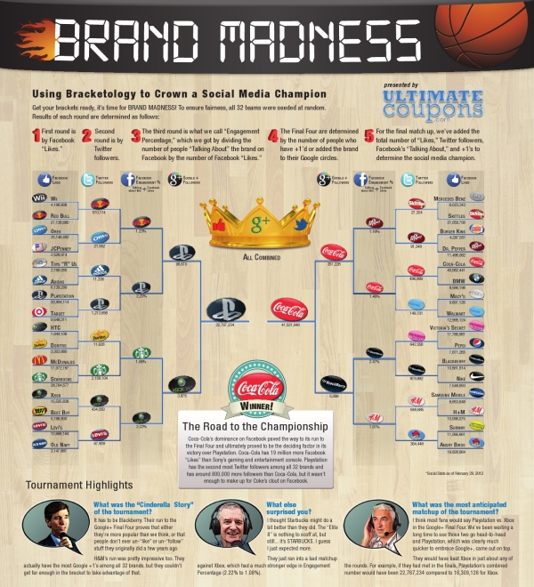
Brand Madness! Using Bracketology to Crown a Social Media Champion is a fun infographic design during the NCAA basketball tournament that uses social media scores to determine winning match-ups.  From UltimateCoupons.com, this design is a great example of taking boring data (Facebook likes and Twitter followers are available to anyone) and using infographic design to make it fun and engaging to the readers.

March Madness has officially arrived, but the UltimateCoupons.com team has Brand Madness! While everyone else’s mind is on basketball, we decided to fill out a bracket pitting 32 of the world’s most popular brand names against each other with the winners and losers being decided by social media popularity.

This is a great use of the visual company logos and the bracket structure to show the readers all of the match-ups, and you can look closer to see the actual numbers if you want to.  Only a year or two ago, this type of blog post would have been all text and a table of numbers, but this is a simple and very effective use of design to grab the readers’ attention.

Thanks to Scarlett for sending in the link!

Monday
Mar122012

The Learning Power of LEGO


The Learning Power of LEGO infographic from onlinecollege.org brings to light the uses of LEGOs in education as well as a brief history of Lego Bricks.


Lego is a range of construction toys first created by Ole Kirk Christiansen in the 1940s in Denmark. Beginning as a set of stackable, interlocking blocks, Lego has evolved into the company’s global flagship product of colorful plastic pieces that can be assembled and re-assembled in infinite ways. The blocks are so popular with children that LEGO has designed educational products and curricula, and teachers are using them in their classrooms.

This is a bright and colorful design, just like LEGOs themselves. Easy to follow the information down the page, but uses too much text in my opinion.

The second section, Statistics, should have used some data visualizations to show the numbers visually. I think they missed an opportunity here to use Legos themselves to visualize the numbers. Hidden in here is the idea that LEGO should be considered the World’s Largest Producer of Tires (which I find astonishing), and a quick visual looking at the world's tire companies would have been great!

The bottom does a good job listing the data sources and the producing company logo, but is missing a URL to the original infographic posting and some type of copyright statement.

Thanks to Stella for sending in the link!

Friday
Mar022012

The Genealogy of Automobile Companies 

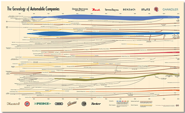
A brand new infographic poster designed by Larry Gormley at HistoryShots.comThe Genealogy of U.S. Automobile Companies visualizes over 100 years or corporate history of car company mergers, acquisitions and closures.

A flowing history of more than 100 automobile companies across the complete time span of the automobile industry. From 1900 to 1925 over 3,300 organizations were formed to produce automobiles in the United States. In 1910 alone 400 new startups entered the industry. Most attempts lasted less than two years. While car sales exploded (from 1910 to 2010 US sales rose from 200,000 to 11.5 million cars) the strongest entrepreneurs bought out rivals and combined forces. Today, ten companies account for about 90% of all US automobile sales.

This graphic uncovers and explains how the industry was created and how it arrived at its present form. At the core is a full genealogy of over 100 companies from the Big Five to the small defunct companies. Folded into the genealogy is the relative market share of US sales for each company.

The Big Five car companies have unique colors, and all of the other companies are color-coded into categories of he trest of the Top 20, defunct companies and other interesting or famous companies.  The thickness of the lines change over time to represent market share.

You can buy a copy of the 38” x 23” poster for $29.95 over at HistoryShots.com

Thanks to Larry for sending in the link!  Great design!

Monday
Jan232012

Job Growth at the 100 Best Companies

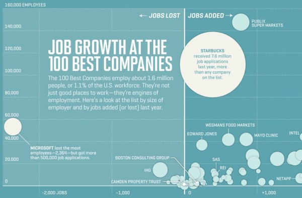
Designed by Nicolas Rapp, with Anne Vandermey (@Vandermy), Job Growth at the 100 Best Companies is a companion infographic for the Fortune feature article, 100 Best Companies to Work For.

Fat paychecks, sweet perks, fun colleagues, and over 70,000 jobs ready to be filled — these employers offer dream workplaces. Like Google, which reclaims the top spot this year to become a three-time champion. Meet this year’s top 100, network with the winners on LinkedIn, and more.
In the latest issue of Fortune Magazine.

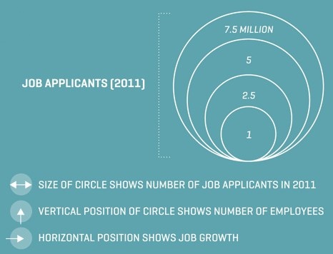
This is a great Bubble Map visualization that shows the reader three different dimension of information: Job growth (or loss), total company employees and total job applications over the course of the last year.


I do wish that all of the bubbles had been identified in the infographic.  There are many company bubbles unmarked, but the reader assumes they are a part of the Top 100 list.  Just my personal preference, but I would have used the company logos instead of text to identify the bubbles too.

Head over to Nicolas’ site to see the full-size version:

Monday
Dec122011

Client Infographic: Top 20 Marketing Automation Software Solutions

Designed here at InfoNewt for Capterra, the new infographic: The Top 20 Marketing Automation Software Solutions explores the relative Popularity of different software companies playing in the Marketing Automation arena. 

In this design, I used a pie chart to represent the total Popularity of the Top 20 solutions, and connected the related company logo to each slice as appropriate.  It was a specific design choice to list the rank number, but not the specific percentage of each slice.  Because the data was gathered and combined from a number of different sources that can change daily, the results needed to be informational at a general level and valid for a longer period of time.  Visually, you can quickly and easily understand the relative popularity, but the specific value isn’t relevant to any purchase decisions.

An infographic product comparison is a great way to help buyers cut through the clutter and add value.  There are currently 184 software solutions listed in the Marketing Automation category directory, so buyers need some way to compare products and make an informed decision.

Capterra is the authority when it comes to finding software solutions for businesses, and they’ve done some great work gathering data and measuring the relative popularity of different software categories.  Although popularity doesn’t necessarily mean the software is right for your business, it is a really good indicator that the solution is working successfully for many businesses and may be worth a closer look.  A better indicator than just total revenue or trying to rate “the best.”

Designed in OmniGraffle, and I cleaned up the logo images using Pixelmator.

Thanks to Mike and the great work from the team at Capterra!

Friday
Nov182011

Project Prediction: Demystifying Parametric Cost Estimation

Project Prediction: Demystifying Parametric Cost Estimation is a new infographic from Galorath.com, and is really an advertisement for their Seer service.

Infographics have a huge potential for use in advertisements, brochures, product packaging, etc.  This one started off nicely with minimal text, using icons and illustrations of the different product abilities, but fell apart into a whole lot of text at the end.

I’m pretty sure I still don’t understand what “Parametric Cost Estimation” does.