About
Randy Krum
President of InfoNewt.
Data Visualization and Infographic Design

Infographic Design

Infographics Design | Presentations
Consulting | Data Visualizations

DFW DataViz Meetup

Join the DFW Data Visualization and Infographics Meetup Group if you're in the Dallas/Fort Worth area!

Search the Cool Infographics site

Custom Search

Subscriptions:


Feedburner

The Cool Infographics® Gallery:

How to add the
Cool Infographics button to your:

Cool Infographics iOS icon

- iPhone
- iPad
- iPod Touch


Read on Flipboard for iPad and iPhone

Featured in the Tech & Science category

Flipboard icon

Twitter Feed
From the Bookstore

Caffeine Poster

The Caffeine Poster infographic

Entries in connections (69)

Friday
Apr272012

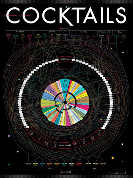
Mapping Popular Story Plot Lines

Finally! The secret ingredient to writing a good book has been revealed. Plot Lines, the infographic from Delayed Gratification, the slow journalism magazine, shows the dominant themes in last year’s books nominated for the Man Booker Prize for Fiction.  An interactive, zooming viewer available on the original landing page.

What makes a prize-winning novel?  As Julian Barnes wins the Booker Prize, Johanna Kamradt charts the themes of this year’s longlisters.  (Illustration by Christian Tate)

If you want to write a hit novel, it pays to stick with the tried-and-true plot lines.  DEATH of your characters is clearly the overall winning theme, with every one of the novels listed from 2011 including death as a theme.  Other classics like WAR, LOVE, BETRAYAL and CORRUPTION followed closely.  Obscure plot points like AN ESCAPED TIGER and HOMICIDAL COWBOY BROTHERS are certainly much more of a risk.

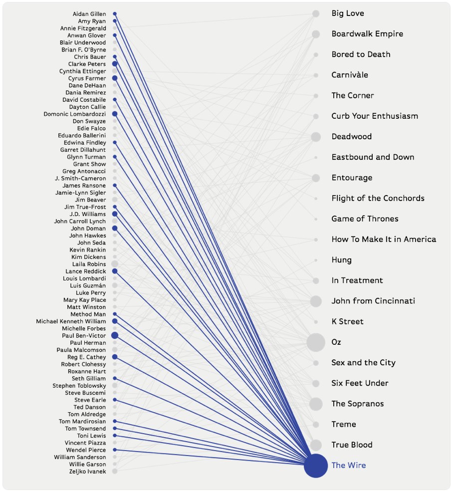
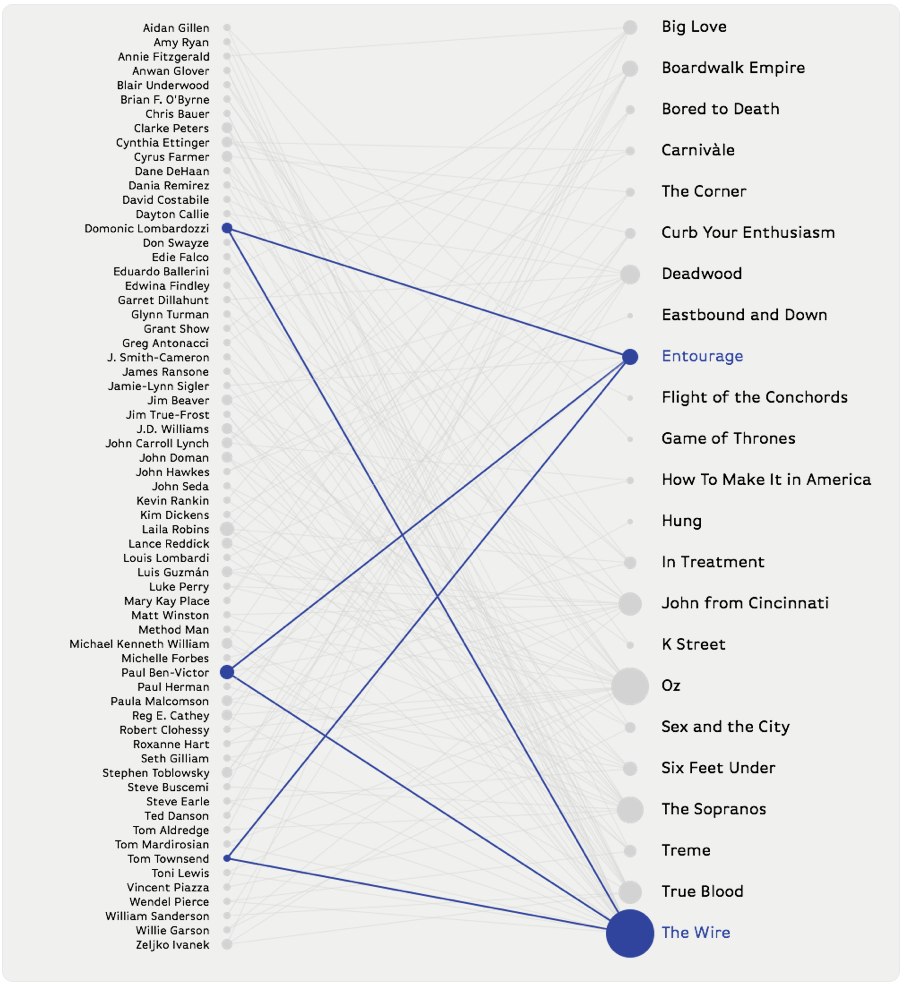
I love this design, and how it takes the multiple, complex story plots from the complicated mix on the left, and converts the chaos into order on the right.  Even with all of the crossover lines, you can still pretty easily follow a line across the diagram.  It’s fun and engaging for readers to follow the connections, and draws the readers in to look more closely. 

Found on visualnews.com

Thursday
Feb092012

The Definitive Cocktails Poster


The Constitution of Classic Cocktails is a cool new poster from Pop Chart Lab.  Available in print for $36, this is a 27”x39” poster.

This definitive guide to classic cocktails breaks down 68 drinks into their constituent parts. Follow the lines to see where spirits, mixers, and garnishes intersect to form delightful concoctions. This massive movie poster-sized print contains over 40 types of alcohol (from distilled spirits to bitters), mixers from raspberry syrup to egg white, and garnishes from the classic olive to a salted rim. This obsessively detailed chart also includes the ratios for each drink, as well as the proper serving glass, making it as functional as it is beautiful. Over a year in the making, this is Pop Chart Lab’s most elaborate chart ever.


I love the circular design, with radial connections between the different alcohol types in the center and the mixed drinks around the perimeter.  I find it easier to start in the center, and figure out which drinks you can make with that alcohol.  They show the different shapes of glassware for cocktails across the bottom, and use those icons to show which glass should be used with each drink.

Pop Chart Lab also posted a fabulous, behind-the-scenes article on FastCoDesign about the process they went through during the design development.  Check out The Only Chart You Need To Mix A Proper Cocktail to see the early concepts and the different stages the design went through.

Found on Chart Porn.

Monday
Oct312011

The Diabolical Diagram of Movie Monsters

The Diabolical Diagram of Movie Monsters is a cool new poster from Pop Chart Lab.  Available in print for $30, this 24”x36” poster fits nicely in any standard poster frame.

A taxonomic breakdown of all manner of frightful creatures from the silver screen, from the very large (like Godzilla) to the rather small (like Chucky) to the very weird (like the Crawling Eye). Hundreds in all, this is the definitive guide to a universe of scarifying baddies.

Found on We Love Datavis

Tuesday
Sep202011

The Internet of Things


Intel has designed a large infographic, The Internet of Things that explores the growing number of devices connected to the Internet since 1960 through predictions up to 2020.  (NOT to be confused with The Internet of Things infographic released by Cisco earlier this year with the same name)  High-Resolution PDF version, additional information and the data files are available here.

The Internet is evolving, again. Every day, billions of people connect to the Internet through billions of devices – PCs, smartphones and TVs to name just a few. While the PC remains at the centre of this evolution, Internet connectivity is now embedded into cars, fitness equipment, factory robots and vending machines. This smarter, connected world has the potential to change how we live.

We’re entering a new phase of Internet evolution. It is expanding much more rapidly than it has done in the last decade. Increasing numbers of everyday appliances are connecting to the Internet, their environment and to each other. Cars, fitness equipment, factory robots, retail signage and vending machines are becoming ‘smart’ thanks to tiny embedded computer processors and sensors, just like those in your laptop or mobile phone.

I have mixed feelings about this one.  It’s visually attractive, and would make a really nice printed poster.  The data is valuable and interesting, apparently gathered from a large number of disparate sources, but the URL listed at the bottom to view the sources didn’t work for me.

However, all of the colored lines aren’t actually connecting any events or actually combining to create a visualization of the values on the left side of the page.  While it visually implies the growing connections to the Internet and complexity, it doesn’t have any connection to the actual data.

I like the circle diagram at the bottom of the growing millions of PCs sold every day, but the “80% of of all PCs shipped today have Intel Inside” turned a fun, informative infographic into an ad and could turn off some readers.

Thanks to Emma for sending in the link!

Friday
Sep162011

HBO Recycling Program

The HBO Recycling Program is a visualization by Craig Robinson that shows many of the actors and actresses that HBO has used in multiple series.  This was posted as part of an article on Grantland.com.

Actors who have appeared in three or more episodes of multiple scripted, live-action, original, HBO series since OZ (excluding miniseries).

Inspired by the original visualization, an interactive version was created by Zack Grossbart that allows you to highlight either the show, or the actor, and it will display the connections.


Click on two shows, and the interactive version will highlight only those actors in both shows.


Zack’s interactive infographic is made with PaperJS, underscore.js, and a little JQuery.  He has made the code open source, and it can be used to display the connections between other groups as well, if anyone has the motivation to map their own connections. 

Wednesday
Aug312011

Who Owns The Beer Brands?

That beer you’re drinking from that cool independent brewery may not be what you think.  Another very cool data visualization from Philip H. Howard and Ginger Ogilvie at Michigan State University called Concentration in the US Beer Industry.  Similar to their last project visualizing the soft drink industry in The Illusion of Diversity, this new project shows the breweries and individual beers owned by the top 13 companies.

There is an appearance of great diversity in the number of brands and varieties of beer sold in the United States. The beer industry, however, is dominated by a relatively small number of firms.

AB InBev owns, co-owns or distributes more than 36 brands, for example, while MillerCoors controls at least 24 more. MillerCoors also brews Metropoulos & Company’s products under contract (thus the company that controls Pabst and 21 other brands is a “virtual” beer company).

Only meant to show which companies own which beer brands, the three bubble sizes are used to show parent companies, brewery brands and individual beer brands.  They designed a separate treemap visualization to show market share.

Because these are large visualizations, they have posted them within zooming viewers on the Michigan State University site.

Found on Flowing Data.

Wednesday
Jul272011

The VIZoSPHERE - Visualizing DataViz People on Twitter

From Moritz Stefaner on Visualizing.org, comes the VIZoSPHERE project (Click the image to see the high-resolution image viewer).  Using GePhi, Moritz started with 18 seed accounts on Twitter, and then mapped 1,645 of the connected, networked accounts that relate to data visualization.  Bubble size in this visualization shows how many followers each account has from within this DataViz pool of users.

This map shows 1645 twitter accounts related to the topic of information visualization. The accounts were determined as follows: For a subjective selection of “seed accounts”[1], the twitter API was queried for followers and friends. In order to be included into the map, a user account needed to have at least 5 links (i.e. follow or being followed) to one of these accounts. The size of the network nodes indicates the number of followers within this network.


[1] The seed accounts were; @moritz_stefaner, @datavis, @infosthetics, @wiederkehr, @FILWD, @janwillemtulp, @visualisingdata, @jcukier, @mccandelish, @flowingdata, @mslima, @blprnt, @pitchinteractiv, @bestiario140, @eagereyes, @feltron, @stamen, @thewhyaxis

The zooming interface is crucial to view such a highly-detailed visualization and be able to read any of the nodes.  I was about to find my own Twitter account (@rtkrum), but it would be nice if Moritz would also provide a listing of the Twitter accounts or some way to search the map.

Great job Moritz!

Found on FlowingData and Robin Richards (@ripetungi) on Twitter.

Friday
Jan282011

InMaps: Viewing Your Business Network

The new LinkedIN Maps is a very cool interactive infographic that visualizes your own LinkedIN network.  The InMaps pull data from your own LinkedIN profile when you allow access, so you can only see your own network.  

The connections are grouped into clusters based on shared connections and companies.  You can see above that my network has a few clearly defined clusters, but then a large blue area that has no clear cluster information.  You can also learn about you network with some of the visual data built into the map.  People with bigger dots and their names in larger fonts have more connections.

It’s interactive, so you can zoom in to see the individual names, and if you click on a connection, it highlights all of their connections as well.

Check out the quick, descriptive video from LinkedIn’s chief scientist DJ Patil:


For some reason, it doesn’t show every connection between people.  There are a few people in my network that I know are also connected to each other; however, the map didn’t show any connection between them.  Not sure what’s going behind the scenes.

You can publicly share your map on Twitter, Facebook and of course LinkedIN when you click the share buttons.  Here’s mine.  This creates a static image with a legend if you have named your color-coded clusters.  Clicking on the map takes readers to the front page to create their own, but clicking on your name takes them to your LinkedIN profile page.

You can also see some other anonymous maps on the front page by clicking on the “Next Map” button which will change to the background map image.

This one has been popular.  Found on FlowingDataVizWorld, Infosthetics and Mashable.

Thursday
Jan202011

The Illusion of Diversity: Visualizing the Soft Drink Industry


Very cool visualization from Philip H. Howard at Michigan State University called The Illusion of Diversity.  It’s fairly big and hard to read, so I dropped the image link into Zoom.it to create the zoomable image above.  You can see the high-resolution image here, or download the high-resolution PDF here.

Background
Three firms control 89% of US soft drink sales [1]. This dominance is obscured from us by the appearance of numerous choices on retailer shelves. Steve Hannaford refers to this as “pseudovariety,” or the illusion of diversity, concealing a lack of real choice [2]. To visualize the extent of pseudovariety in this industry we developed a cluster diagram to represent the number of soft drink brands and varieties found in the refrigerator cases of 94 Michigan retailers, along with their ownership and/or licensing connections.

Professor Howard’s team did a lot of legwork visiting stores to gather the data, recording 987 different varieties of soft drinks from 94 food retailers in the Lansing, Michigan area.


The statement “Three firms control 89% of US soft drink sales” really means that “89% of the drinks available come from only three firms”.  The distinction is subtle, but there is no sales data included.  This is just an ownership structure.

You also have pay attention to what you’re seeing.  The bubble sizes are mixed because the parent company bubbles are sized to the portion of drinks they control, but the size of the individual drink bubbles is consistent and doesn’t convey any meaning.  For the individual drink, the color-coding is what conveys meaning.

Conclusion
The illusion of diversity in the soft drink industry extends beyond obscuring ownership, as its products are primarily water and sweeteners. More research is needed on the links between pseudovariety and the consumption of energy-dense, nutrient-poor substances.

I noticed that this was created using OmniGraffle, which is a vector mapping application that I use a lot.

Found on Infosthetics.com and VizWolrd.com 

Tuesday
Jan182011

The X-Men Family Tree #infographic


Joe Stone just posted his design of the X-Men Family Tree.  Connection lines styles and colors reveal the type of relationship.  Silhouettes or minimal illustrations give the reader just enough visual cues to identify each of the mutants.  How many can you identify?

A little Illustrator-drawn infographic I’ve been playing around with. I probably could have included more characters, but I had to draw the line somewhere.

Joe has also made a high-resolution version available for anyone that wants to print it out!  Thanks Joe!