About
Randy Krum
President of InfoNewt.
Data Visualization and Infographic Design

Infographic Design

Infographics Design | Presentations
Consulting | Data Visualizations

DFW DataViz Meetup

Join the DFW Data Visualization and Infographics Meetup Group if you're in the Dallas/Fort Worth area!

Search the Cool Infographics site

Custom Search

Subscriptions:


Feedburner

The Cool Infographics® Gallery:

How to add the
Cool Infographics button to your:

Cool Infographics iOS icon

- iPhone
- iPad
- iPod Touch


Read on Flipboard for iPad and iPhone

Featured in the Tech & Science category

Flipboard icon

Twitter Feed
From the Bookstore

Caffeine Poster

The Caffeine Poster infographic

Entries in design (479)

Tuesday
Jan012008

Smoking Kills 200,000 Every 6 Months


Skull With Cigarette, 2007 [based on a painting by Van Gogh]
72x98"

Depicts 200,000 packs of cigarettes, equal to the number of Americans who die from cigarette smoking every six months.

I've become a big fan of Chris Jordan's work, especially the Running The Numbers series. I just noticed that he has added to the collection on his website with some new pieces! A friend of mine quit smoking this week, so in her honor I want to share one of the new artwork pieces.

Thursday
Dec272007

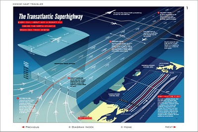
The Transatlantic Superhighway


I never really thought about it, but I'm sure the flight patterns over the Atlantic are actually this tightly controlled. Now the news that President Bush made some of the military flight paths available over the holidays makes more sense. The Transatlantic Superhighway is one of the diagrams on John Grimwade's Information Graphics site.

Wednesday
Dec262007

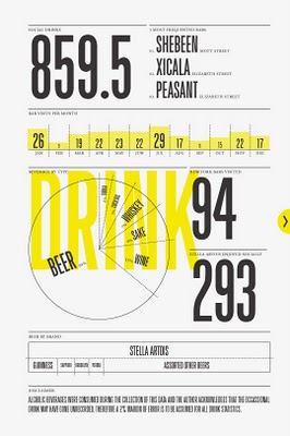
Nichloas Felton's Personal Annual Report

Nicholas Felton (www.feltron.com) has created his own personal 2006 Annual Report, looking back at his life during 2006 and using maps, charts, timelines and facts to visually track his activities. With pages dedicated to photos, travel, drinking, reading and food, he plots out his one-year history.

Saturday
Dec222007

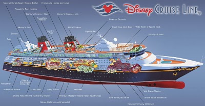
The Disney Cruise Line Cut-Away


The family took our first Disney Cruise this year, which was fantastic! Here’s a great cut-away graphic of the Disney Wonder, but the other ship, the Disney Magic is almost identical. This graphic is a little out of date, because some things have changed. The ESPN Skybox is now a teen area called The Stack or Aloft depending on which ship you’re on.

The ship is actually quite large, so the spacial representation of locations is really helpful. You can get turned around very easily.

Friday
Dec072007

Cooking Infographics


Found on SimpleComplexity.net, Cookz (coo.kz) is a website under development that illustrates recipes with visual infographics. There is an example up now for chocolate chip cookies.

More details are found on flickr, under the user macro girl:

The visual equivalent of a thesis - work from my final semester in Visual Communications.

Monday
Dec032007

Infographic Airport Video

I came across this on Janine Swainston's blog:

The animated story of one man's epic journey, created entirely from public domain symbols. In other words, an airport story told in the language of airport infographics.

Wednesday
Nov142007

See My Voice


From the University of Sydney, Bachelor of Design Computing website, See My Voice was a project by one of the students in the program, Andrea Lau.

SeeMyVoice - Social Information/Data Visualisation (or infovis). SeeMyVoice visualises chat transcripts stored by MSN Messenger. It aims to highlight people's style of chatting and increase understanding of our online social interaction. Each person is represented by a coloured wave which ebbs and fluctuates according to message length and the time taken between messages.
Great job Andrea! That's exactly how IM conversations go.

UPDATE: Andrea has a complete website describing her work and the See My Voice project in much more detail.

Monday
Nov052007

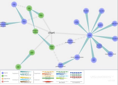
Visuwords


Visuwords is a new website that visually shows the relationships between words. More than an online dictionary or thesaurus. The relationships are shown graphically like a mind-map.

Visuwords™ online graphical dictionary — Look up words to find their meanings and associations with other words and concepts. Produce diagrams reminiscent of a neural net. Learn how words associate.
Found on LifeHacker.

Monday
Nov052007

Infographic Video Advertisement


Found on Uswim, a French company developed an ad campaign around the infographic video style we saw in the Royksopp video.

It had such an impact that a few years later Areva, the French nuclear giant, wanted to use it for their advertising. Being denied it by the Norwegian pop group they finally went for the hit “Funky Town” on a video that looks very similar (as it was done by the same French art collectif H5 that did Royksopp’s video).


Their objective was to show Areva’s expertise in the energy sector (see their corresponding website using Flash animation) as part of the branding campaign of a company anticipating to go private (still waiting because of internal French politics). The choice of animated graphics was to reinforce the educative aspect on Areva’s business and avoid the harsh reality of images of nuclear plants. In a way the almost childish graphics (almost like a comic strip) make it look like a video game of some sort, some kind of SimCity. It was very successful and the idea was again used in a slightly different angle (accelerated special effects video) by EDF (another French energy giant) in a commercial

I found the link to Uswim on Simple Complexity.


Friday
Nov022007

The World Freedom Atlas


The World Freedom Atlas, offers many different views of the world. Developed by Zachary Forest Johnson, his blog is here. The one above is the Raw Political Rights Score (darker is better) based on data from the Freedom House. Offering a bunch of datasets from a number of different sources, the interface is fantastically easy to use. Depending on the dataset, you can also view the data by year from 1990-2006.