About
Randy Krum
President of InfoNewt.
Data Visualization and Infographic Design

Infographic Design

Infographics Design | Presentations
Consulting | Data Visualizations

DFW DataViz Meetup

Join the DFW Data Visualization and Infographics Meetup Group if you're in the Dallas/Fort Worth area!

Search the Cool Infographics site

Custom Search

Subscriptions:


Feedburner

The Cool Infographics® Gallery:

How to add the
Cool Infographics button to your:

Cool Infographics iOS icon

- iPhone
- iPad
- iPod Touch


Read on Flipboard for iPad and iPhone

Featured in the Tech & Science category

Flipboard icon

Twitter Feed
From the Bookstore

Caffeine Poster

The Caffeine Poster infographic

Entries in design (479)

Friday
Sep282007

The Wine Advocate Vintage Guide
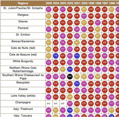

From eRobertParker.com, the online Wine Advocate Vintage Guide. Fascinating guide of wines from 1970-2005. Wines are grouped by region and year, and each group is scored and given a letter code to identify the current maturity status of those wines (like Ready to Drink, Too Old and Early Maturing). The color coding represents ranges of the numeric scores.

The guide is interactive, so clicking on any of the rating circles brings you to a list of the specific wines grouped together for that region. For the specific wines, you can see their individual name, score, maturity level and price range.

A PDF version of the guide is available here for download.

Monday
Sep242007

History of Computer Languages


O'Reilly has created a poster showing the 50-year history of computer languages from 1954 to 2004, available as a PDF. They have also been giving away copies of the posters at O'Reilly conferences. I love the links shown where older languages split or combined to create the newer languages over time.

I look back around 1990 when I was programming in college and see Fortran V, C++ and the birth of Visual Basic. I remember having to convince my engineering professors to let me program assignments in C++ instead of Fortran.

The original diagram was created by ร‰ric Lรฉvรฉnez. Although O'Reilly is not updating the poster, Eric is keeping his original diagram up to date on levenez.com.

Wednesday
Sep192007

The inner mind of a brand geek


A subject near and dear to my heart, I found this poster on Visual Complexity. This map "illustrates the intricate, interwoven relationship between businesses and their brands." The source appears to be 300million.com, which is a Marketing agency in the UK.

I love this map, and I thought this would be a good entry to the VizThink Mind Map Contest.

Tuesday
Sep182007

Bed Sheets for Couples


My wife got the biggest laugh out of these. Found on Information Aesthetics, these double bed sheets are printed with a ruler starting at the center and measuring outward. You can always tell whose side you're on because the ruler is printed to be read when you are in the bed.

The sheets are from DesignWise, a store chain with designer products in Portugal, Spain and France. DESIGNWISE is a brand that edits original products and objects created by Portuguese designers.

Monday
Sep172007

Human Trafficking

Found on VisualComplexity.com, this disturbing poster examines global human trafficking.

"It depicts each country's level of involvement (from Very High to Very Low) as either a country of destination or origin. The project concentrates on the smuggling of people from one country to another - mainly illegally. In many cases these people are forced to do work that is illegal, such as prostitution or child labor."
The poster was created by Taulant Bushi, and the original image is here.

Wednesday
Sep122007

searchCrystal

Check this one out! The graphic above is an embedded object from searchCrystal that lets you search multiple sources for images (or other forms of information). I've preloaded it to search for "inforgraphics" from GoogleImages, Flickr, AskImages, YahooImages and MSNImages. When you dig a little deeper, you can choose the different sources you are searching from, save searches, share results with others, etc.

The arrangement shows the overlap of the results from multiple sites. Simple navigation like scrolling over images enlarges them, and clicking takes you to the source image.

Also works for video, blogs, tags, news, etc...blah, blah, blah. We only care about images don't we?

Wednesday
Sep122007

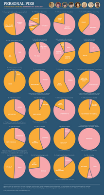
Personal Pies


Craig Robinson from Flip Flop Flyin' charted his current existence with the use of pie charts in his Personal Pies project. Although amusing to look through, I think this demonstrates really well how shallow pie charts are, and how much information depth can be lost with charts.

Monday
Sep102007

The Bloomberg Makeover

Three design firms took on the challenge of re-designing the Bloomberg terminal interface, and the results were fantastic. The challenge came from Portfolio.com. The original article is here, but the fantasy terminals are here with an interactive interface that lets you highlight and zoom in on particular features. The design above is from thehappycorp.com and is my personal favorite.

Bloomberg claims to be constantly improving their interface design, but it still looks like runs on DOS and is straight out of the 80's.


Here is the desing from IDEO.com:


And one from Ziba.com:

Thursday
Sep062007

Running the Numbers


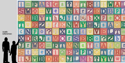
Chris Jordan has created some fantastic photographic artwork depicting the massive scale of some statistics about American life. This is where infographics actually become artwork.

The image above "Depicts nine million wooden ABC blocks, equal to the number of American children with no health insurance coverage in 2007." The complete image is 16 feet tall x 32 feet wide.

There are 17 different images available to view on his website. You can see the images magnified there to show the small pieces that each image is made from. Each image is based on an actual statistic about American life.

FYI: This series will be exhibited at the Paul Kopeikin Gallery in Los Angeles, opening Sep 8. More info at www.paulkopeikingallery.com.

Wednesday
Sep052007

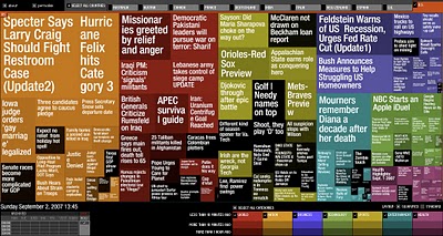
Marumushi News Map


Marumushi.com has a fantastic News Map using the treemap visualization style. This is one of the best implementations of a treemap that I have found. Updated every 6 hours, it groups news stories (from the Google news aggregator) by overall category (technology, world, sports, etc.). You can choose to show the news map from 11 different countries, and the color shading of each block represents how old that particular news story is. Hovering your mouse over any square shows the whole title, and clicking takes you directly to the story.