About
Randy Krum
President of InfoNewt.
Data Visualization and Infographic Design

Infographic Design

Infographics Design | Presentations
Consulting | Data Visualizations

DFW DataViz Meetup

Join the DFW Data Visualization and Infographics Meetup Group if you're in the Dallas/Fort Worth area!

Search the Cool Infographics site

Custom Search

Subscriptions:


Feedburner

The Cool Infographics® Gallery:

How to add the
Cool Infographics button to your:

Cool Infographics iOS icon

- iPhone
- iPad
- iPod Touch


Read on Flipboard for iPad and iPhone

Featured in the Tech & Science category

Flipboard icon

Twitter Feed
From the Bookstore

Caffeine Poster

The Caffeine Poster infographic

Entries in food (83)

Wednesday
Feb052014

The Best Temperatures for Cooking Fats & Oils

The Best Temperatures for Cooking Fats & Oils infographic

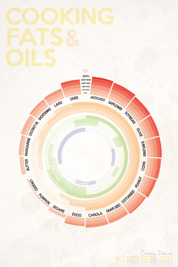
What a great topic for an infographic!  Different oils have different smoking points. and the Kitchen 101: Cooking Fats & Oils infographic from Chasing Delicious helps you make sense of them.

When it comes to cooking and baking, there is no shortage of fats and oils. Plants, flowers, seeds, nuts, animal fat, and milk almost all seem to end up as a cooking oil or fat at one point in time or another. And today, a trip down the oil isle makes it clear just how many choices exist. But can they all be used interchangeably? And if not, what do you have to take into consideration?

The answer to the first question is a big no. And to answer the second question, you must take in to consideration four main aspects of a cooking oil or fat: 1. smoking point, 2. flavor, 3. how it interacts with other ingredients, and 4. its nutritional value.

No, you can’t just trade out EVOO for peanut oil and expect the same results on the stove!

The circular bar chart is easy to understand for the audience, and the color gradients make comparisons simple between the different oils and fats.  The light colors used in the center arcs make the text hard to read though.  Available as small printed posters, this infographic would make a great addition to any kitchen.

Found on Lifehacker

Wednesday
Jan082014

The Charted Cheese Wheel

The Charted Cheese Wheel infographic

The Charted Cheese Wheel infographic poster is your cheese cheat sheet to success. The infographic can be found at popchartlab.com in poster form for purchase at $28.

A charting of 65 delightful cheeses from around the world, assembled into one wondrous wheel. The cheeses are broken down by the animal that produced the luscious milk, and then by the texture of the resultant cheese, forming a cornucopia of cheese that range from the mild to the stinky and from the rock hard to the silky smooth. The chart includes all-time greats like Cheddar, Brie, and Mozzarella as well as foodie faves like Stinking Bishop and Humboldt Fog.

18” x 24”

Each print is signed and numbered by the artists, and comes packaged in a Pop Chart Lab Test Tube. See below for finishing options, and note that framed prints require an additional 3-4 business days of processing time.

Using 100 lb. archival recycled stock certified by The Forest Stewardship Council, this poster is pressed on an offset lithographic press with vegetable-based inks in Flatlands, Brooklyn.

The infographic is organized well. There is a lot of cheese out there and Pop Chart Lab was able to organize 66 different varieties of cheese into easily-understood categories.

Found on visual.ly and www.fastcodesign.com

Wednesday
Nov272013

Thanksgiving Table Setting Diagrams

Thanksgiving Table Setting Diagrams

Just in case anyone needs a visual reminder when setting the Thanksgiving dinner table, the Table Setting Diagrams from Dinner-Party-Menu-Ideas.com make it super easy!  More of a diagram than an infographic, it’s still a super-useful visual!

Found on lifehacker, Brunch at Saks, and Apartment Therapy

Here’s a more detailed and further designed Thanksgiving Etiquette Table Setting Guide infographic from Adirondack Authority:

Thanksgiving Etiquette Table Setting Guide infographic

Found on Fine Dining Lovers

Both of these designs have an excellent Online Lifespan.  These designs are not new, they were originally published in years past.  The information presented is long-lasting, and will be relevant to readers every year for many years to come.

Tuesday
Nov262013

Thanksgiving Timed Right

Thanksgiving Timed Right infographic

Thanksgiving Timed Right is a timeline infographic from allrecipes.com that helps everyone plan when to start cooking each dish for Thanksgiving dinner.  You want everything to make it to the table at the same time right?  I especially appreciate the Wine Breaks!

Great idea, and I know many, many people that struggle to figure this out on their own.  As an infographic released on the web, it really needs to have the URL back to the original full-size version included in the footer.  Many people are going to share this infographic with friends and family, but very few with correct link back to the Fresh Bites Blog where you can find the original.

The topic choice here is fantastic!  This design will have an Online Lifespan of many years as people go looking for this information every November.

Also found posted on Scribd by StephanieRobinett

Thursday
Nov072013

Most Popular Pizza Chains Map Visualization

Most Popular Pizza Chains infographic

FlowingData has released a fantastic map visualization of the Most Popular Pizza Chains in the United States.

Most of the major pizza chains are within a 5-mile radius of where I live, so I have my pick, but I usually order from whatever place is closest to where I am. So it doesn’t matter if there are more Domino’s locations than Pizza Huts where I live. I just want my feeding time to come sooner rather than later, and if that place happens to be Pizza Hut so be it. (Although, if I’m not in a rush, I’ll go to the local sit-down place.)

This is the point of the map above, which shows the nearest pizza place within a 10-mile radius across the United States. Nice and clean data courtesy of AggData.

You can also see the major chains individually:

Most Popular Pizza Chains Separate Maps

Found on LaughingSquid.

Now I’m hungry.

Friday
Sep272013

The Anatomy of Sangria

The Anatomy of Sangria infographic

A good way to start the weekend!  The Anatomy of Sangria from Wine Enthusiast Magazine is a nice visual explanation of what goes into making sangria, including different variations of ingredients.

It’s sometimes tough to know where to start when making sangria. In addition to selecting a red wine or white, there are several elements to consider: Which fruit will you use? What mixer will you add? Will you choose a savory or sweet garnish? Flavor combinations can make or break even the simplest of sangrias, so to make sure your next batch is stellar, use the guidelines below to create a version that promises to suit your palate—and your guests.

Bright, colorful design using photographs of the different ingredients is visually appealing and should get shared frequently.

This is also a great example of a long Online Lifespan topic for an infographic.  The ingredients for making sangria don’t change, so the infographic will be relevant for years to come; driving traffic and links to the website.

The footer should include a copyright statement, and the URL to the infographic landing page so readers that find this infographic on other sites can find the original full-size version.

Found on Foodista

Friday
Aug232013

The Periodic Table of Alcohol

The Periodic Table of Alcohol infographic

The Periodic Table of Alcohol infographic does a good job of organizing popular alcoholic drinks in the periodic table design format.  Posted on Visual.ly by designer Mayra Magalhães (mayra.artes), 

This infographic shows important information about the most famous alcoholic beverages.

It’s unclear who the infographic was designed for.  The footer of the infographic lists BestCollegesOnline.com, the landing page on Visual.ly lists the Consumer Media Network and the URL actually links to CarInsurance.org.  It looks like this design is a modification of a design from 2011 done for Best Colleges Online called the College Student’s Guide to Boozing.  I’m guessing Mayra uploaded this recently to be included as a part of her design portfolio.

The infographic has been heavily shared, and I found this version on Laughing SquidBusiness Insider, Popular Science, This is Happiness, Geekologie, and Gizmodo.

Friday
Jun212013

Smoothie Recipes For Everything

Smoothie Recipes For Everything infographic

Who knew that the solution to most our problems could be solved with a smoothie?! Smoothie Recipes For Everything infographic from Super Skinny Me gives you the ingredients and visually represents the amount of each that should put in. Trying to lose weight? Want to de-stress? Or maybe just want a bedtime drink. This infographic has it all.

Is there anything as versatile, adaptable and convenient as a smoothie? I doubt it. Nor are there many things as universally beloved.  Smoothies are scrumptious, indulgent concoctions that tickle the taste buds and, inexplicably, with every sip make you feel just a little bit happier and make the world a little bit friendlier. The smoothie is so much greater than the sum of it’s parts. And just to prove the smoothie can do no wrong, it can actually make you more awesome too.

Smoothies contain a smorgasbord of ingredients, and depending on what you throw in, smoothies can ascend from mere flavorsome delight and sweet-tooth satisfier to the dizzying heights of muscle-building, energizing, health-enhancing superdrink. Why eat just one superfood, when you can combine a load of goodness into one easily digestible drink? Plus, it’s super quick and absurdly easy to prepare, making it weirdly efficient not just nutritionally, but generally. Created in the 1940’s, but perfectly designed for 21st century living.

Smoothies can be tailored to suit your own needs. And while the flavors are virtually limitless, don’t just think about taste, but also why you’re making it. Do you want to lose weight or perhaps build muscle? Do you need a pick-me up or extra energy to power through an intense workout? Had a bad day and want to wind down? Or maybe you can’t get to sleep. With a little smoothie science, you can easily make a smoothie that doesn’t just taste good (or look pretty), but actually does something.

The major issue I have with this design is that the proportions visualized for each smoothie aren’t accurate to the recipe.  The sections are sized to fit the text, and have no relationship to the data.  Big mistake!

Also, the actual amounts of each ingredient aren’t shown.  The recipes are on the infographic landing page in the text portion, but aren’t included in the infographic itself.  The issue with infographics is that they need to include the complete information because they are shared all by themselves, without any accompanying description text.

Found on superskinnyme.com

Thursday
Jun202013

The Cost of a Road Trip to the Top 10 U.S. Vacation Cities

The Cost of a Road Trip to the Top 10 U.S. Vacation Cities infographic

I Drive Safely and Gas Buddy partner up to create the Cost of a Road Trip to the Top 10 U.S. Vacation Cities infographic. The infographic calculates the total cost of food, lodgings, and gas and then gives some money saving tips. This infographic can be found on idrivesafely.com.

Did you know that a road trip to the top 10 US vacation cities is more than 7,600 miles (12,231km) of driving? That’s the same distance as a flight from Alaska to Australia! Wondering if you could afford to pack up and leave on this awesome road trip? We partnered with our friends at GasBuddy.com to bring you the infographic below which breaks down the cost of a 25-day road trip including the cost of gas, food and lodging. We’ve also included some tips for saving money on your trip.

The top 10 U.S. vacation cities are based on a 2012 poll from U.S. News Travel and excludes cities not in the continental United States. Fun fact: 3 of the top 10 US vacations spots are in California: San Diego, Yosemite and San Francisco!

Fun topic idea, and certainly relevant to both Gas Buddy and I Drive Safely.  Relevance is super-important as the search engines would like to down-grade the value of links to irrelevant content.

I would have liked to see more of the actual data visualized in the design.  Why does the calendar icon have 8 days shown when the data is 5.2 days?  Because it’s just an icon, not a data visualization, and can be confusing to readers.  The costs would have been very easy to visualize as stacked bars to make them easier to understand.

Thanks to John for sending in the link!

Friday
Mar292013

Wine Pairing - Inspired Infographic Advertising

Wine Pairing - Inspired Infographic Advertising

How to Pair Wine with the Bright, Bold flavors of Southeast Asia is a new infographic from P.F. Changs’s, an upscale restaurant chain, as part of the content in their “Inspired” advertising campaign.

The flavors of Southeast Asia cuisine are exploding in popularity.  Venture below to learn about the region’s most delicious ingredients and the dishes they can create.  Find out how to pair each dish with the perfect wine to enhance those flavors.

I love seeing an infographic design being used in this fashion, as part of a larger content marketing strategy.  The larger advertising campaign also includes specifically, interactive PDFs and a dedicated page on their site to entire program.

Although wine pairing infographics are not new, P.F.Chang’s made this custom to coincide with their own menu.  So this design is meant to help diners match wine types specifically to items on the menu at P.F. Chang’s.  The color coding ties the ingredients in to the different dishes and types of wine.

Thanks to Anne for sending in the link!