About
Randy Krum
President of InfoNewt.
Data Visualization and Infographic Design

Infographic Design

Infographics Design | Presentations
Consulting | Data Visualizations

DFW DataViz Meetup

Join the DFW Data Visualization and Infographics Meetup Group if you're in the Dallas/Fort Worth area!

Search the Cool Infographics site

Custom Search

Subscriptions:


Feedburner

The Cool Infographics® Gallery:

How to add the
Cool Infographics button to your:

Cool Infographics iOS icon

- iPhone
- iPad
- iPod Touch


Read on Flipboard for iPad and iPhone

Featured in the Tech & Science category

Flipboard icon

Twitter Feed
From the Bookstore

Caffeine Poster

The Caffeine Poster infographic

Entries in health (118)

Monday
Aug112014

The State of AIDS

The State of AIDS infographic

The four states in the US that have the highest number of cases of HIV and AIDS cases are California, New York, Florida, and Texas. The State of AIDS infographic shows the increase in cases from the 1980’s to the 2000’s and was designed by Alan Bui.

An Info-Graphic produced using statical reports from the CDC to represent visually the Four State in the US that have the highest cases of HIV/AID’S cases. The Info-Graph also shows disparity from the first reported case of HIV/AIDS in the 1980’s to the 2000’s.

Good data visualization that tells one story really well.  You can clearly see the number of reported cases increases dramatically each decade. 

Thanks to Alan for sending in the link!

Friday
Aug012014

Cold or the Flu? How to Spot the Difference

Cold or the Flu? How to Spot the Difference infographic

Getting sick is NOT fun and trying to figure out what you have is even worse. The Cold or Flu? How to Spot the Difference infographic from Vaccine Hub highlights some key points to help you tell the difference. Get well soon!

What is influenza?
Influenza, or the flu, is caused by a highly contagious virus that infects your nose, throat and lungs. Symptoms develop quickly and last around one week. The flu is seasonal and in Australia tends to occur between June and August.

Read more information at Vaccine Hub.

Determining if you have a cold or the flu is always difficult. This infographic does a good job of choosing one topic and telling its story well without adding too much information.  Visualizing the few statistics they included would make the side-by-side comparison more effective, and the treatment section could benefit from a few graphics to break up word usage.

The infographic is missing it’s URL address to the infographic landing page that should be included at the bottom of the graphic to locate the original.

Thanks to Ellie for sending in the link!

Friday
Jun062014

When Are Fruits and Vegetables in Season?

When Are Vegetables in Season? infographic

If your are an avid gardener or just prefer to know when your favorite fruits are in season, these two infographics will make your tastebuds happy with the When Are Fruits in Season? and When Are Vegetables in Season? infographics created by Greek Body Codex.

Ever wondered why sometimes your veggies taste fresh and full of flavor where other times it tastes dull and old? Some vegetables are seasonal and either don’t grow at all during certain months or don’t do well during certain times of the year. This infographic will show you when all of your favorite vegetables are in season and when they’ll taste the absolute best.

Both are good designs with a clear message.  Plotting out the calendar months in doughnut chart works nicely, and the bright colors make the overall design very visually appealing.

Thanks to Tom for sending in the link!

When Are Fruits and Vegetables in Season? infographic


Thursday
May222014

Hack Your Grill

Hack Your Grill infographic

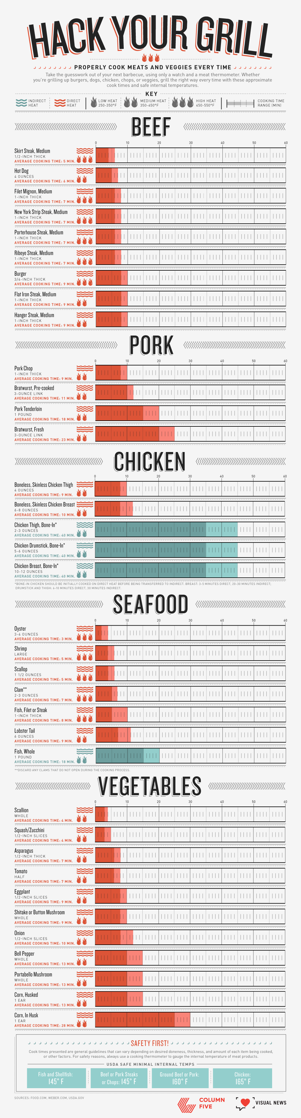
Are you planning on grilling for Memorial Day? Check out the recommended cooking instructions for your meal with the Hack Your Grill infographic from Column Five.

With Memorial Day weekend right around the corner, we can’t wait to get our beer and BBQ on. But mastering the grill can be tricky, whether it’s raw veggies or red meat. To help us crack the code, we created the helpful infographic to make sure everything cooks at the right temperature and time.

Column Five created this guide to average cook times to take the guesswork out of grilling. The guide provides average times for a wide variety of beef, poultry, pork, and vegetable items you might plan on throwing on the grill this summer—all you’ll need is a watch and a meat thermometer.

An easy-to-read, clear guide to grilling times, this design does a great job of focusing on telling one story really well.

The tall format design works really for sharing online, but I would bet that many people will want to print this out as a cooking reference.  It would be nice to have a separate PDF version that breaks the design into two printable pages that readers can print out to keep near the grill.

I would recommend two things to improve the information included in the footer.  First, the sources list only shows the main URL of the sites where the data came from.  This means that any readers would have to search for the information themselves on those sites.  It would be more transparent to list the URL directly to the report or web page that shows the specific data used in the infographic.  

Second, the footer should include the URL directly to the infographic landing page on the Column Five site.  Sadly, many blogs and sites will share an infographic without appropriately linking back to the infographic landing page, and by putting the URL in the infographic itself readers will always be able to find the original.

Thanks to Column Five for sending in the infographic! 

Friday
May022014

The Deadliest Animal in the World

The Deadliest Animal in the World is an infographic posted by Bill Gates on his blog as part of Mosquito Week.

What would you say is the most dangerous animal on Earth? Sharks? Snakes? Humans?

Of course the answer depends on how you define dangerous. Personally I’ve had a thing about sharks since the first time I saw Jaws. But if you’re judging by how many people are killed by an animal every year, then the answer isn’t any of the above. It’s mosquitoes.

When it comes to killing humans, no other animal even comes close. Take a look:

Considering their impact, you might expect mosquitoes to get more attention than they do. Sharks kill fewer than a dozen people every year and in the U.S. they get a week dedicated to them on TV every year. Mosquitoes kill 50,000 times as many people, but if there’s a TV channel that features Mosquito Week, I haven’t heard about it.

This infographic does a number of things right from a design perspective, but the major point is that as humans we see the two-dimensional area of objects as representing the values.  This design uses both the width and height of the rectangles to visualize the scale of deaths caused by the various animals.

Sometimes it might be too subtle.  For example, the width is the same for the rectangles for tapeworms and crocodiles, but the height of the tapeworm box has twice the height to represent the value correctly.

The other thing it does well is to tell one story really well.  There’s isn’t any extraneous information like geographic locations or animal populations.  The infographic focuses on communicating one set of data.

Because the infographic will be shared online without the rest of the article, there are three piece of information that are missing from this design:

  1. The Gates Notes logo, or some type of identification of who published the infographic
  2. A copyright or Creative Commons license state to clearly identify the rights for people sharing the infographic
  3. The URL of the article where readers can find the original, full-size infographic and the associated text.

Thanks to Peter for recommending the link!

Wednesday
Feb052014

The Best Temperatures for Cooking Fats & Oils

The Best Temperatures for Cooking Fats & Oils infographic

What a great topic for an infographic!  Different oils have different smoking points. and the Kitchen 101: Cooking Fats & Oils infographic from Chasing Delicious helps you make sense of them.

When it comes to cooking and baking, there is no shortage of fats and oils. Plants, flowers, seeds, nuts, animal fat, and milk almost all seem to end up as a cooking oil or fat at one point in time or another. And today, a trip down the oil isle makes it clear just how many choices exist. But can they all be used interchangeably? And if not, what do you have to take into consideration?

The answer to the first question is a big no. And to answer the second question, you must take in to consideration four main aspects of a cooking oil or fat: 1. smoking point, 2. flavor, 3. how it interacts with other ingredients, and 4. its nutritional value.

No, you can’t just trade out EVOO for peanut oil and expect the same results on the stove!

The circular bar chart is easy to understand for the audience, and the color gradients make comparisons simple between the different oils and fats.  The light colors used in the center arcs make the text hard to read though.  Available as small printed posters, this infographic would make a great addition to any kitchen.

Found on Lifehacker

Thursday
Dec122013

How To Boost Recovery After An Injury

How To Boost Recovery After An Injury infographic

How To Boost Recovery After An Injury from BodyHeal.com.au is a visual explanation infographic that uses illustrations and icons to explain the R.I.C.E. injury treatment process.

R.I.C.E. treatment is an acronym for: rest, ice, compression, elevation. It is commonly used to speed up healing and reduce pain and swelling caused by mild-to-moderate injuries, such as sprains, strains, and bruises.

The design uses a good combination of text explanations, character illustrations, icons and story layout to educate the audience about injury treatment.  Short text explanations effectively keep the information consumption quick and easy.

Some of the text is too small when reduced to fit on a blog (like this one), so the design should have included the URL back to the infographic landing page so readers can easily find the full-size original version.


Wednesday
Dec042013

50 Incredible Facts About Skin

50 Incredible Facts About Skin infographic

Did you know that your skin is considered an organ? Or that every 28 days the skin renews itself? These fact and more can be found on the 50 Incredible Facts About Skin infographic brought to you by Beautyflash. You can learn general facts about the skin as well as what you need to keep healthy skin.

Good visuals, minimal text, interesting topic and data, clear sources.  Good design all around.  The footer should have included the URL link directly to the infographic landing page so readers could find the original full-size version.

Thanks to David for sending in the link!

Tuesday
Dec032013

Understanding Healthcare.gov’s Rocky Rollout 

Understanding Healthcare.gov’s Rocky Rollout infographic

Understanding Healthcare.gov’s Rocky Rollout infographic from SEER by Galorath is a very tall infographic design that does a thorough job of examining the Healthcare.gov site rollout.

Galorath Inc. (the SEER Cost, Schedule, Risk Model Developers) watched the healthcare.gov rollout difficulties, the outcries and finger pointing and decided to take a more analytical look. While it is easy to throw stones at stakeholders, this was a huge IT project and there were bound to be challenges. Could it have gone better? Sure. Were there adequate resources? Seems so. Should testing and quality assurance been more rigorous? Yes, but there didn’t appear to be adequate time. Were the requirements firmed up in advance? That could have been a significant contributor.

Although longer than I usually like for infographic designs, this one tackles a fairly complicated topic and breaks it down nicely.  The use of icons and minimal text make this design easy for readers to skim through, but read the details they are interested in.

Also available as a large, high-resolution PDF for download.

Thanks to Shell for sending in the link!

Monday
Dec022013

NFL Concussion Watch 2013

NFL Concussion Watch 2013 infographic visualization

PBS Frontline has published the interactive data visualization, NFL Concussion Watch 2013 to summarize all of the player concussions reported in the NFL.

Every week in the National Football League, a player is sidelined by a head injury. In some cases, their symptoms are clearly visible and they exit the game. Other times, less obvious warning signs can mean a missed diagnosis and a return to the field. Either way, research indicates that the long-term health effects of such injuries — including memory loss, depression and even dementia — can pose problems for players long after retirement.

Concussion Watch is an effort to monitor the NFL’s response to the persistent risk of head injury in professional football. To do so, FRONTLINE will track which players are being removed from games after a hit to the head — and which players are not — and keep score of how long they are kept from the field following a concussion.

I really like the idea of this data visualization, but they messed up the visuals.  The circle sizes are supposed to change relative to the values, but they’re not correct.  The designer chose to make the circles for 1-3 too large in order to fit the numbers inside the circles, and 4-5 are larger but the same size.  The choice of aesthetics over accuracy is a common mistake, and creates a false visual to the readers.  It’s the wrong choice.  Accuracy of the data visualization is more important than any other part of the design.

In visualizations, the design is supposed to visually compare values to create context and understand for the readers.  Because some of these circles are larger than their actual values, this creates the impression that most of the football positions have similar risk, instead of clearly highlighting how less risky some positions truly are.

I do like the design layout that places the circles into their correct player positions.  Readers can grasp this layout in a fraction of a second, and understand where the riskiest positions are.

Thanks to Melanie for sending in the link!