About
Randy Krum
President of InfoNewt.
Data Visualization and Infographic Design

Infographic Design

Infographics Design | Presentations
Consulting | Data Visualizations

DFW DataViz Meetup

Join the DFW Data Visualization and Infographics Meetup Group if you're in the Dallas/Fort Worth area!

Search the Cool Infographics site

Custom Search

Subscriptions:


Feedburner

The Cool Infographics® Gallery:

How to add the
Cool Infographics button to your:

Cool Infographics iOS icon

- iPhone
- iPad
- iPod Touch


Read on Flipboard for iPad and iPhone

Featured in the Tech & Science category

Flipboard icon

Twitter Feed
From the Bookstore

Caffeine Poster

The Caffeine Poster infographic

Entries in history (262)

Friday
Jun252010

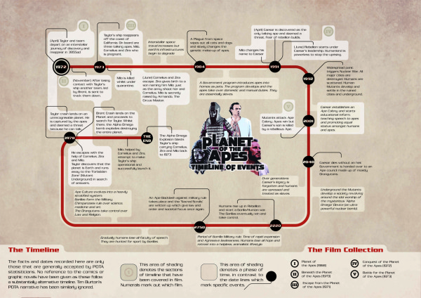
Timeline for Planet of the Apes

Created by Phil Laver, the Planet of the Apes Timeline of Events covers events across all five of the movies.

The facts and dates recorded here are only those that are generally accepted by POTA statisticians.  No reference to the comics or graphic novels have been given as these follow a substantially alternative timeline.  Tim Burton’s POTA narrative has been similarly ignored.

Phil also had his timeline infographic displayed during an exhibition, you can see a couple photos here.

Thursday
Jun242010

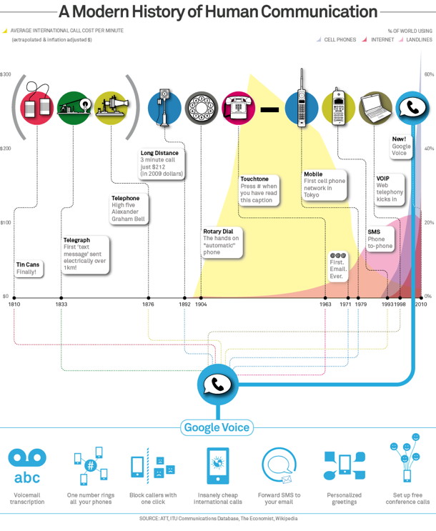
Google's History of Communication Infographic

Google posted this infographic, A Modern History of Human Communication, on the Official Google Mobile Blog as part of their opening up the Google Voice service to everyone.  It’s no longer an invite-only service.

To put things in context, we created this infographic to visualize some recent history of human communication and how Google Voice uses the web to help people communicate in more ways than ever before (click the image for a larger version):


Thursday
Jun102010

A Visual History of the American Presidency - new infographic poster


Timeplots has released their second infographic poster, A Visual History of the American Presidency.  Timeplots was launched by Nathaniel Pearlman and Frank Hamilton in December 2009 with the release of the Visual History of the Supreme Court infographic poster, which is now hanging in many schools, law practices and political offices.

This large-scale print is like nothing else available on the history of the American presidency. It places each president in historical context, visualizing a remarkable range of political, social, and economic measures to succinctly tell the story of the presidency. Narratives are displayed within the larger context of American political history by aggregating and annotating hard data on population, presidential elections, Congress, the Supreme Court, the Cabinet, the U.S. economy, and the federal budget and debt. The Timeplot provides a new lens into American political history; it is not intended to be absorbed at a glance, but rather to be visited and revisited over time.
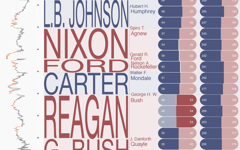


A beautiful poster, and a very impressive infographic design.  Very Tufte-like in its infographic design, which is no surprise since Nathaniel was a student of Edward Tufte at Yale.  

At its heart, this is a fantastic mix of timelines.  Additionally, the poster is an incredibly detailed infographic that includes things like the time period of each President, the balance of Congress during each term, approval ratings, population growth, the U.S. GDP, the Federal Budget, unemployment, election cartograms and statistics, a biography of each President’s political history and so much more.
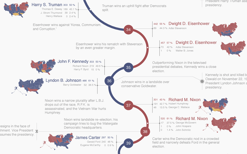


The high-resolution infographic is available on the Timeplots site using Zoomify, but it really shines as the printed poster.  You can order the printed 32”x48” poster from the Timeplots.com site for $45, or a smaller 24”x36” version for $30. 
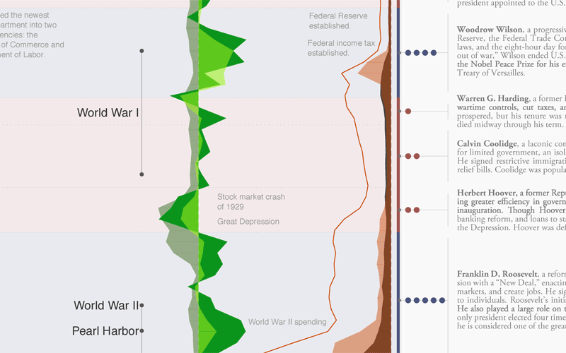


Great job to the entire team at Timeplots!  Later today, I’ll post a behind-the-scenes interview with Nathaniel.

Friday
May282010

The Evolution of the Television - infographic timeline

The Evolution of the Television looks at the last 84 years of TV’s history.  Brought to us from the Sterling Satellite blog.

Did you know it took 13 years for television to reach 50 million users? TV has evolved from the time it started with just a few programs airing each day into 24/7 news and hundreds of stations to choose from.

People didn’t immediately embrace the new technology though. 10 years after its debut in 1936, the head of 20th Century Fox Darryl F. Zanuck (seeing TV as a competitor to movies) famous last words were predicting it would not catch on.  He said he thought “People will soon get tired of staring at a plywood box every night.”

But they have not.

Thanks to @Matt_Siltala for the link!

Tuesday
Apr132010

An Infographic Evolution of the Bra

This two-panel infographic on the Evolution of the Modern Bra was designed by Suzi Slavik for an assignment in her information graphics class at Ohio State University.

The first panel is devoted to social influences, industry leaders, and shifts in fashionable silhouettes. The second panel discusses historical milestones, significant fabrics used, and the bra fitting procedure.

The assignment was to choose any sequence, cycle, or evolution and represent it graphically. The information was to be presented in two separate panels that were related but could also function independently of one another.

Thanks to Matt for the link!

Tuesday
Mar092010

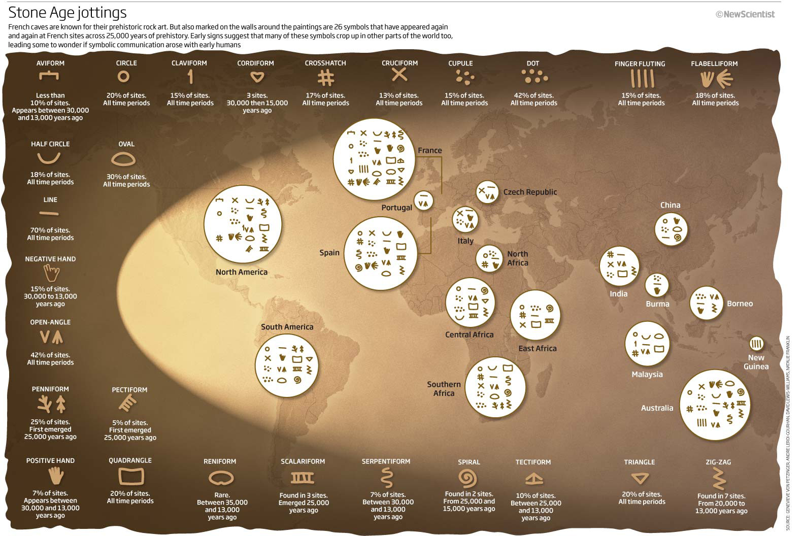
The Writing on the Wall

From an article in New Scientist titled “The writing on the cave wall”, this infographic shows that many symbols and figures used in cave-wall paintings have similar forms.

What emerged was startling: 26 signs, all drawn in the same style, appeared again and again at numerous sites (see illustration). Admittedly, some of the symbols are pretty basic, like straight lines, circles and triangles, but the fact that many of the more complex designs also appeared in several places hinted to von Petzinger and Nowell that they were meaningful - perhaps even the seeds of written communication.

A group of 26 symbols crops up at Stone Age sites throughout the world – are these the origin of the written word?

Found on Chart Porn

Friday
Feb192010

NASA's New Budget [infographic]

GOOD has a good timeline of NASA’s budget over the last 50 years.

The Obama administration announced a new budget for NASA, which despite a nominal increase, cuts future programs and the prospect of more space exploration. This is a look at NASA’s budget over time, and the major missions it accomplished with that budget.

A collaboration between GOOD and 
Karlssonwilker.

Although, since the timeline wraps like text to keep it on one page, I think the bars that represent the different programs should stay in the same order.  And what’s with the flashing images when you view the large infographic?

Friday
Feb122010

101 Muppets of Sesame Street infographic

Mahna Mahna!  Not always about using new programming languages to plot massive amounts of data, infographics can be fun too.  From the National Post comes the 101 Muppets from Sesame Street.  Who would want to read a boring Cast of Characters list.  Visualizing the information is what makes it fun as you try to recognize some of the more obscure characters.

The muppet who sings Mahna Mahna is in there, can you find him?

Some Muppet faces are more familiar than others, so here’s a handy guide to some of our favorites in celebration of Sesame Street’s 40th year on the air!

In celebration of Sesame Street’s 40th season, Steve Murray created this visual of 101 of the most used characters over the years using data from muppet.wikia.com.  The infographic was made interactive with the help of Rebecca Yanovskaya, so when you mouse over any muppet you get a popup with their name and a little history.

Don’t forget to check out the new Muppet videos on the MuppetsStudio channel on YouTube!

Tuesday
Feb022010

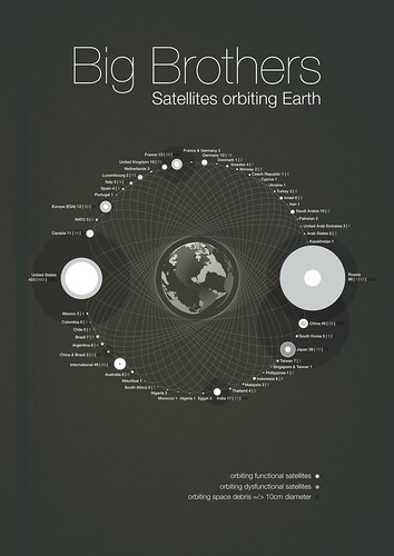
Big Brothers: Satellites Orbiting Earth

Michael Paukner has created a great infographic, Big Brothers: Satellites Orbiting Earth.  Visually showing which countries own all of the space junk currently orbiting Earth (functional, dysfunctional and floating debris).  We apparently have Saturn-envy as we attempt to create rings around our planet.

You’ve got to feel bad for countries like Chile, who used to have a single working satellite in orbit, but the warranty ran out and it doesn’t function anymore.

View the high-resolution image on Flickr.

Thursday
Jan142010

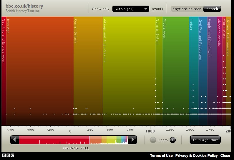
The British History Visual Timeline


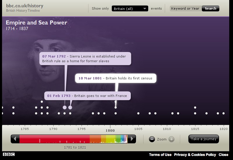
The BBC has put up a great interactive, visual British History Timeline.  Each dot represents a signnificant event.  Clicking a color “era” zooms the timeline to just that time period.

Mousing over the individual dots shows the specific event details and timing.


You can also select a particular region of the UK, or search for a specific year or keyword.