About
Randy Krum
President of InfoNewt.
Data Visualization and Infographic Design

Infographic Design

Infographics Design | Presentations
Consulting | Data Visualizations

DFW DataViz Meetup

Join the DFW Data Visualization and Infographics Meetup Group if you're in the Dallas/Fort Worth area!

Search the Cool Infographics site

Custom Search

Subscriptions:


Feedburner

The Cool Infographics® Gallery:

How to add the
Cool Infographics button to your:

Cool Infographics iOS icon

- iPhone
- iPad
- iPod Touch


Read on Flipboard for iPad and iPhone

Featured in the Tech & Science category

Flipboard icon

Twitter Feed
From the Bookstore

Caffeine Poster

The Caffeine Poster infographic

Entries in how-to (67)

Tuesday
Jul092013

What Is Autism?

What Is Autism? from Global Medical Education is a long, informational infographic that covers the symptons, signs, types, treatments and history of diagnosing autism.

Autism Spectrum Disorder is very common. About 1 in 50 school aged children had parent reported ASD in 2011-2012. There have been changes in DSM-5 with the category of Autism Spectrum Disorder being introduced  which includes Autistic disorder, Asperger’s disorder, Rett’s disorder and Pervasive Developmental Disorder-NOS from DSM-IV. Researchers have studied several important questions in this disorder.

This is a big design with a bunch of good information.  However, I think it’s way too much text for an infographic.  Infographics should make information easier to understand, and most readers won’t stick around to read this much information.  In fact, many readers won’t read any of the information because that much text is intimidating and implies an investment of time and attention by the reader.

The information is fantastic, and should have been broken up into multiple infographics to cover the different topics.  This would make the information easier to digest, and would also spread out links and views to the hosting site over a longer period of time.

Thanks to David for sending in the link!


Tuesday
Jul092013

Methods to Sell My House in the UK

Methods to Sell My House in the UK is an infographic from YouSellQuick.co.uk that looks at the different ways to sell a house and the financial implications.

When looking to sell your home you may not realise that there are a variety of different options available. Not all are as favourable as others and there are different pros and cons for each. Such as how long will it take to sell my home and what amount of cash can I receive. Should I sell my house at an auction or would it be better to use an on-line property buyer?

I like the diagrams that explain the different processes, but the pie charts have really been used poorly in this design.  I think I nderstand what they were trying to explain, but it won’t be obvious to most readers.  Many readers will think they got the pie chart data wrong because the percentages shown don’t add up to 100%.

Thanks to Mark for sending in the link!


Thursday
Jun202013

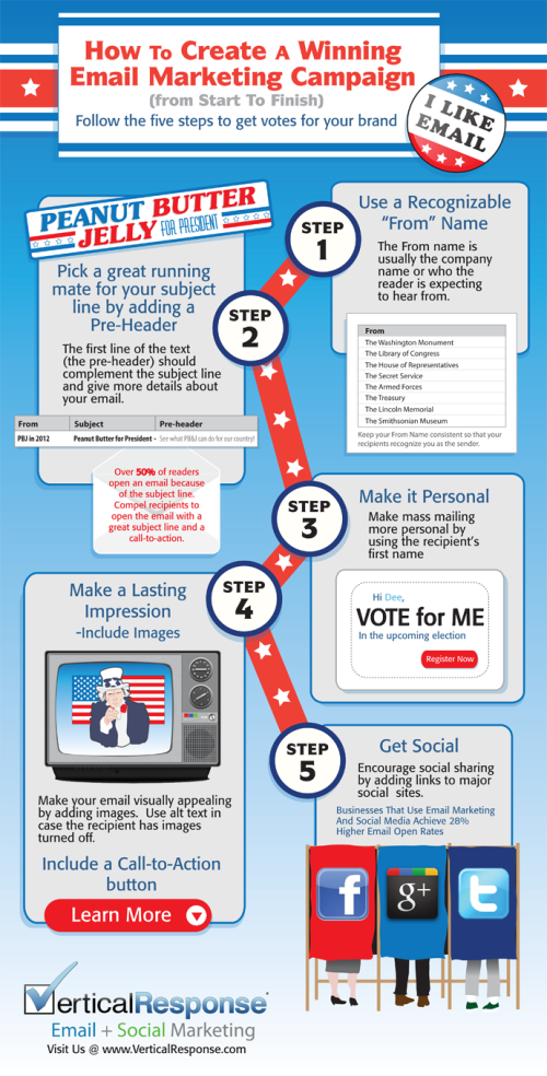
How to Create a Winning Email Marketing Campaign

How to Create a Winning Marketing Campaign infographic

Originally intended for the election year, VerticalResponse has created an infographic on How to Create a Winning Email Marketing Campaign

With over three billion email accounts open worldwide, numbers are showing that email marketing is a viable strategy to target and captivate potential customers. That number is expected to grow to a whopping 4.3 billion by 2016.

How do you make your email stand out from an inbox that receives an average of 112 emails per day? If stats citing click-through rates for 2011 are accurate, only 22 of those emails are opened, leaving the other 90 emails to become unopened, or worse, marked as spam (a four-letter word that strikes fear into the hearts of email marketers).

With election day coming up, we wanted to celebrate the occasion with a patriotic infographic on email marketing. From choosing the right “from” name to integrating your email with social networks, if email marketing has your vote, check out the infographic for five steps towards a winning email marketing campaign.

This is a good way to use an infographic as a visual explanation instead of a bullet list in text for a blog post.  It’s easier to share and includes the images to make it easier to understand.

They had some great data about the growing number of email accounts, but they didn’t include that in the infographic.  Any text description on the infographic landing page is usually lost when people share the infographic, so all of that information should be included in the infographics itself.

Thanks to Leigh for sending in the link!

Friday
Jun142013

How to Fold the U.S. Flag

How to Fold the U.S. Flag infographic

Happy Flag Day in the U.S.  June 14, 2013

Found on the Boy’s Life Facebook page.

Monday
Jun102013

How to Woo a Designer

How to Woo a Designer infographic

Want to learn how to woo a designer instead of offending them? The How to Woo a Designer infographic from 99designs.com gives us a look into the designers’ world.  Both the best sides and the worst sides. 

The 99designs designer survey was conducted in September and October 2012 and received 2,379 responses. Survey sources include graphic designers active in 99designs’ community and graphic designers not affiliated  with 99designs. 

We asked our survey respondents to list some of the best and worst things a client has ever said to them

Good information whether you’re an inside designer or a design freelancer working for clients!  Some of the data could have been visualized better.  The ranking of misconceptions looks like a bar chart with the colored rectangles behind the text, but they fit the text size and don’t represent the data.

The design should include a clear title in the infographic (not just on the web page), the URL link back to the original infographic, some type of copyright or Creative Commons license statement and credit to the designer.  Come on, it’s an infographic about designers on an online marketplace for graphic designers!  Give the designer some credit!

Thanks to Lauren for sending in the link!

Tuesday
Feb052013

How to Find A Missing Child Using Social Media

How to Find A Missing Child Using Social Media infographic

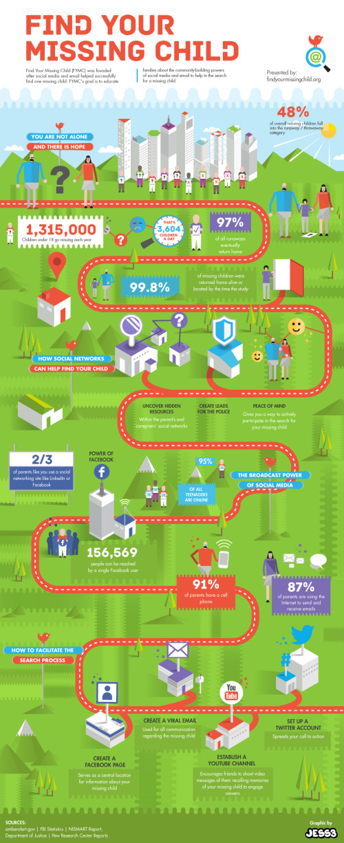
Find Your Missing Child is a new infographic design by the team at JESS3.com for FindYourMissingChild.org.

Find Your Missing Child (FYMC) was founded after social media and email helped successfully find one missing child.  FYMC’s goal is to educate families about the community-building powers of social media and email to help in the search for a missing child.

The design does a good job of walking the reader through the statistics and benefits of engaging with social media as a tool in the search for a missing child.  The path provides a clear sequence of information for the readers to follow.

Some of the statistics are impressive, and would make a bigger impression on the reader if they had been visualized.  Big numbers are not data visualizations, and many designs make the mistake that using a big font makes the numbers more impressive.  An infographic should put those values into context for the reader by visualizing them.

In the footer, the URL to the infographic landing page is missing and would be helpful to readers that want to find the original full-size infographic.

Thanks to Jarred for sending in the link!

Tuesday
Jan082013

The Ultimate Complete Final Social Media Sizing Cheat Sheet

The Ultimate Complete Final Social Media Sizing Cheat Sheet infographic


The Ultimate Complete Final Social Media Sizing Cheat Sheet by LunaMetrics is a huge (and very long) informational infographic that shows the readers all of the important image sizing requirements for the major social networks.

In June of this year, we published an infographic listing all of the sizing information for images on Facebook, Twitter, Google+, and Pinterest. It was a wildly successful piece of content, totally blowing our expectations out of the water. Unfortunately, while its popularity has flourished, nearly every social network instituted changes to their image sizes, rendering most of the information on the infographic out of date.

We knew we needed to update the information on the cheat sheet, but we weren’t comfortable with simply adjusting one or two figures on the blog post and leaving it as-is. We’d also received a lot of feedback, both on the design and information it contained. We decided to redesign the entire sheet and incorporate a few more social networks.

We also decided to permanently redirect the old sheet here, so that shared tweets, pins, likes, and so on, would lead to the correct sizing dimensions. Additionally, as sizing changes are implemented across social networks, we’ll actively update this sheet – meaning that if you use the embed code at the bottom to share this sheet on your own site, the image will automatically update with changes as they are rolled out. No more out-of-date information.

I love that all of the sizes are shown in correctly proportional rectangles!  Based on their claim, this infographic should also update correctly as they revise it to match the ongiong changes from all of the social networks.  

Some color of the official logos of the different social media networks at each section break would have been helpful to the reader.  The light typeface used at each section break is hard to distinguish from the rest of the design.

Found on Social Media and Social Good

Wednesday
Nov282012

State of Graphic Design

State of Graphic Design infographic

Smartpress surveyed some of the best and most talented graphic designers and put the results into the State of Graphic Design infographic.  They include tips like “How to learn the field” and “Top 5 states for graphic designer employment” that could be crucial for newbies to the field.

Welcome to the 2012 edition of the State of Graphic Design!

Smartpress.com conducted a survey to aggregate the opinion of dozens of the best and most-talented graphic designers in the industry. The results were turned into a success factors/guide document in form of an infographic. This year the survey included more than 40 industry experts that have 5+ years of experience.

Thanks to Harrison for sending in the link!

Friday
Nov022012

How to Travel Like a President

How to Travel like a President infographic

It is almost election time! Hard to imagine how the presidential candidates were able to accomplish visiting so many cities in the amount of time they did! Flipkey crunched some numbers and put together their How to Travel Like a President infographic. They show the candidate’s mode of travel, what they ate and where they stayed. If you want to see the country, I’d recommend traveling with the president! Just make sure they are the ones to flip the bill. 

With less than a month to go before America heads to the polls, we keep thinking about the candidates hitting the road. After all, for those of us here at FlipKey, visiting over 25 towns across the country in a month sounds like a dream job – but who can afford it? Over the past four months, President Obama’s campaign travel expenses have totaled a cool $3 million, which may have factored into his decision to skip this year’s summer vacation. Meanwhile, challenger Mitt Romney has shown that the first step to becoming president is traveling like one: the former governor has poured close to $10 million into travel for himself and his staff. Looking at these price tags, we decided to go to work and find out exactly what it takes to travel like a president…

I like the different approach to data surrounding the election campaigns.  The data is a little bit skewed because of the date range represented.  The numbers for Obama only show 2 days on the road, so hotel and food costs are very small.

Good list of sources, but missing a copyright and a URL link back to the infographic landing page on the FlipKey site.

Thanks to Claire for sending in the link!

Wednesday
Oct032012

How-Many Guide to Kitchen Conversions

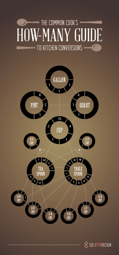
Common Cook's How-Many Guide to Kitchen Conversions infographic


Designed by Shannon Lattin at S.B. Lattin Design, the Common Cook's How-Many Guide to Kitchen Conversions is a super-helpful infographic design.  Very quickly the reader can lookup to the conversions between many of the most common recipe measurements.

If your kitchen drawers are anything like ours, you never have the right measuring implement for the recipe you’re tackling. Keep this chart on hand, and the next time you find yourself asking “How many…” you’ll know just what to do.

This design is an excellent example of "tell one story really well."  It's a clear and simple design that is quick and easy for the reader to understand.  

Found on Visual.ly

Nice job Shannon!