About
Randy Krum
President of InfoNewt.
Data Visualization and Infographic Design

Infographic Design

Infographics Design | Presentations
Consulting | Data Visualizations

DFW DataViz Meetup

Join the DFW Data Visualization and Infographics Meetup Group if you're in the Dallas/Fort Worth area!

Search the Cool Infographics site

Custom Search

Subscriptions:


Feedburner

The Cool Infographics® Gallery:

How to add the
Cool Infographics button to your:

Cool Infographics iOS icon

- iPhone
- iPad
- iPod Touch


Read on Flipboard for iPad and iPhone

Featured in the Tech & Science category

Flipboard icon

Twitter Feed
From the Bookstore

Caffeine Poster

The Caffeine Poster infographic

Entries in how-to (67)

Monday
Mar242014

How Google Glass Works

How Google Glass Works infographic

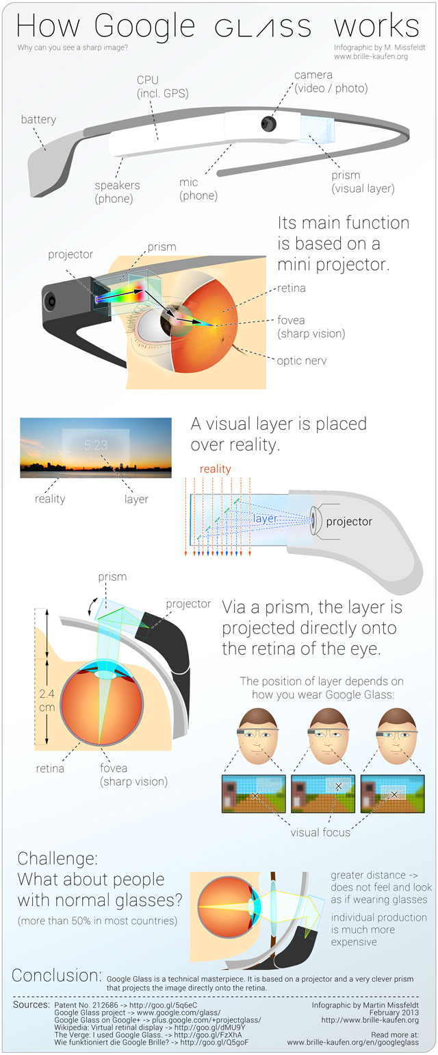
The Google Glass phenomenon has gotten a ton of coverage from the tech press, but how does it work? Creator Martin Missfeldt explains the inner workings in his How Google Glass Works infographic.

How does it work, Google’s new Glass? Why can you see with it a sharp image-layer? How does the image overlay the image of reality? The following infographic illustrates the optical principle - very simple and easy to understand.

Google Glass is a technical masterpiece. It combines numerous functions and features in a very small unit. In addition to phone and camera (photo, video), it offers Internet connection, including GPS.

The core feature of Google Glass is a visual layer that is placed over the reality (“augmented reality”). This layer opens a door to amazing new possibilities. But how does it work? In the Google Glass contains a mini-projector, which projected the layer via a clever, semi-transparent prism directly on the retina in the eye. Because of this the image, even though it is so close to the eye, is sharp and clear. You can move the front part of the Google Glass easily to optimize the focus.

This informative infographic is a great how-to explanation of the science and technology built into Google Glass.  Illustrations and images are used in this design to tell the story instead of data visualizations.

A German version of the infographic was also published.

Found on http://www.educatorstechnology.com/2013/05/a-great-visual-guide-on-how-google.html


Tuesday
Feb252014

An Infographic Guide to Wedding Roles

An Infographic Guide to Wedding Roles


The Ultimate Visual Guide to Wedding Roles from Great Speech Writing helps clarify the complicated and misunderstood traditions behind who does what in a wedding.

Thinking about proposing; recently proposed; or just worried about what planning a wedding actually involves?  Big or small, at home or in a venue, it’s going to tale a lot of organising. When it comes to the wedding speeches we take the strain.  But there’s also a guest list to compile, a venue to book and countless people to arrange.  And in most cases, it’s something we only do once!  So here is the Great Speech Writing contribution: a wedding infographic to print-off, pin on the fridge and help you focus on who does what and when.  It’s not going to be easy, but at least you won’t have to worry about the speeches.

In terms of relevance, this is a great topic selection for an infographic from the publisher, Great Speech Writing.  It’s related to their business, but it is also a general interest topic that will be informative to a broad audience.

The topic also has a long Online Lifespan, which is how long the infographic will remain relevant to readers and continue to generate page views and back links.  Since the topic isn’t tied to any current events in the news, the infographic will be relevant for years to come.

The design is overly text-heavy, but I understand the design challenge.  Each action item should probably have an associated icon or illustration like the Joint Responsibilities section.  For example, a silhouette of a stripper pole dancing for the “Organise and host a memorable stag party” action item.  The design of an “Ultimate Visual Guide” should be much more visual!

The footer has the URL to the main front page of the Great Speech Writing site, but that doesn’t help readers find the original full-size infographic.  There isn’t a link to the infographic on the front page.  So the infographic should include the URL directly to the infographic landing page, so readers can find it even when people share the infographic in social media without an active link.

Thanks to David for sending in the link!


Monday
Feb242014

How to Create Beautiful Calligraphy

How to Create Beautiful Calligraphy infographic

Calligraphy is a skill that requires a lot of practice. But no amount of practice will help you if you don’t have the right tools. The How to Create Beautiful Calligraphy infographic from Moo explains everything that you need to be successful. From the tools you need, to how to actually do each letter.

The graphic is a step-by-step guide to creating your own stunning hand-drawn calligraphy, and explores everything from the tools and materials you need, to how to draw the perfect curve with your nib.  The design very clearly walks the audience through the sequence of information using illustrations to enhance each point.

The text is a little bit too small when the infographic is sized to fit within a blog post (usually 600 pixels wide, as you can see above), but that can also have the benefit of encouraging readers to click through to see the original full-size version on the Moo site.

The footer of the infographic should include a copyright statement (or Creative Commons) to clearly outline the rights for sharing that the publisher wants to allow online.   Also, the URL to the original infographic landing page on the Moo site would be very helpful.  Currently it is very hard to find on the Moo site, and is not included in any blog posts that I could find.  Including the URL in the infographic image itself ensures that readers will be able to find the orignal even when the infographic is shared in social media without a correct link back to the original.

Thanks to Dan for sending in the link!

Tuesday
Feb182014

Food & Wine Pairing Method

Food & Wine Pairing Method infographic poster

A great infographic for National Drink Wine Day (February 18), the Food & Wine Pairing Method is a new poster from Wine Folly that shows all of the compatible and Best wine matches for different foods and preparation methods.

See the theory of food and wine pairing in action with this easy to use chart. Then, understand the simple science behind food and wine pairing based on our basic sense of taste.

You can learn the fundamentals of how taste components like sweet, sour, spice, bitter and fat go together. Then, try pairing wine by letting the characteristics of your food suggest your wine.

Available for purchase for $24, it’s also available as a high-resolution download so you can print out your own personal poster.

The design is very clean and colorful.  The circles in the table only have two different sizes, small and larger.  There can be many small circles to show all of the compatible wines, but only one “Best” match shown with the large circle.  The multi-ingredient direction down the left side are easy to understand, but it is still a little difficult for readers to visually compare rows that are not adjacent, and far apart.

Friday
Nov292013

Seven Myths of Email Marketing

Seven Myths of Email Marketing infographic

The Seven Myths of Email Marketing infographic from Alchemy Worx addresses many of the misconceptions about email marketing head on.

Many beliefs that email marketers hold true regarding email are simply false, according to research and analysis conducted by my email marketing agency, Alchemy Worx. We analyzed data sourced from our work with customers and industry figures to arrive at our conclusions.

Here are seven such email myths, which are also presented in an infographic at the end of this article.

Great information with fun illustrations that attract viewers.  The statistics should be visualized though, instead of just shown in text.  Big fonts are not data visualizations, and don’t make the data any easier to understand for the readers.

Footer has good information with full links to the sources, a clear copyright and the company logo.  It’s only missing the URL link back to the infographic landing page so readers can find the orignal when people post it without a link back to the Alchemy Worx site.

Thanks to Christine for sending in the link!


Wednesday
Nov272013

Thanksgiving Table Setting Diagrams

Thanksgiving Table Setting Diagrams

Just in case anyone needs a visual reminder when setting the Thanksgiving dinner table, the Table Setting Diagrams from Dinner-Party-Menu-Ideas.com make it super easy!  More of a diagram than an infographic, it’s still a super-useful visual!

Found on lifehacker, Brunch at Saks, and Apartment Therapy

Here’s a more detailed and further designed Thanksgiving Etiquette Table Setting Guide infographic from Adirondack Authority:

Thanksgiving Etiquette Table Setting Guide infographic

Found on Fine Dining Lovers

Both of these designs have an excellent Online Lifespan.  These designs are not new, they were originally published in years past.  The information presented is long-lasting, and will be relevant to readers every year for many years to come.

Monday
Nov252013

How NOT To Look Ugly on a Webcam

How NOT To Look Ugly on a Webcam infographic

How NOT To Look Ugly on a Webcam from Mixergy and Lemon.ly lays out the top 10 tips for successfully using your webcam.

No matter who you are and how good you look, it’s pretty easy to look terrible on a webcam. We teamed up with our friends at Mixergy to showcase just how NOT to look bad on a webcam with this handy infographic. By just following a few of our easy webcam tips, you’ll look as good as you feel in your next webcam interview. What do you think? Have any other tricks to add?

Nice instructional how-to infographic.  There’s no data visualized, just illustrations of the 10 tips.  Quick and easy to read.  This design also has a long Online Lifespan.  The topic is so universal, the infographic will be relevant for years!

The footer should include the text URL link to the infographic landing page on either Mixergy or Lemon.ly so when readers see smaller thumbnail versions posted on Facebook, Pinterest, Twitter, Google+ or blogs without a link, they can still find the original full-size version!

Thanks to @jasongaloob on Twitter for the link!


And Guy Kawasaki on Facebook:

Monday
Nov182013

17 LinkedIn Profile Must-Haves

17 LinkedIn Profile Must-Haves is a how-to infographic that walks the reader through optimizing their LinkedIn profile page.  Published by MarketMeSuite working with Maximize Social Business.com’s Neal Schaffer.

This year has been a big one for LinkedIn. With new features like the Creative Portfolio Display, you now have the ability to visually showcase your professional portfolio. But before diving any deeper with the latest add-ons, does your LinkedIn profile have all the elements that will help you rise to the top? This new infographic has all the tips you need to elevate your LinkedIn profile: 17 LinkedIn Profile Must-Haves!  Everyone can use great tips, so please share the LinkedIn love!

Great design using a mock LinkedIn profile as the background.  The callouts are clearly connected to the appropriate areas on the profile.  There’s a lot of text, but in this case I think most of it is necessary to clearly explain each point.  The reader can work off of this infographic without any additional research on other sites.

The statistics at the bottom should have been better visualized.  Mixing the 50.5% stat with the profile complete percentage visual from LinkedIn is confusing.  Also, it was difficult for me to find the original infographic landing page.  The footer should have the URL for readers to find the full-size original version of the infographic.  The source list text is too small to read too.

Thanks to Martin Mosler for post on Google+!

Wednesday
Sep252013

Your One Month Guide To Beating Clutter

Your One Month Guide To Beating Clutter infographic

Clutter is everywhere. No matter what we seem to do, it just accumulates. Your One Month Guide To Beating Clutter infographic from Terrys Fabrics gives some helpful hints with a flowchart on how to decide what can be saved vs. tossed. There are also some specific tips based on areas of your home to help minimize clutter.

De-cluttering can sometimes be overwhelming. A room-by-room approach can make the process more manageable. By starting small and keeping up good habits, you can soon work your way towards clutterless bliss.

Thanks to Meilen for sending in the link!

Tuesday
Aug132013

How to Match Shirt and Tie Patterns

How to Match Shirt and Tie Patterns infographic

If you have some trouble balancing your serious business side with your fun side, a look at the How to Match Shirt and Tie Patterns infographic could be helpful. The infographic from Beckett Simonon shows a few examples of complicated patterns that work together, and then some to definitely stay away from.

So you’ve been wearing solid ties and shirts for a while, you think you look great but you feel is time to earn some extra style points by adding some patterns? No worries, we got you covered! Shirt and tie patterns are great if you want to stand out from the crowd, they are also fun and will bring a new life to your look. Just make sure your pattern groupings are far from making people dizzy and fall hypnotized. We made this cheat guide so you can learn the basics and develop your own combinations and style from there. Enjoy!

Great visual explanation design that stays focused, and tells one story really well.

Thanks to Nicholas for sending in the link!