Entries in personal (139)
What if...

Craig Robinson, from flipflopflyin.com, has created a graphic showing many of the different paths/branches his life could have taken. Clicking on each character icon reveals text describing the event or deviation from actual events.
Who hasn't at one time or another wondered how their life could've gone in other directions if different events had occurred or different choices been made? These are the ways my life could've deviated from its actual path (the top row)." Craig dies at the age of 34, killed by an angry swan" I found incredibly funny.
Found on NiXLOG.
National Gruntledness Index

New interactive map on CareerBuilder.com charts the results of user survey data on how gruntled (or disgruntled) people are with their jobs across the country. You can even narrow the map results to a particular industry.
The map doesn't change that often, but when you roll your mouse over the map, it highlights the cities where the score has changed.
Thanks Kevin for the email.
 ad,
ad,  charts,
  compensation,
  corporations,
  history,
  map,
map,  personal,
  relative
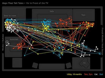
 Family Movement Map

Cool infographic project on Flickr, this map of the living room tracks the movements of a family over the course of only one hour on Christmas Day in 2006. Posted on Flickr by The Bumblebee.
Thanks Oliver for sending me the link.
The Timeline of "Cool"

Found on Wikipedia, this is the timeline of what was "Cool" from 1500 A.D. through today. Apparently, the Beatles aren't cool anymore...
Superior Coffee

Another one from Beau and Alan Daniels at beaudaniels.com that I really liked. Superior Coffee is half blueprint, half illustration that helps communicate the Superior Coffee strategy of delivering a better coffee to customers and is used at trade shows. A good way to visually show the technical aspects behind a product.
The Marathon Meal

You have to walk 26.2 miles (a complete marathon!) to burn off the calories from a standard Thanksgiving meal, shown here broken down by each dish included. That extra piece of pumpkin pie is worth 5 miles!
This infographic is from Gary Newman Design, who does some fantastic work.
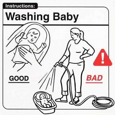
Do's and Don'ts with Babies

A series of infographics to help the parents of a new baby...sort of. Some of these are very funny, but some of them are very odd.
These are apparently a series of images from the book Safe Baby Handling Tips, by David and Kelly Sopp.
Nichloas Felton's 2007 Annual Report

Nicholas Felton has published his new 2007 Annual Report. I love the way he breaks down his own personal life into maps and charts. I had just posted about his 2006 Annual Report last month.


