About
Randy Krum
President of InfoNewt.
Data Visualization and Infographic Design

Infographic Design

Infographics Design | Presentations
Consulting | Data Visualizations

DFW DataViz Meetup

Join the DFW Data Visualization and Infographics Meetup Group if you're in the Dallas/Fort Worth area!

Search the Cool Infographics site

Custom Search

Subscriptions:


Feedburner

The Cool Infographics® Gallery:

How to add the
Cool Infographics button to your:

Cool Infographics iOS icon

- iPhone
- iPad
- iPod Touch


Read on Flipboard for iPad and iPhone

Featured in the Tech & Science category

Flipboard icon

Twitter Feed
From the Bookstore

Caffeine Poster

The Caffeine Poster infographic

Entries in relative (157)

Friday
Nov022007

The World Freedom Atlas


The World Freedom Atlas, offers many different views of the world. Developed by Zachary Forest Johnson, his blog is here. The one above is the Raw Political Rights Score (darker is better) based on data from the Freedom House. Offering a bunch of datasets from a number of different sources, the interface is fantastically easy to use. Depending on the dataset, you can also view the data by year from 1990-2006.

Tuesday
Oct302007

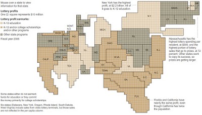
Lotteries Profit, but Do Students?


Interactive graphic, from the NYTimes:

Lotteries in 42 states and the District of Columbia rake in billions of dollars, but much of the cash from ticket sales gets channeled back into prizes and lottery administration. States earmark the profits for programs like education, but the lottery dollars contribute only a small percentage of the total education funding.

Sunday
Oct282007

Where we live...


Found on Data Mining, this is an interactive graphic from Time magazine showing the population density in America as a histogram. Similar to my earlier post on World Population Density, this one focuses on just America, and adds the 3d element to the visual.

Friday
Oct262007

Science Related Wikipedian Activity


A new visualization from the same group that did the earlier visualization of Wikipedia revision activity. This one focused on science and tech related articles. The mystery is the significance of the blue/green band that crosses the map.

Thursday
Oct182007

Plastic Bags


Here's another one from Chris Jordan. Is it art, or is it infographic?

The image shows 60,000 plastic bags, which is how many bags are used in the U.S. every 5 seconds! The picture currently on display at the Paul Kopeikin Gallery in Los Angeles is 5ft x 6ft large so viewers can step up close to see all of the details.

Wednesday
Oct172007

Americans Remain Woefully Ill-Informed


Wired magazine calls infographics like this "infoporn". I guess you could call this a version of a bubble chart, but it shows a comparison of what people knew in 1989 vs. 2007. Separately it shows knowledge of three questions based on the respondent's usual source of news.

I can't tell how big the sample size was, or what type of people they interviewed. It quotes the source as the Pew Research Center for the People & the Press, but that alone isn't enough to make it credible.

Friday
Oct122007

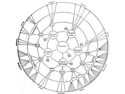
Radial Organization Chart

Found on Visual Complexity, this chart from 1924 is an interesting variation of an organization chart. With the authoritarian leader in the center, the subordinates are mapped outward from the center. Rings at different radii show peer level responsibility.

Monday
Oct082007

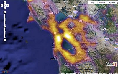
Population Heat Map


From CraigStats, the image above shows the population per square mile in the San Francisco area as a pseudo heat map. The site also has combined the apartment listings on Craig's List with Google maps to create pseudo heat maps showing the areas with the most apartments.

Monday
Oct012007

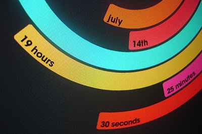
The Polar Clock


The Polar Clock, from Pixel Breaker, version 3 is now out as a screen saver for Mac and Windows. It's also available as a Mac OS X Widget.

I don't know why, but I love this clock. I'm mesmerized watching the seconds going around. With a little practice, you can visualize the time. I won't say this is the best way to visualize the time, but it's definitely fascinating.

Monday
Sep172007

Human Trafficking

Found on VisualComplexity.com, this disturbing poster examines global human trafficking.

"It depicts each country's level of involvement (from Very High to Very Low) as either a country of destination or origin. The project concentrates on the smuggling of people from one country to another - mainly illegally. In many cases these people are forced to do work that is illegal, such as prostitution or child labor."
The poster was created by Taulant Bushi, and the original image is here.