About
Randy Krum
President of InfoNewt.
Data Visualization and Infographic Design

Infographic Design

Infographics Design | Presentations
Consulting | Data Visualizations

DFW DataViz Meetup

Join the DFW Data Visualization and Infographics Meetup Group if you're in the Dallas/Fort Worth area!

Search the Cool Infographics site

Custom Search

Subscriptions:


Feedburner

The Cool Infographics® Gallery:

How to add the
Cool Infographics button to your:

Cool Infographics iOS icon

- iPhone
- iPad
- iPod Touch


Read on Flipboard for iPad and iPhone

Featured in the Tech & Science category

Flipboard icon

Twitter Feed
From the Bookstore

Caffeine Poster

The Caffeine Poster infographic

Entries in relative (157)

Sunday
Sep162007

The Elegant Universe


Following my earlier post on Imagining the Tenth Dimension, I found that NOVA has put the entire 3-hour show The Elegant Universe on their website.


The show is full of different visual methods to visual strings, gravity, the scale of particles and multiple dimensions. Brian Greene really did a fantastic job with this show based on his book on the same name.

Friday
Sep072007

The Cosmic Calendar


This last December was the 10th anniversary of Carl Sagan's death. One of his most popular episodes of Cosmos was titled The Dragons of Eden where he first described his Cosmic Calendar. This website from discovery.com has a simple image showing the Cosmic Calendar as Carl described it. A few websites are selling posters of the Cosmic Calendar, like AllPosters.com.

The premise is that if you compress the entire history of the universe into a calendar year, homo sapiens only exist in the last 6 minutes, and the last second represents the last 400+ years of human history.

You can see Cosmos, and hear Carl describe it on YouTube here:

Wednesday
Sep052007

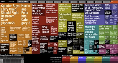
Marumushi News Map


Marumushi.com has a fantastic News Map using the treemap visualization style. This is one of the best implementations of a treemap that I have found. Updated every 6 hours, it groups news stories (from the Google news aggregator) by overall category (technology, world, sports, etc.). You can choose to show the news map from 11 different countries, and the color shading of each block represents how old that particular news story is. Hovering your mouse over any square shows the whole title, and clicking takes you directly to the story.

Sunday
Sep022007

World Population Density


This is a prime example of how seeing the data visually is better than reading numbers. Here is a population density map from Wikipedia.

We have heard that China and India have most of the human population in the world, but here you can really see and understand how much. Reading that China's population is four times that of the U.S. is much harder than really seeing it on a map.

The Wikipedia page on World Population has some other great information too.

Monday
Aug272007

Katrina's Diaspora

Originally from the nytimes.com in October 2005, I found this map graphic on mylifestream.net. This shows the geographic distribution of applications to FEMA for aid from Katrina victims. Presumably, that means the application locations imply where displaced Louisiana residents moved to.

Sunday
Aug262007

Bodies in the Solar System


Another great infographic on kokogiak.com showing the relative size of large objects (88 of them, at least over 200 miles in diameter) in our solar system. The largest (of course) being the sun down to the smallest, which is Davida, an asteroid 203 miles in diameter.

Saturday
Aug252007

Consumer Spending (5% on Tech Stuff)


From Wired magazine (issue 15.08) a treemap infographic of consumer spending in 2005. 5% of all consumer spending was on technology, and of course, Wired broke down that 5% into an expanded treemap.

Internet access +216%, Residential phone -25%. VOIP seems to be making an impact.

Sunday
Aug122007

Starship Dimensions


As a follow-up to my earlier post on the Starship Comparison Poster, the Starship Dimensions website has a much more extensive library of sci-fi ships all shown to scale. There are so many here that the website is broken up into different pages from small scale up to "Big" scale. Click on the tabs across the top to pick a scale (100X, 10X, 1X, etc.).

Fantastic resource. Jeff Russell has done a great job accumulating the images and tracking down their relative sizes.

Friday
Aug102007

World's Most Dangerous Drugs


Another good one from Healthbolt. Color coded by class, and ranked by overall harm to the human body.

Wednesday
Aug082007

2008 Presidential Campaign Finances


This interactive infographic from the New York Times website is really impressive. Using weekly data reported by the Federal Election Commission, it plots the contributions on a map of the U.S. and sizes the bubbles based on contributions from that city. It has data from every week since January 1st, so it will also "play" and animated version showing the contribution as time progresses (similar to the Trendalyzer that Google purchased from GapMinder).

You can also search for specific contributors to see which candidate campaigns they have contributed to, and how much they gave.